LecoursDesign teamed with our client Murraysmith to enter three submissions for the national SMPS Marketing Communications Awards. What happened? We won all three!
Best Corporate Identity/Rebrand
Jurors said they loved the fun, engaging, impressive impact on recruitment and retention. It was comprehensive in approach and implementation. Another stated “Great job! Logo and materials look great, and the entry was very responsive.”
Jurors enjoyed this new site and their graphic approach “the visuals are fresh and unique”. Great research and planning, tied nicely to strategic plan! They clearly set out to rebrand their website as a recruitment/retention tool – did a good job at each stage. Outstanding results!
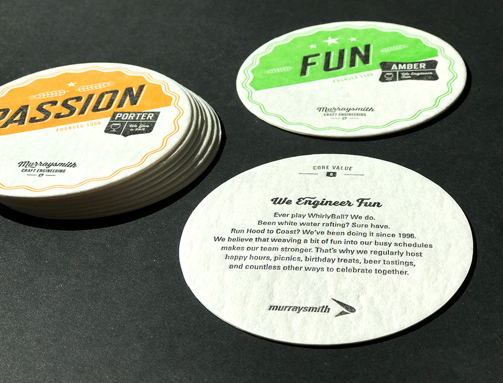
One juror stated “What a great award submission – it made me want to work for MurraySmith! It’s clear that a lot of time and effort went into developing and refining each core value. And this set of coasters was a creative, perfectly executed way to help communicate your firm’s personality.
Resources and links from David Lecours’ SMPS Southwest Regional Conference and SMPS Pacific Regional Conference session on Innovative Websites: A/E/C Best Practices.
Program Description
In 2017 the SMPS Foundation published this study: How A/E/C Clients Use Websites to Find and Vet Services Providers. In 2018, David Lecours published research on best practices of ENR 20 and 20 progressive firm websites. Merging these two studies, David will share data, and what we can learn about the effectiveness of top A/E/C websites. You’ll learn the latest tactics that firms are using to attract and convert great clients and talent.
Slide Deck
To download the slides, click the LinkedIn logo (“˜in’ square above). Within Slideshare, click “Download” button under the title.
PSM: Professional Services Marketing was one of two podcasts that Andrew Sculthorpe (Scully) and Brad Entwistle founded. Brad and Scully, Principals of ImageSeven, an Australia-based marketing communications firm continue producing SMC: School Marketing Communications podcast.
“We’re excited to serve the PSM audience with juicy marketing ideas to help firms attract great clients and talent,” said David Lecours. “Josh is a seasoned podcaster, and highly persuasive. So when he asked me to join him in co-hosting PSM, it was an easy yes!”
In Episode 102, Josh and David discuss their plans for the show. Mentioned in the episode:
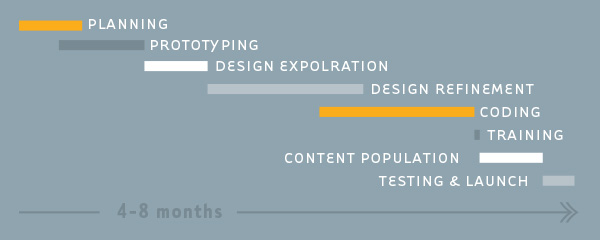
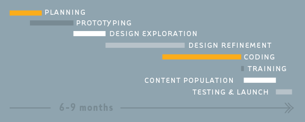
A great AEC firm website doesn’t just happen. It needs a defined process with each phase informing the next. LecoursDesign was honored with winning the Best Website Award at the SMPS Awards Gala for Randall Lamb’s site. We repeated the win, at the next Gala, for Bergelectric’s site. Creating award-winning websites requires visionary clients and a process of specific phases to ensure smooth project delivery. To help you with your next website project, I summarize each phase below.
Planning (2″“4 weeks)
First, we establish goals and tactics for your new site. Every new client and employee will pass through your website. So we consider how your new site will be a hub for your firm’s offline and online marketing initiatives. We review your current site’s analytics to see where users go on your site, how long they stay, and how they find your site (keyword search and referring sites). We review sites you admire, including your competitors to evaluate their online presence.
Architects call this phase programming. In website development, we call it planning. In both cases, it’s about gaining clarity on the why, what, and when of your new site. Even more important, it’s about who; the user and their needs. We develop three “personas” for the targeted user archetypes who will be visiting the new site. These “personas” are a compilation of demographic information and user profiling at the three buying stages: researcher, evaluator, and purchaser. It may sound silly, but I recommend giving each persona a name and a photo so they seem as real as possible.
This phase focuses on information architecture: what sections/pages to include in the new site and how will the user find her way to the information she seeks. This results in a Site Map: an outline of all the proposed pages organized by navigation buttons and page titles.
Deliverable: Findings & Recommendations, Strategic Brief (2″“3 page document outlining why, what, when, who, goals and scope of the new site), Personas, Keyword/SEO Research, Site Map
Prototyping (2″“4 weeks)
After approving the Site Map, we create greyscreen prototypes of the key page templates. Greyscreens, also called wireframes, are sketches of content on each key page template. They are grey because color at this point is distracting. The goal in this phase is to focus on content, not design. We used to present printed greyscreens, but now prefer digital. To really understand how a user experiences navigating from one page to the next, these greyscreens need to be on screen and clickable within a browser environment.
Knowing all page titles, you must begin wrangling content. This means gathering case stories, blog content, project descriptions and photos, people stories and photos, and about the firm information. A determination must now be made for a writer and photographer or illustrator to create content you’ll need for the new site. We can help you with all this.
Deliverable: Greyscreens
Design Exploration (2 weeks)
We bring the greyscreen key templates to life with design by introducing color, typography, photography, illustration, backgrounds, graphic elements, buttons, etc. We present two design explorations of the Home, About, Project Gallery and Project page templates. If the new copy and photography isn’t ready, we use placeholder photos and copy.
Deliverable: Static Screenshots presented on screen.
Design Refinement (4″“8 weeks)
We refine the design by adding actual copywriting and imagery to the initial key templates. Upon approval, we apply the chosen design to all the remaining page templates. Interactive elements like rollovers or motion are shown as storyboards. If the site features responsive design (optimized for desktop, tablet and mobile), and it should, then we fine tune the design for different sized screens. Design refinement continues through the coding phase, and even after launch. A great website is never “done.” There are always opportunities for improving the user experience.
Deliverable: Static .jpg Screenshots presented on a laptop and smart phone
Coding (4″“8 weeks)
Except for the greyscreens, pages so far are static. Coding brings the pages to life by making them interactive, and fully functioning within modern web browsers. We code sites by creating a Content Management System (CMS) framework to allow clients to take over maintenance of key sections of their sites.
Deliverable: Coded site viewable within a web browser
Content Management System (CMS) and Search Engine Optimization (SEO) Training (1 day)
After coding the first key templates, we hold a training session with you on how to use your shiny new CMS. We share best practices for adding and updating content so your site stays fresh without having to hire an outside coder every time you want to make changes. We can also hold a training session for you to optimize each page of your site for search (SEO).
Content Population (4″“6 weeks)
Newly trained on your CMS, you can now populate your entire site with all the copy and imagery you have gathered since the Prototyping phase. This helps you learn the CMS in a “real environment” with a safety net of the site not being live yet. Plus, you’ve got an available expert (us) should you run into roadblocks.
Browser Testing & Launch (1 week)
We test your site on major browsers (both desktop and mobile) and operating systems (Mac, PC, iOs, and Android). Once ready, we prefer to go live with the new site as a soft launch where you don’t make a big announcement for at least a week. This let’s us all fine tune any quirks (there will be some). Then you announce that you are live and launch a promotion to drive visitors to your new site.
Obviously I’m biased, but I recommend you hire a web consultant focused on Architecture, Engineering and Construction (A/E/C) firms to help you with your next website. With the guide above, you’ll be an informed partner in the process. Who knows, it may lead to your next site being awarded “Best Website.”
I too was confused, overwhelmed and scared of Google Analytics. Since the antidote to fear is knowledge, I wrote this post to help me, and you, understand how to use this essential tool. With the following advice, you can start slow, gain a basic understanding, and grow from here. Google Analytics is a tool that all A/E/C Marketers need to use in our increasingly digital world.
Why AEC Firms Should Use Google Analytics?
I like Google’s answer on their website: “Google wants you to attract more of the traffic you are looking for, and help you turn more visitors into customers.” I recognize that few, if any, A/E/C firms use e-commerce to instantly sell your services. But, relationships can, and do, begin online. A more realistic goal is to begin a relationship with a visitor by sharing your firm’s expertise and then asking the visitor to sign up for your email list, or blog. Google Analytics helps you continually refine your content to attract clients and talent that value your point-of-view.
To help you attract the right leads, here are questions you should be asking, that Google Analytics can help you answer:
Who is visiting my site?
Who is driving traffic to my site?
Which content are they consuming on my site?
How are they engaging with that content?
What can I do to make their experience better?
I’ll take you “behind the curtain” with Google Analytics screenshots to answer the above questions for this site, lecoursdesign.com.
“The value of your website will grow as you regularly draw actionable conclusions form your measurement that help you to improve it.” ““ Chris Butler, author of A Strategic Web Designer.
Installing Google Analytics
If you already have Google Analytics installed, skip this section.
Even if you aren’t ready to use Google Analytics, you should install the tracking code in your website to begin to accumulate data. If you are in the process of creating a new website, you should definitely install Analytics in your old site so you have a baseline to compare the performance of your new site. Analytics is free, it’s invisible to your site visitors, and easy to install so you have no excuses for not having this useful tool.
If you don’t have a Content Management System, then you’ll need to install a snippet of code, that includes your tracking ID, just before the </head> tag in each page you’d like to track. There is more info about how to do this here on the Google Analytics Website. Or you might need your friendly web developer to help you with this.
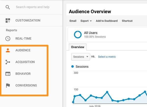
The Analytics User Interface and Key Terminology
In the left hand navigation, there are four main buttons you should know:
AUDIENCE reports help you understand your users.
ACQUISITION reports explore where your users come from.
BEHAVIOR reports summarize what your users do after they arrive.
CONVERSION reports show how well you’re doing against goals or revenue.
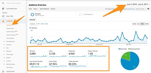
Audience Overview
One of the first reports you’ll want to view is Audience > Overview, but first, you’ll need to know some key data point terminology (and my thoughts on their usefulness). This is a real report for this site, over the last year, with the numbers (in italics) for reference.
Sessions (3880) – Total number of Sessions within the date range. A session is a period time a user is actively engaged with your website.
Users (3128) – Users that have had at least one session within the selected date range. Includes both new and returning users. The pie graph in blue and green designates returning visitors (19.8%) vs. new visitors (80.2%).
Just because Google puts Sessions and Users front and center doesn’t mean it’s the most important data point. These are good to track for basic growth of your site traffic and may be good for your ego. But remember, the purpose of your site is not to bring mass visitors to your site; it should be to bring targeted prospects to your site and convert them to sign up for your mailing list.
Pageviews (6965) – Pageviews is the total number of pages viewed. Repeated views of a single page are counted.
“Traffic is meaningless; action is everything.” ““Mark O’Brien, author of A Website That Works
Pages/Session (1.80)
The average number of pages viewed during a session on your site. Repeated views of a single page are counted. This is simply Pageviews (6965) divided by Sessions (3880). This important metric helps to measure how deep a visitor is going into your site. We can assume the higher this number, the deeper a visitor is engaging with your site. Anything above 2 pages per visit is considered good.
Average Session Duration (00:01:12)
The average time duration a visitor stays on your site from when they land to when they leave. Time spent indicates engagement so longer = better. Anything greater than 2 min. per session is decent.
Bounce Rate (67.96%)
Percentage of users that enter your site and leave (bounce) after visiting only one page. Remember that this is an average across all pages. So, it’s more useful to drill down into specific pages to see where visitors are bouncing. For example, a high bounce rate (anything higher than 40%) on a Home, About, Services or Projects page is problematic. But a high bounce rate on a Contact Page is fine because visitors may come directly to this page to get your phone number or address and then leave. As you add valuable content to your blog (and you should), your bounce rate will probably increase because users may search and find your article, read it, be satisfied, and then go on with their day.
Start With Only These Three Reports
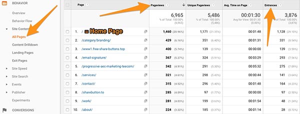
1. Behavior > Site Content > All Pages
This report shows which pages on your site are the most popular as measured by Pageviews. You can also view average time spent on specific pages here. While most visitors will enter your site through your home page, “Entrances” can help you determine what other pages visitors are entering on. Look at the top “Entrance” pages of your site and think about what would be the visitor’s impression if they entered your site through that page. Does your navigation allow the user to easily visit related, or other pages?
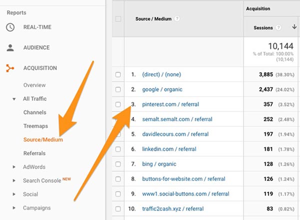
2. Acquisition > All Traffic > Source/Medium
Shows which sources on the internet are referring visitors to your site. Since Pinterest is my top referrer, I know that I should pay attention to promoting my site on Pinterest. Google/Organic means organic (non-paid) search using Google. (Direct) / (none) means that visitors are keying in my URL “lecoursdesign.com” directly (no referring sites and no search).
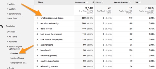
This report shows you what search phrases visitors use to find your site. Since the goal of Search Engine Optimization (SEO) is to attract visitors to your site who are unaware of you (they already know your brand name), pay attention to non-branded keywords. Non-branded keywords contain no reference to your brand name, but are hopefully geared towards your expertise. If your top keywords don’t match what your expertise, then re-work your Titles and Keywords in your SEO. Since “what is responsive design” is the top search phrase for my site, I should make sure I have a blog post related to this topic. I do, here. Note: You’ll access this report through Google Webmaster Tools , not Google Analytics.
Make it a Habit
Create a recurring event (monthly) in your Calendar to spend 20 minutes reviewing your analytics. You can export data easily if you like. Look for trends over a period of time to keep your finger on the pulse of your website. An example of this would be to measure which types of content your visitors are consuming the most (measured by Pageviews) on your blog. This gives you data for decision making on which subjects to write about in the future.
Whenever you make tweaks to your website, be sure to archive what you did, and when, so you can measure how these tweaks affect your website. It’s best to make tweaks one at a time so you can isolate the reason for changes in your website performance.
There were certain assumptions you made when building your site. Google Analytics allows you to prove or disprove these assumptions. It also allows you to respond to usability patterns that you didn’t anticipate. Think of your website using the Japanese concept of kaizen, or continual improvement. This will extend the life of your current site and make it an increasingly powerful marketing tool for your firm.
Unlike yogurt containers, AEC websites don’t have an expiration date. But they should. Every single new client, employee, or teaming partner will pass through your website. You can’t allow the first impression of your firm to be spoiled. So, it’s critical to keep your site fresh. Web years are like dog years (you have to multiply by seven) because web technology is constantly evolving.
How do you know when it’s time to redesign your site? Here are the top 5 symptoms LecoursDesign sees when A/E/C firms hire us to update their site. A properly designed site will eliminate these maladies to help your firm attract great clients and talent.
1) Your Site Lacks a Content Management System (CMS)
You may have a new project, person or press release that you want to add to your site. You know how easy it is to make these simple updates on your personal blog (or so you’ve heard). So, it’s frustrating that making simple content updates on your firm’s website requires you to hire your web designer to make these changes. Your web designer is busy so it takes a couple weeks and costs you more than it should. There has got to be a better way.
Solution: There is a better way. Develop your site to be built on a Content Management System (CMS). A CMS is an easy-to-use back end to your site that allows you to make content updates without having to know code. Some of the most popular CMS platforms are WordPress, Drupal and Joomla.
2) No Blog
Your site may have a News category because it sounded good at the time, but nobody in your firm is responsible for updating this section. As a result, the latest news item is dated 2009. This communicates that your firm hasn’t accomplished anything noteworthy since the previous decade. Or, maybe you have Thought Leaders in your firm who are speaking at conferences or writing articles or white papers but that content dies after being delivered. You never recoup a return on the investment of preparing the article or presentation.
Solution: Your thought leadership content should live indefinitely on your website in a blog. This will boost the likelihood that a prospective client will find your firm when Googling for topics covered in your blog posts. Experts call this Content Marketing, an effective way to move a prospective client from getting to know, to like, to trust your firm.
3) Small and Crowded Above The Fold
An early web myth was that all content on a web page needed to be visible within the browser window. This was the equivalent of the newsstand days when top stories had to be “above the fold” of a newspaper to be noticed. Websites aren’t newspapers, they should be interactive. Today, with finger swiping and mouse track-wheels, users expect content to be presented in a generously spaced, vertical orientation for a pleasant viewing experience. With great writing and compelling imagery, users will scroll to engage with your content.
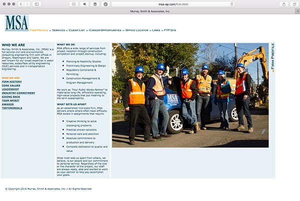
A site crammed in the upper left corner, or a site that features only small type and photography is a dated site. Websites used to be no more than 800 pixels wide to ensure fast loading for those on dial-up modems and with small screens. Your clients now use broadband and have bigger monitors and browser windows so it’s time to grow the size of your site.
Before (below: small and crowded into the upper left corner)
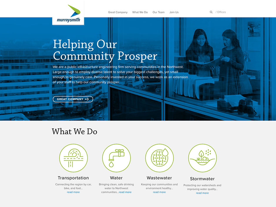
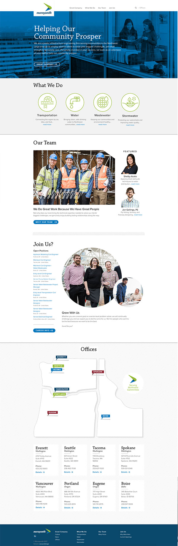
After (below: pleasant scrolling experience) murraysmith.us designed by LecoursDesign.
Solution: Redesign your site to be from 960 pixels wide to full-width. It should re-center, or scale, as you increase the size of your browser window. Better yet, it should utilize responsive technology to respond to the screen size.
4) A Dated Vision
If your site communicates where your firm was three years ago, not where it’s going to be in three years, it’s time to update your site. There is a good chance that the strategic direction of your firm has evolved since you created the last version of your site. You may be pursuing new markets, have new leaders or projects, or offer new services. An effective site is a beacon that transmits your strategic plan three years into the future.
Solution: Great clients and talent are attracted to firms that have a clear vision of where they are headed. Update the copywriting and design of your site to look forward, not backward.
5) Mobile and Tablet Unfriendly
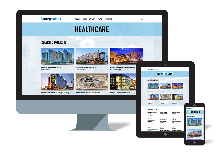
Our experience is that 20″“30% of your web traffic will come from mobile and tablet users. Theses are nice people and deserve a great user experience. So, don’t force them to pinch in and out to view your site on their smartphone. Or, if your current site is uses Flash, it isn’t even viewable on iOS devices (iPhone and iPads) unless the designer created an alternate iOS friendly site. Another issue with your current site may be that the navigation or design elements depend on rollovers or clicks of a mouse. This creates a problem with phones and tablets, where the primary user interface is touch, not a mouse.
Solution: Your new site should feature responsive design. In the olden days (five years ago), firms would create three separate versions of their site: desktop, tablet, and mobile. This was a pain to manage three separate URLs while making site updates in triplicate. Today, you can have one URL and one site that responds to provide a great experience regardless of viewport size. As seen in the Bergelectric site above, the type and imagery will fluidly respond for mobile, tablet and desktop viewing.
Websites should be considered a living entity. As such, they have a lifecycle. If any of the above symptoms are present in your site, then your site is in decline. It’s time to speak with your friendly web consultant to audit your site for a recommendation on how to proceed.