WEBSITE /
Ascent’s Website, Ascended.
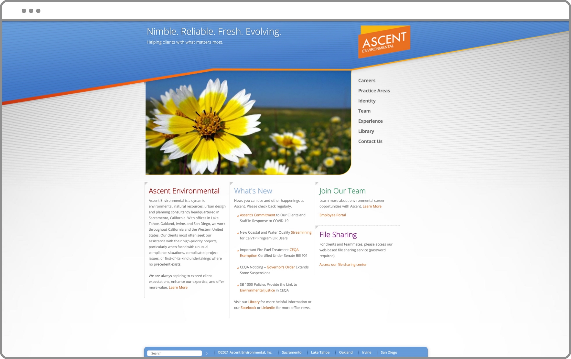
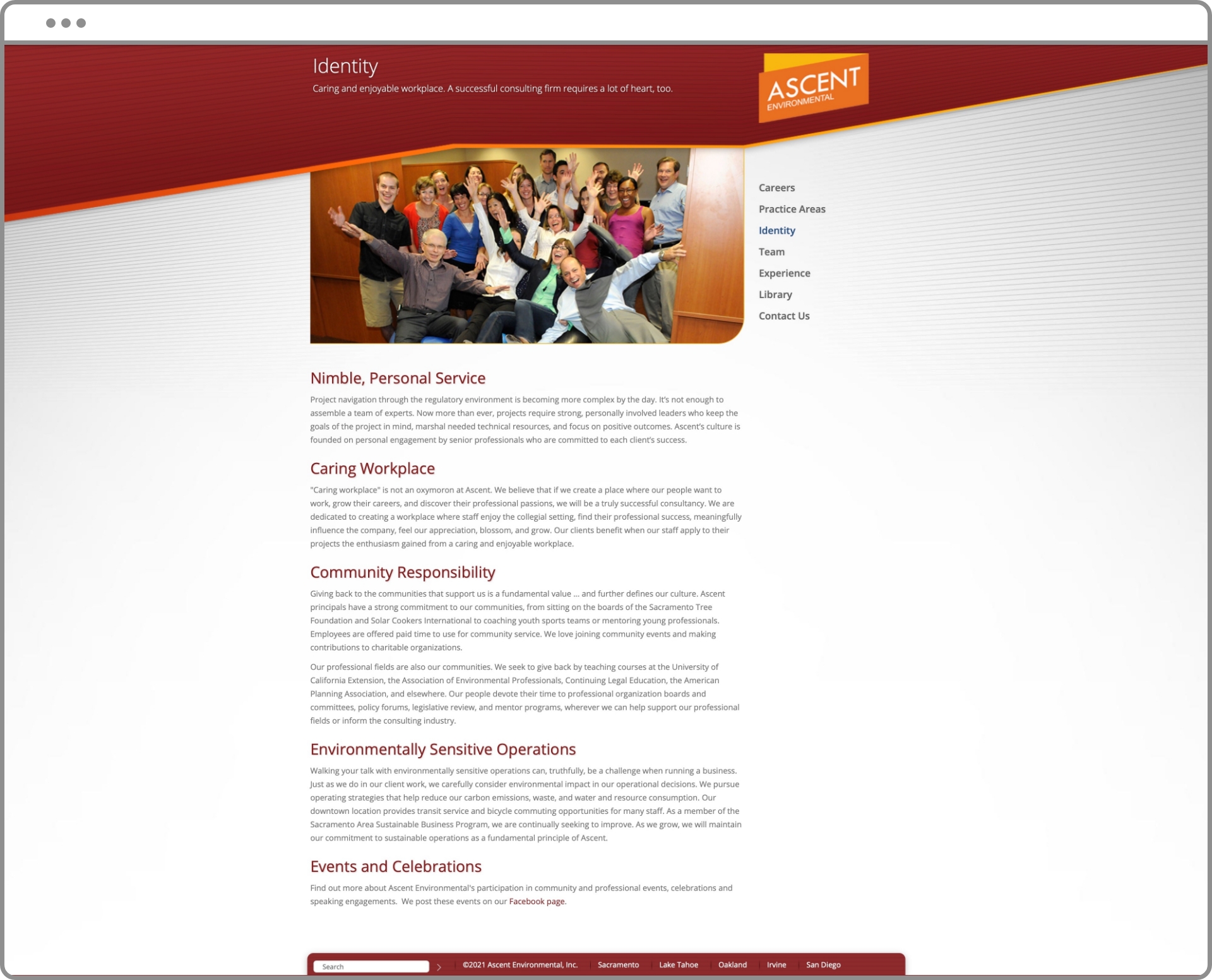
Ascent’s old site did not reflect where the firm is headed. Maintaining the site had suffered because the old technology was cumbersome. Along with a brand refresh, the new website aligns with Ascent’s brand positioning.
/ IDEA
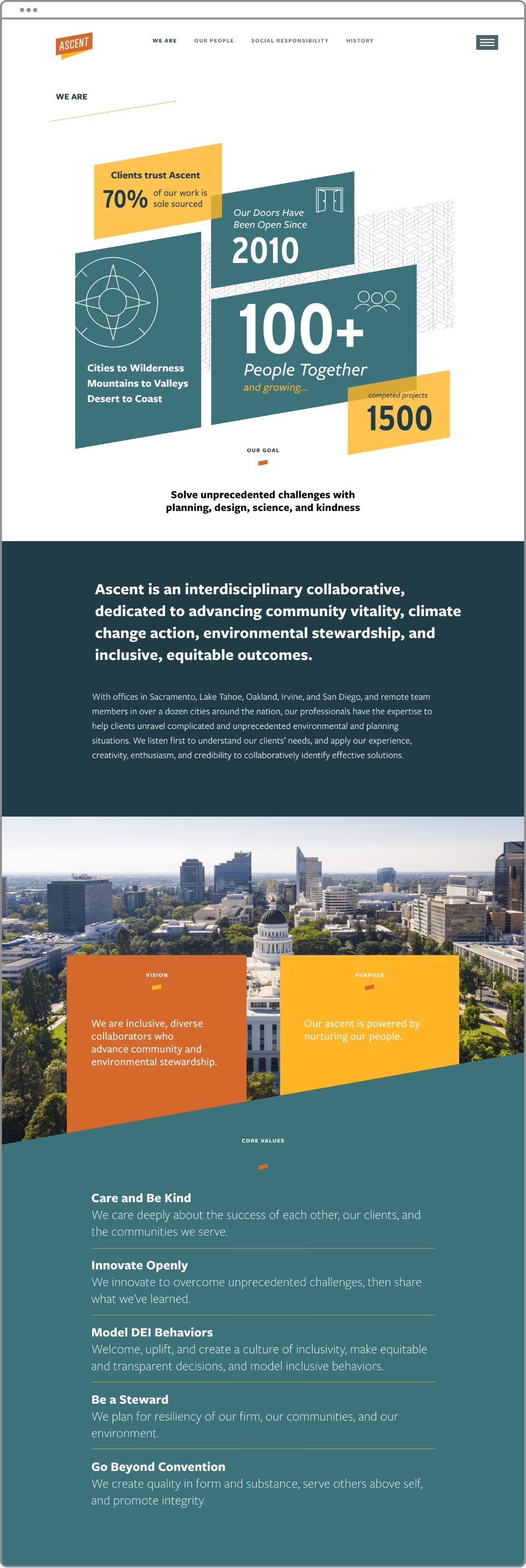
We designed a visual and strategic treat, featuring Ascent’s refreshed logo and brand colors that leave a lasting impression on visitors. Playful animations, shapes, and custom icons were created for a modern and dynamic feel. According to our client, the new site is much more fun to update with fresh content.
Before

After
1 year before (old site) VS. 1 year after (new site) launch:
Increase in total page views
1460%
Increase in pages per user
225%
increase in average session duration
12x
Reduction in bounce rate
29%
/ USER TESTIMONIAL
Ascent’s website stands out because it introduces their team as whole people, not just professionals. Finding Christy’s story about Ohio thunderstorms created an immediate personal connection that enriched our first interaction. These authentic glimpses into the people behind the work signal the kind of partners they’ll be – thoughtful, genuine, and committed to building relationships that matter. This approach perfectly reflects the values-driven collaboration that has made our strategic planning work together so effective.
Brad Britton, Britton Coaching & Consulting
Before

After
David and his team guided us through defining our vision, purpose, core values, brand personality, and positioning in the marketplace. They even crafted our new logo and brand colors. Armed with this strong identity, we collaborated seamlessly on our website—from strategy and content to design, coding, and training for our custom CMS. The result? A website that authentically reflects who we are.
Christy Ryan
Marketing Director, Ascent

