Have you noticed that several companies have recently updated their logos? Starbucks, GAP, Pepsi, and Comedy Central all come to mind. Should your firm update its logo? Here are four good reasons to freshen up.
1. Your Firm Has Come of Age
Congratulations! While many new businesses don’t last more than two years, yours is healthy, growing and moving from childhood into adolescence. In start-up mode, you probably didn’t invest the time, energy, and dollars to create a logo and brand identity system that represents the level of professionalism you now want to convey. As the saying goes, “what got you here, won’t get you there.” It’s time to shed the toddler haircut and baby clothes for a more grown-up look.
Perhaps your firm has reached a significant milestone. A fresh new logo can be a great way to symbolize this accomplishment. As Schmidt Design Group approached their 20 year anniversary, we worked with them to design a new logo and book that were unveiled at their 20th Anniversary Party.
2. Your Logo is Rotten (beyond its expiration date)
Everything has a life cycle. Businesses and logos go through distinct phases of conception, growth, maturity and decline. Like the myth of Narcissus, we can get overly attached to our own (brand) image. This can blind us into denial about the fact that our logo has gone into decline. Just as fashion and hairstyles become dated, your logo’s color, typography (font), and symbol may be communicating that your firm is past its prime. Even classics, like the Shell logo below, get a facelift every ten or so years.
3. A New Strategic Plan
A healthy firm grows and evolves to respond to new demands and opportunities in the marketplace. This could mean that your firm has added new services to your quiver. Or, you may be serving new markets. If the evolution of your firm is significant, you’ll want to shift the perception of prospective clients to catch up with the new you. A new logo can symbolize this shift. The first time we worked with Island Architects in 1999, it was to update their start-up logo into a more professional mark (reason #1 above). Then, in 2008, the firm made a strategic decision to communicate that they design modern homes in addition to their heritage of classical homes. A logo should be a beacon communicating where you are headed, not where you’ve been.
4. Merger, Acquisition or Ownership Change
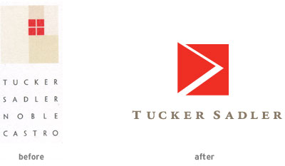
A change in firm ownership can often inspire a new firm name and thus a new logo. Even if the firm name persists for continuity, new leadership may want a new visual symbol to represent their new era. When we began work with Tucker Sadler Noble Castro Architects, they had new owners, new Principals and a new office. Instead of continuing to add the names of Principals to the firm name, they shortened it to Tucker Sadler to reflect their founders, their web site address, and how they were referred to colloquially. We designed a new logo and brand identity system to propel the firm into a new chapter of their evolution.
Your logo is not your brand, but it is the most visible touchpoint of your brand. So, how do you know when it’s time to update your logo? The previous four scenarios are all good reasons. Or, consider hiring LecoursDesign to perform a Brand Audit. This wise investment will help you determine the strength of your logo and all your brand touchpoints.


