One way to measure the success of your website we is to monitor visitor’s length of stay. The longer a visitor “sticks” on your site, the greater the chance they are making an emotional connection with your brand. Using principles from the outstanding book, Made to Stick – Why Some Ideas Survive and Others Die by Dan and Chip Heath, here are three key qualities of a sticky website.
1. Simplicity
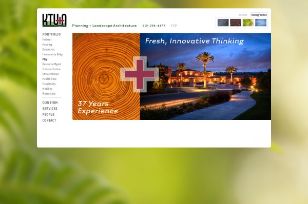
Before redesigning your website, review your strategic and marketing plans, analyzing your current site, and prioritizing what you want site visitors to do on your new site. This gives you a creative brief, or target, to compare design solutions against. Next, create a Site Map which is a clear outline of proposed content. Again, measure against brief. Now a clear navigation system can be designed which allows the visitor to easily find what they need. In a site we recently designed for KTU+A, we determined that viewing projects by market sector was a priority. So we designed the main navigation system to always show all market sectors. With the custom Content Mangagement Sytem we created for KTU+A, they are able to maintain their own site full of current content. Our goal for this site was to keep the graphic design simple so it serves as a frame, supporting their projects as the art.
2. Unexpected Personalization
To capture and hold a visitor’s attention, your site needs to surprise and delight while delivering meaningful content. With the KTU+A site, a goal was to weave their positioning of “balancing human activites with elements of nature” into the site in an enexpected way. So the visitor gets an option to choose their own background image and sound (elements of nature). This infuses the inorganic activity of using a computer with unexpected elements of nature. We created the Project List to allow visitors to sort projects in a way most meaningful to them. Visitors can sort by title, location, market sector or service with the ability to get more information on all projects and detailed information and imagery on featured projects.
3. Stories
Your brand is a story made true through personal experience. It’s critical that your site tell the story of your firm, your projects and your people in a compelling way. Invest in professional project photography and show it off at least 600 pixels wide. Here’s a great example of how impactful photography tells stories. Video is another great tool. Don’t expect your video to go “viral” on YouTube, but do expect to connect with visitors on an emotional level. Here’s a great example from NBBJ. When introducing Principals, use great photography or video, and wording that humanizes the person beyond impersonal resume bullet points. People hire people they know, so let site visitors get to know your key staff.
Your website is the new “front door” to your firm. It’s the first place prospective clients go to learn about you, or confirm what they’ve heard. Use these 3 tips to make a positive first impression “stick” in your client’s mind.
What other web site features, would you recommend to make a site sticky?
Does your website provide compelling content to make visitors stick around?
