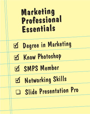
As marketers, we are required to be persuasive. Externally, our primary job is to persuade prospective clients to hire our firm. Internally, we have to persuade our Principals, or CFO, to endorse and fund our marketing plans. Presenting with slides, using PowerPoint or Keynote, can be an incredibly powerful way to make an emotional connection with your audience. Therefore, this is a skill that all marketing professionals should possess. But very few of us have received any training in how to develop, design and deliver a persuasive slide presentation. For the next several blog posts, I will share my expertise as a professional speaker and graphic designer to provide you with simple, timeless tips to help you deliver slide presentations like a pro.
Why Should You Develop this Skill?
To be perceived as a leader in your firm, you must be able to present your ideas clearly and persuasively. There is a direct link between leadership and presentation skills. In fact, Toastmasters International, the worldwide organization previously known for developing public speaking skills, has just rebranded with the tagline “Where Leaders Are Made.” Having the ability to present well will not only gain you the respect of your firm’s Principals, but will also serve you well in persuading your entire firm to embrace your marketing plan. Outside your firm, this skill will enable you to present at industry conferences and raise your value to firms looking to recruit you.
The Problem
Most PowerPoint presentations are dreadful. You’ve probably heard the term “Death by PowerPoint” or perhaps you’ve read “Really Bad PowerPoint” by Seth Godin. Powerpoint is almost universally hated because most presenters develop, design and deliver slides that do not engage their audience. I’m sure you’ve suffered through a presenter turning his back on the audience to read 15 bullet points. Don’t blame the presenter, blame his education. With plenty of classes in Literature, English, and Writing, you were well educated in verbal communication. Unless you attended art or design school, you didn’t receive an education in visual communication. Yet PowerPoint forces people communicate visually. So, what do presenters do? They revert to what they know (verbal communication) by placing a bunch of bullet points on a slide. This is the quickest way to lose the attention of your audience.
A Great Presentation is a 3 Legged Stool
The 3 legs to your presentation are Development, Design and Delivery. Remove one of these legs and your presentation will end up on its rear! You’ll want to begin with the development of your content. Consider why you are making this presentation, who is the audience, and what do you want them to do. Start to outline your main points and gather evidence, stories and imagery to support those points. Next, you’ll want to design simple, clear slides that support you and your message. I recommend including 1 message per slide. Finally, you’ll need to practice your delivery so that you are confident in front of your audience. Remember that you are the star, not the slides. If the slides can live on their own, then cancel the presentation and send the audience a PDF.
Read Next
Slide Presentations Like a Pro: Roles
What Do You Think?
Do you have a favorite TED Talk that effectively uses slides?
Do you have a PowerPoint horror story?
What tips can you share for creating slide presentations?
If you want to see the principles mentioned in this post in action, purchase a DVD or Online Download of Change the World Slide by Slide: How To Design & Deliver Professional Slide Presentations.
Similar Posts
How to Give The King’s Speech: Lessons Learned From the Oscar Winning Film
Using Public Speaking To Attract Clients
