
Most A/E/C firms tout proficiency with the latest technology and excellence in user experience (a.k.a. client service) written on their websites. But if those websites are only designed for viewing on a desktop computer, then they are contradicting any claims of technology or user experience prowess. The medium must match the message.
Have you had the painful experience of navigating a website on your smart phone by pinching in and out to touch one button without accidentally hitting the adjacent button? It reminds me of the childhood board game Operation where you test your dexterity by tweezing out body parts without getting zapped. Responsive Design prevents your website users/visitors from getting “zapped.”
Your next A/E/C firm website must incorporate Responsive Design because it provides an optimal user experience on all screen sizes. In this post, I’ll share the following:
- What is Responsive Design?
- How Does Responsive Design Work?
- Why Do You Need a Responsive Design Site?
- Who is Using Responsive Design?
What is Responsive Design?
Responsive Design is a new design and coding approach to provide an optimal user experience based on the user’s screen size and orientation. The content of the site “responds” to fit a smart phone, tablet, laptop or desktop computer.

“Instead of building alternate versions of your website for mobile devices or platforms, responsive design is a method that allows you to build one site that adapts to the context in which it is viewed” explains Chris Butler, author of The Strategic Web Designer.
If you are into etymology, the term “responsive design” originated from a 2010 blog post from Ethan Marcotte.
How Does Responsive Design Work?
You don’t want to hear technical nerdspeak about code, so I’ll focus on what the user experiences when viewing a responsive design site. Responsive design is based on a fluid grid that adjusts the layout of the site based on the size of the visitor’s screen. Here are 3 screen sizes and what happens to the content.

Why Do You Need a Responsive Design Site?
1. Mobile
By summer 2013, there will 7.1 billion mobile subscriptions. This equals the number of humans on the planet. Since we look at our mobile phones, on average, 150x per day, there’s a good chance that your website will be viewed on a mobile phone. Responsive design helps to ensure the user experience on your website is favorable regardless of screen size. At best, the technology is transparent and the user simply finds what she needs. At worst, the user notices the responsive design and makes a mental note of your firm’s technical savvy.
If your website is not optimized for mobile, users may hate your website . A 2012 survey of mobile users by Sterling Research and SmithGeiger show that nearly half of all mobile users say they feel “frustrated and annoyed” when visiting poorly mobile optimized sites. And 36% say they feel like “they’ve wasted their time” when they visit those sites. Responsive design can fix this.
2. Content Marketing
If your firm engages a content marketing strategy, and it should, responsive design supports users engaging with your content regardless of their device. User’s often begin consuming content on one device, only to finish on another. I often browse my twitter stream in Hootsuite on my phone, and send longer blog post links via Evernote to read later on my iPad. I may get an email on my desktop computer about a firm I’d like to research, then send it to Evernote to read later on my iPhone while waiting at the airport. Your website, and it’s content need to live and work like you do (everywhere).
3. Single Site, Single Web Address
The old model was to create a separate website for each device: desktop, tablet and phone. This tripled the amount of design and coding required. It often resulted in dumb-downed versions of your site for phones. It also potentially created 3 different URLs: desktop.you.com, tablet.you.com, and phone.you.com. Which URL do you use, or do others use, when virally sharing your brilliant content? Responsive design let’s you update and share one URL: you.com.
Successful Examples of Responsive Design
Time magazine recently upgraded Time.com to a responsive site. Their pages viewed per visit, mobile, tablet and desktop usage, are all up considerably:
Mobile is up 23%
Home Page uniques are up 15% and time spent is up 7.5%
Mobile bounce rate decreased by 26%
time.com
davidlecours.com
lecoursdesign.com (this site)
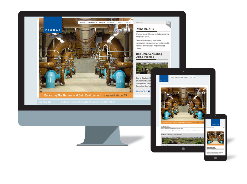
psomas.com
moonmayoras.com
Conclusion
Is Responsive Design simply a website trend that will become obsolete 5 years from now? I doubt it. But the web is always evolving. I can guarantee you there will be something new down the road. If you want to back up your project delivery claims of using the latest technology, plan to update your website every 3″“5 years. If you are planning a a new website now, call David Lecours 760-632-7619. We’re very responsive.