Unlike yogurt containers, AEC websites don’t have an expiration date. But they should. Every single new client, employee, or teaming partner will pass through your website. You can’t allow the first impression of your firm to be spoiled. So, it’s critical to keep your site fresh. Web years are like dog years (you have to multiply by seven) because web technology is constantly evolving.
How do you know when it’s time to redesign your site? Here are the top 5 symptoms LecoursDesign sees when A/E/C firms hire us to update their site. A properly designed site will eliminate these maladies to help your firm attract great clients and talent.
1) Your Site Lacks a Content Management System (CMS)
You may have a new project, person or press release that you want to add to your site. You know how easy it is to make these simple updates on your personal blog (or so you’ve heard). So, it’s frustrating that making simple content updates on your firm’s website requires you to hire your web designer to make these changes. Your web designer is busy so it takes a couple weeks and costs you more than it should. There has got to be a better way.
Solution: There is a better way. Develop your site to be built on a Content Management System (CMS). A CMS is an easy-to-use back end to your site that allows you to make content updates without having to know code. Some of the most popular CMS platforms are WordPress, Drupal and Joomla.
2) No Blog
Your site may have a News category because it sounded good at the time, but nobody in your firm is responsible for updating this section. As a result, the latest news item is dated 2009. This communicates that your firm hasn’t accomplished anything noteworthy since the previous decade. Or, maybe you have Thought Leaders in your firm who are speaking at conferences or writing articles or white papers but that content dies after being delivered. You never recoup a return on the investment of preparing the article or presentation.
Solution: Your thought leadership content should live indefinitely on your website in a blog. This will boost the likelihood that a prospective client will find your firm when Googling for topics covered in your blog posts. Experts call this Content Marketing, an effective way to move a prospective client from getting to know, to like, to trust your firm.
3) Small and Crowded Above The Fold
An early web myth was that all content on a web page needed to be visible within the browser window. This was the equivalent of the newsstand days when top stories had to be “above the fold” of a newspaper to be noticed. Websites aren’t newspapers, they should be interactive. Today, with finger swiping and mouse track-wheels, users expect content to be presented in a generously spaced, vertical orientation for a pleasant viewing experience. With great writing and compelling imagery, users will scroll to engage with your content.
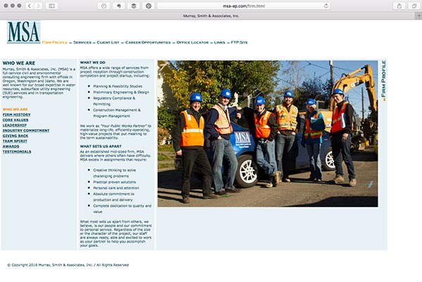
A site crammed in the upper left corner, or a site that features only small type and photography is a dated site. Websites used to be no more than 800 pixels wide to ensure fast loading for those on dial-up modems and with small screens. Your clients now use broadband and have bigger monitors and browser windows so it’s time to grow the size of your site.
Before (below: small and crowded into the upper left corner)

After (below: pleasant scrolling experience) murraysmith.us designed by LecoursDesign.

Solution: Redesign your site to be from 960 pixels wide to full-width. It should re-center, or scale, as you increase the size of your browser window. Better yet, it should utilize responsive technology to respond to the screen size.
4) A Dated Vision
If your site communicates where your firm was three years ago, not where it’s going to be in three years, it’s time to update your site. There is a good chance that the strategic direction of your firm has evolved since you created the last version of your site. You may be pursuing new markets, have new leaders or projects, or offer new services. An effective site is a beacon that transmits your strategic plan three years into the future.
Solution: Great clients and talent are attracted to firms that have a clear vision of where they are headed. Update the copywriting and design of your site to look forward, not backward.
5) Mobile and Tablet Unfriendly
Our experience is that 20″“30% of your web traffic will come from mobile and tablet users. Theses are nice people and deserve a great user experience. So, don’t force them to pinch in and out to view your site on their smartphone. Or, if your current site is uses Flash, it isn’t even viewable on iOS devices (iPhone and iPads) unless the designer created an alternate iOS friendly site. Another issue with your current site may be that the navigation or design elements depend on rollovers or clicks of a mouse. This creates a problem with phones and tablets, where the primary user interface is touch, not a mouse.

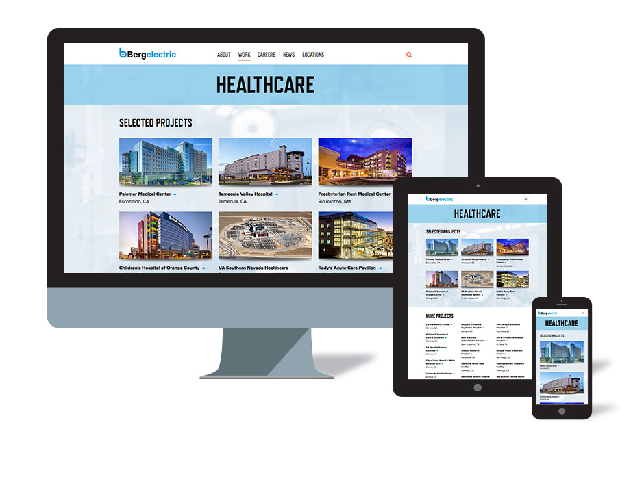
Solution: Your new site should feature responsive design. In the olden days (five years ago), firms would create three separate versions of their site: desktop, tablet, and mobile. This was a pain to manage three separate URLs while making site updates in triplicate. Today, you can have one URL and one site that responds to provide a great experience regardless of viewport size. As seen in the Bergelectric site above, the type and imagery will fluidly respond for mobile, tablet and desktop viewing.
Websites should be considered a living entity. As such, they have a lifecycle. If any of the above symptoms are present in your site, then your site is in decline. It’s time to speak with your friendly web consultant to audit your site for a recommendation on how to proceed.
