by davidlecours | Jun 5, 2021
BRAND FOUNDATION & WEBSITE
/ SERVICES
Brand Foundation
Collateral
Voice & Messaging
Experience Design
Web Development
VISIT WEBSITE
/ OBJECTIVE
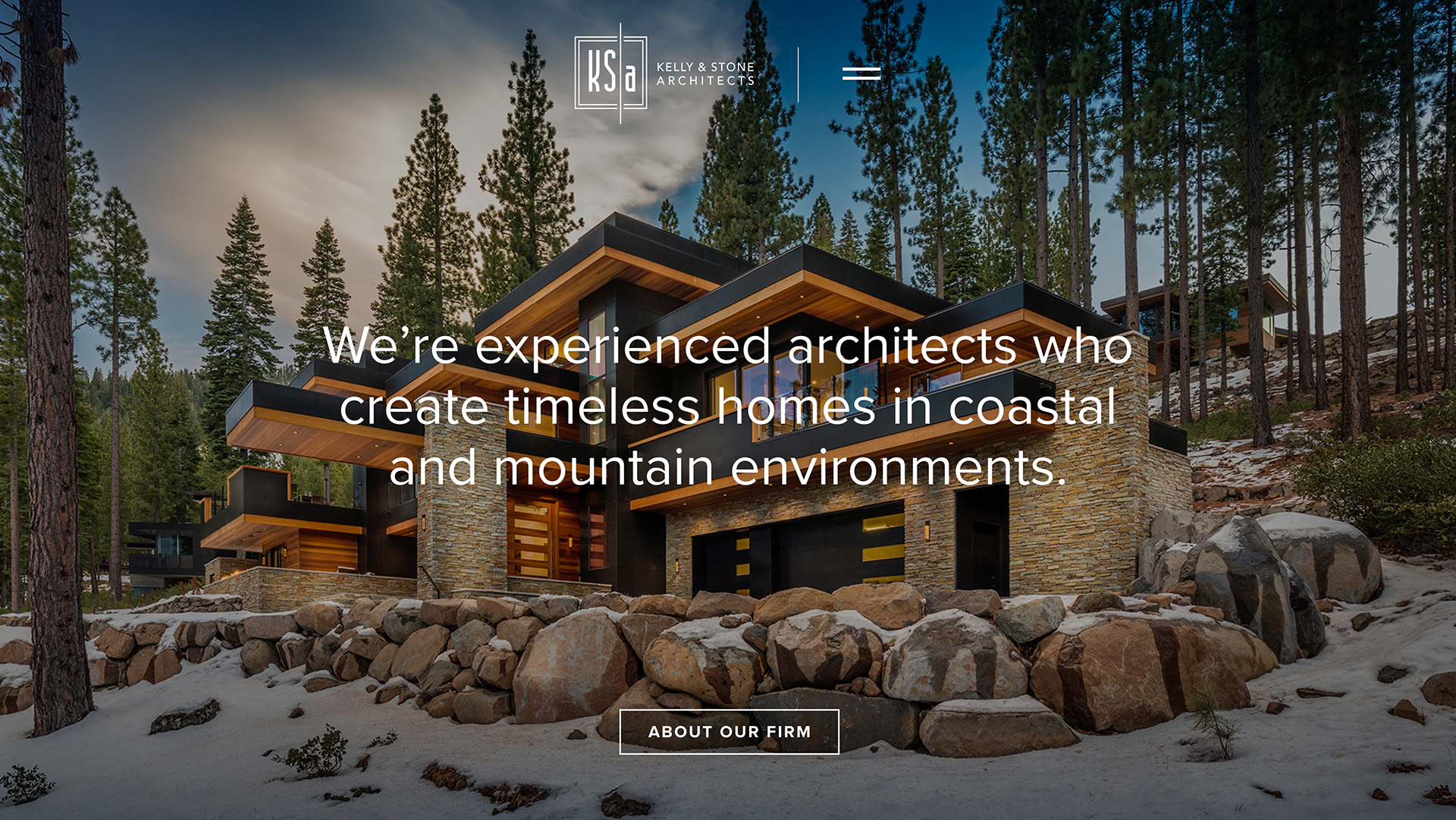
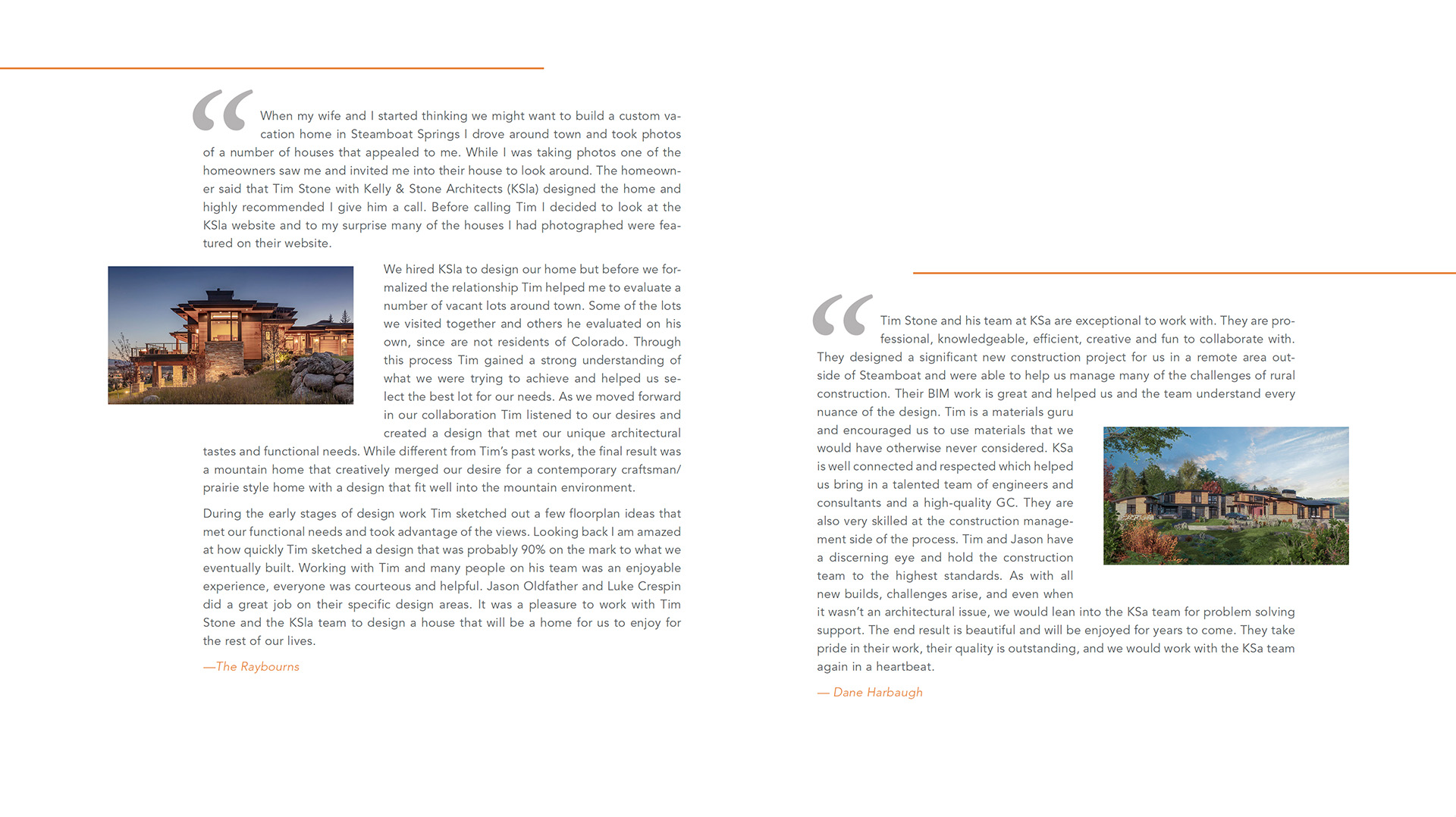
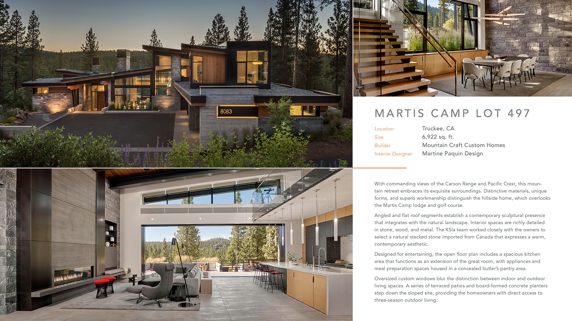
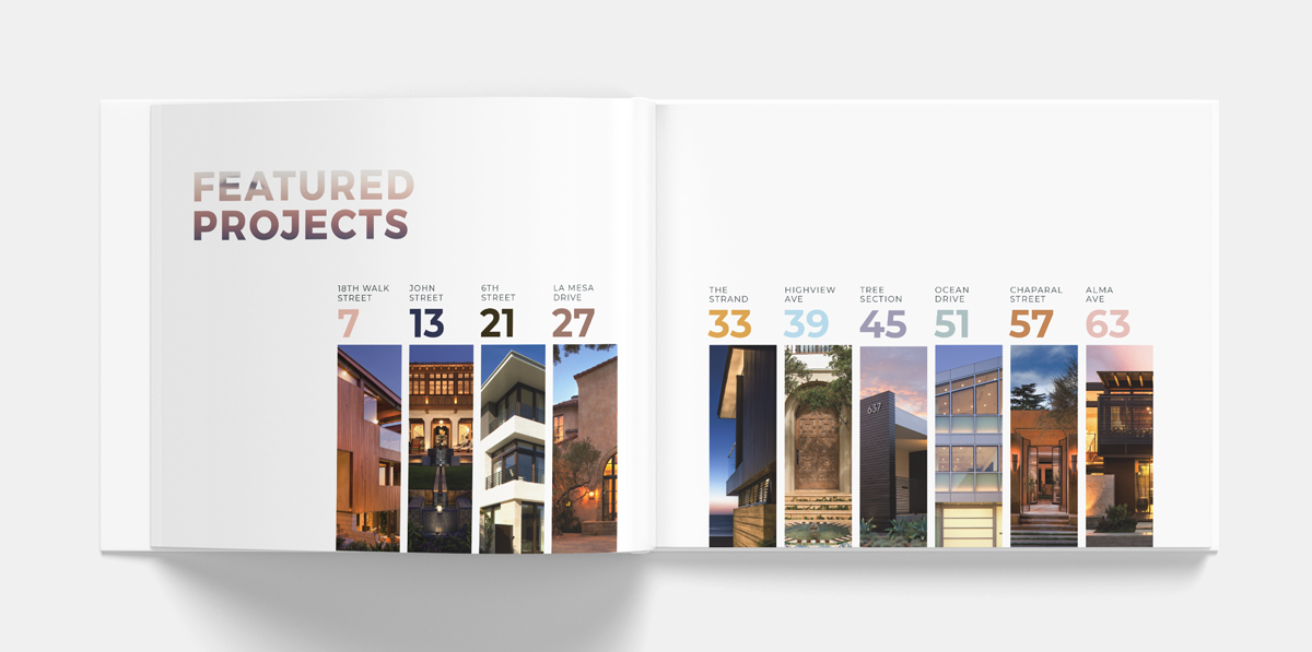
After completing brand strategy, messaging, and project descriptions, we designed SOQ and proposal templates. These looked so good, KSA hired us to redo their website.
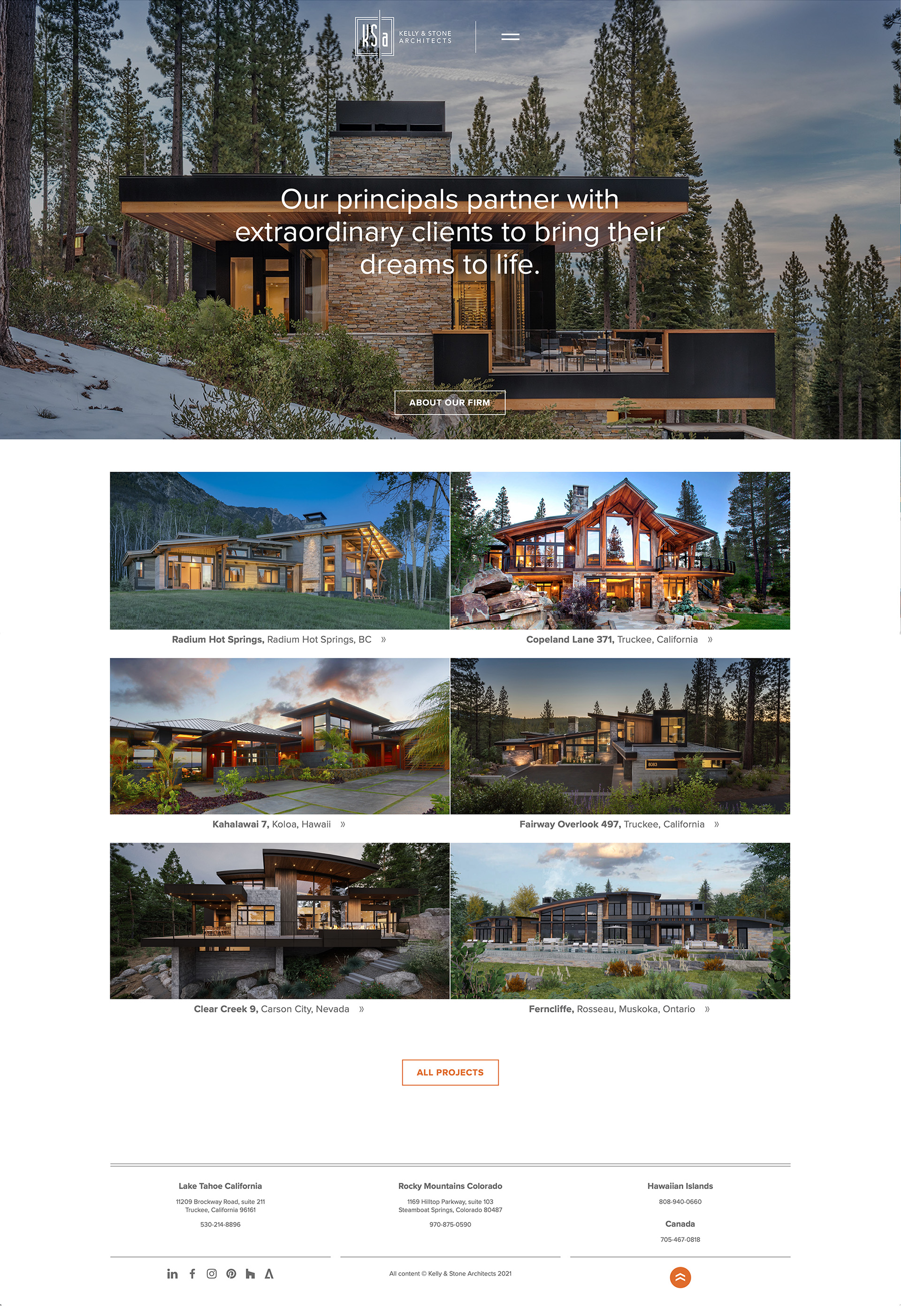
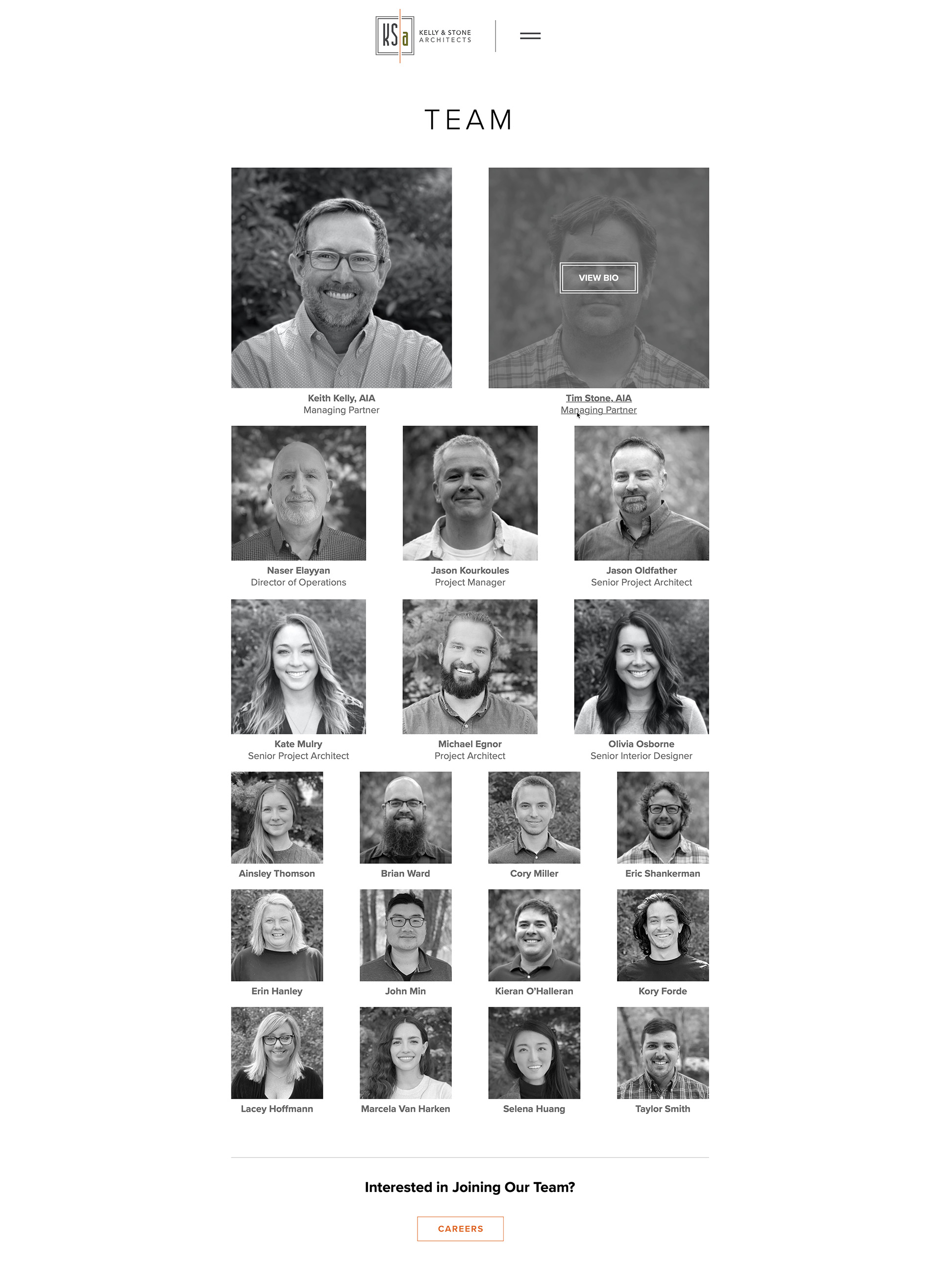
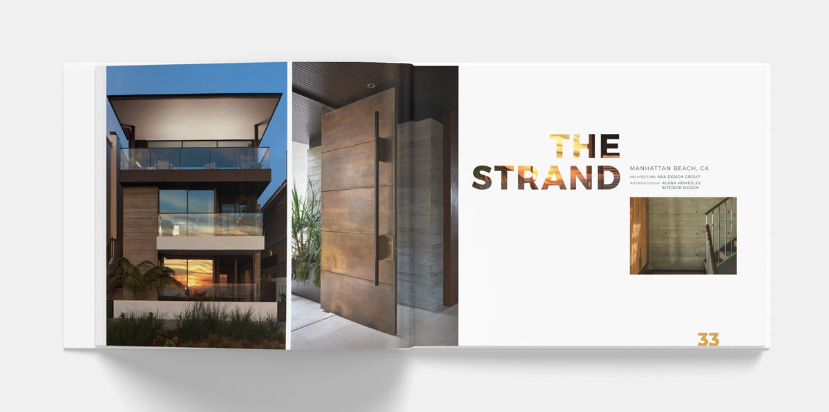
The new website creates a better mobile experience, features the team, and shows off a curated global portfolio of homes.
/ IDEA
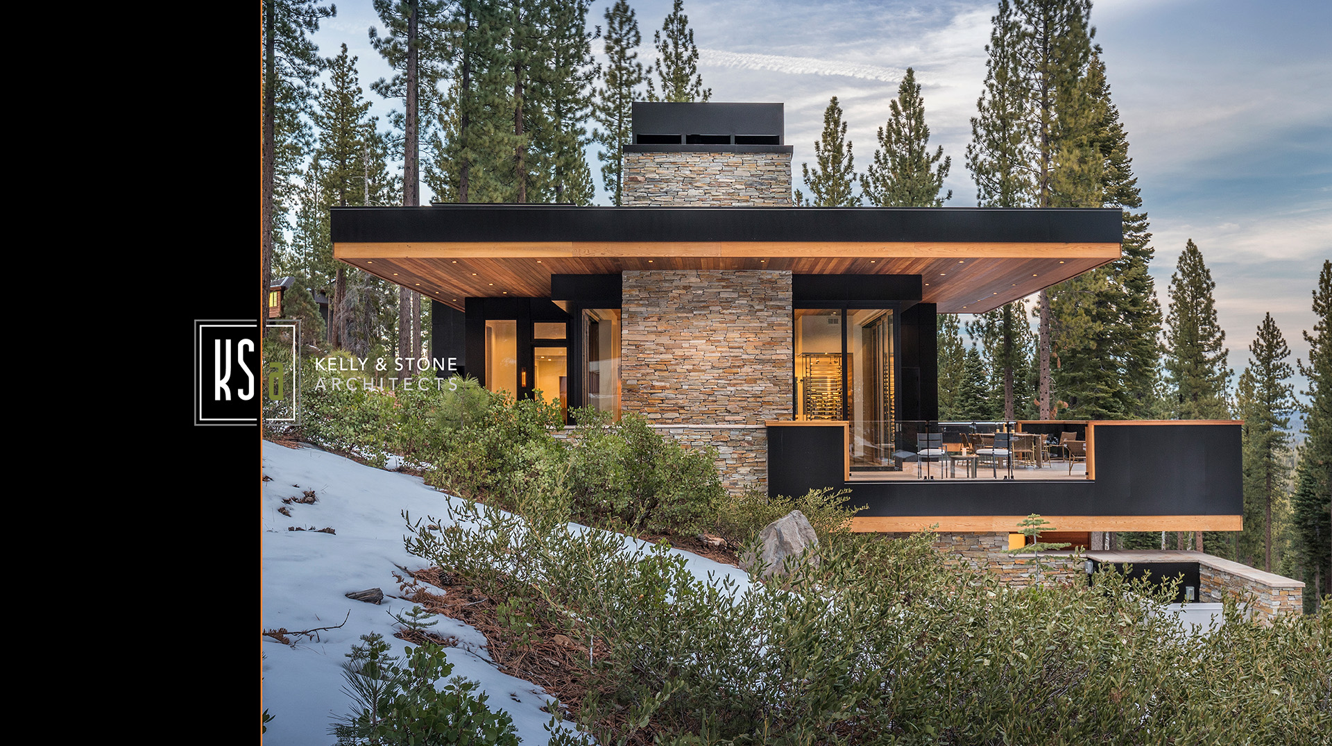
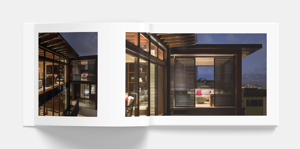
KSA already had a strong logo and color palette. With such powerful project photography, we kept the design of the website “quiet” so that their work, not ours, is what gets noticed.
Brand foundation & messaging by LecoursDesign.
We love designing timeless homes and building lasting relationships.
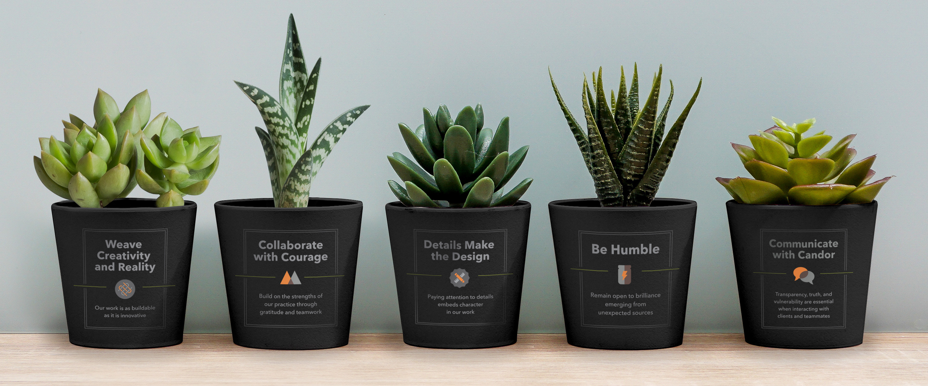
/ CORE VALUES
Weave Creativity and Reality
Our work is as buildable as it is innovative.
Collaborate with Courage
Build on the strengths of our practice through gratitude and teamwork.
Details Make the Design
Paying attention to details embeds character in our work.
Be Humble
Remain open to brilliance emerging from unexpected sources.
Communicate with Candor
Transparency, truth, and vulnerability are essential when interacting with clients
and teammates.
/ BRAND PERSONALITY
Before designing the website, we created five brand personality attributes to guide all future marketing communication materials:
Distinctive
Imaginative
Timeless
Approachable
Passionate

by davidlecours | Apr 13, 2020
Shawn Nelson Builders Print Marketing
C L I E N T
Shawn Nelson Builders
S E R V I C E S
Discovery, Insights & Recommendations,
Brand Strategy, Marketing Planning, Print
T H E B R I E F
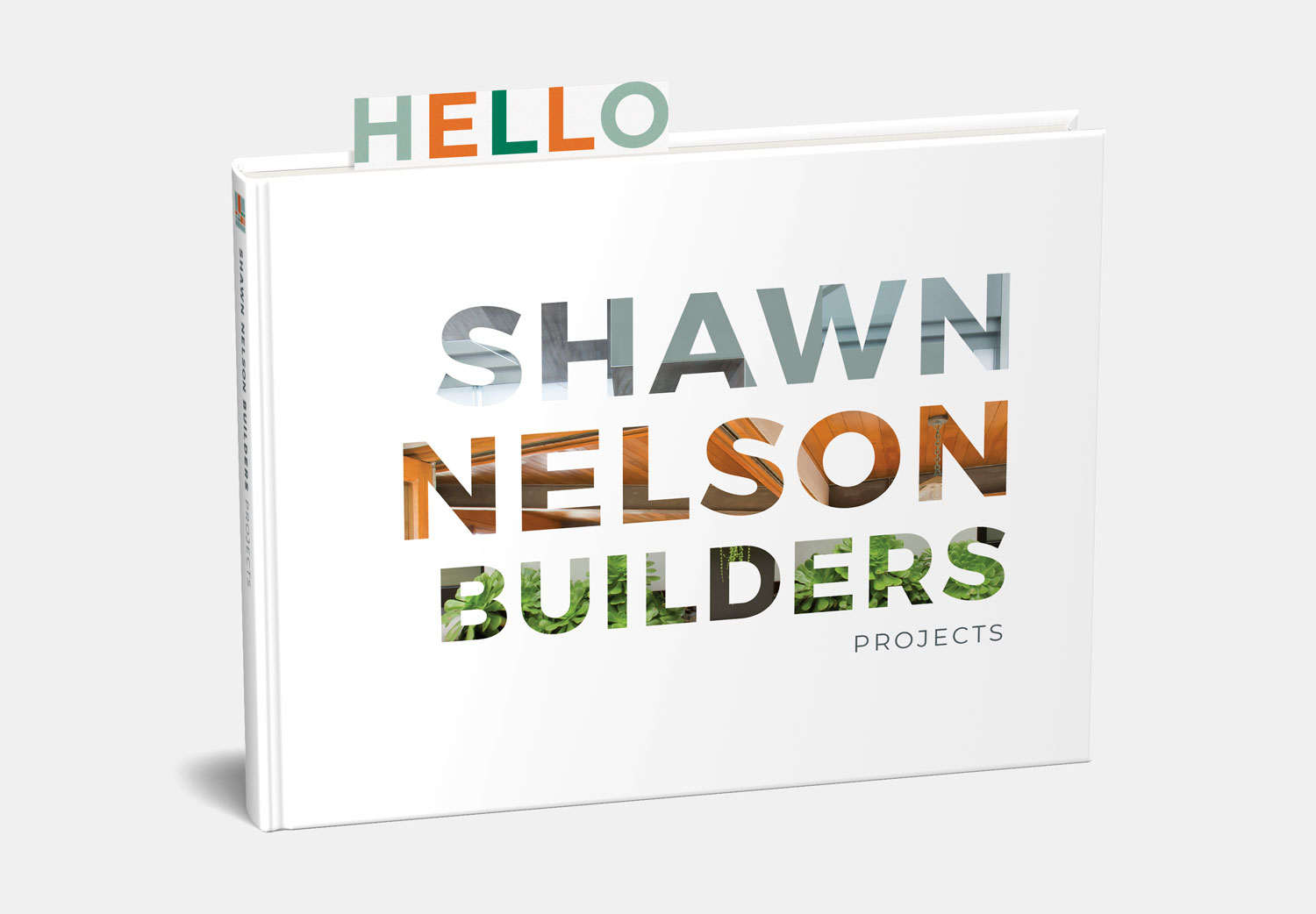
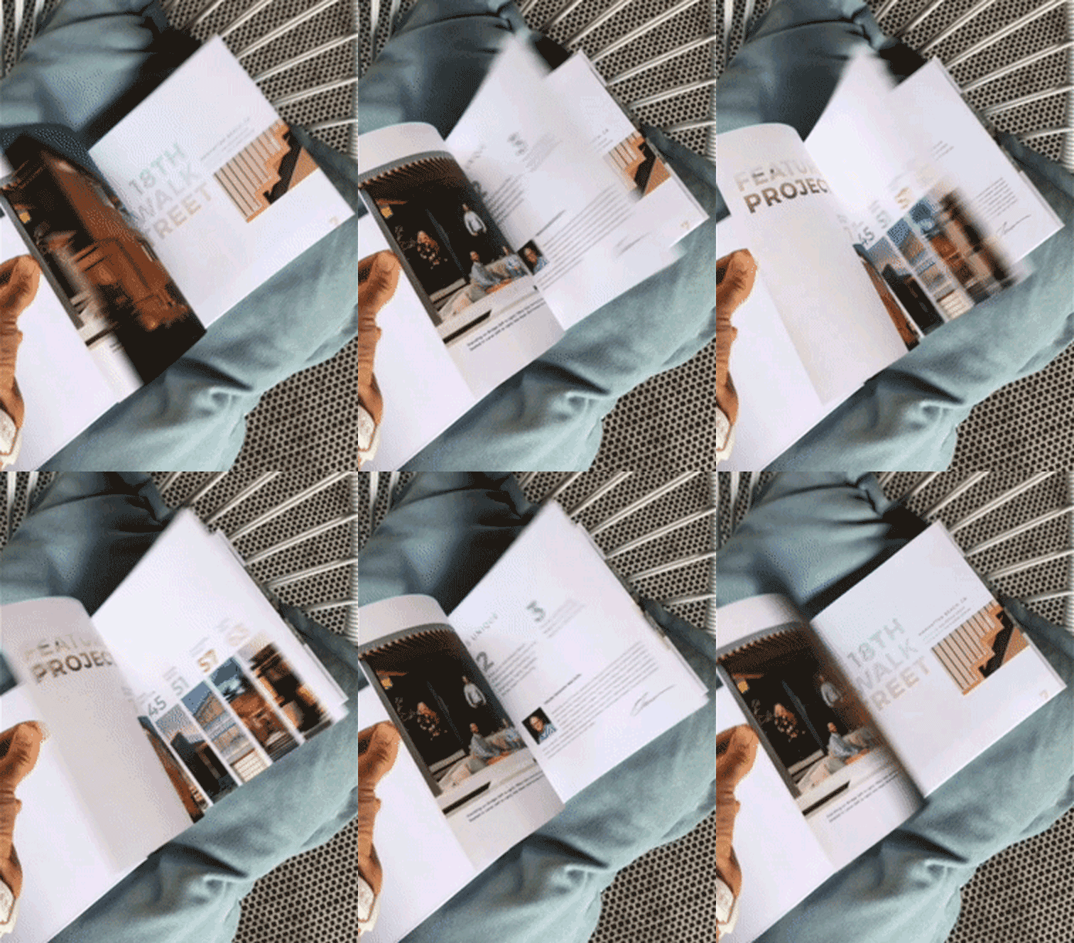
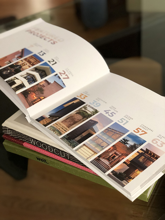
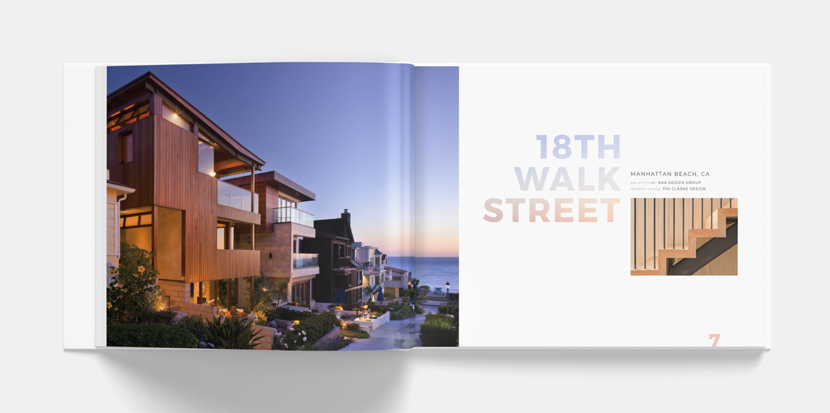
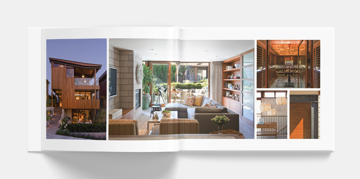
Design print marketing materials, including an elegant portfolio book. The book is given to prospective clients and influential architects and designers.
C R E A T I V E C O N C E P T S
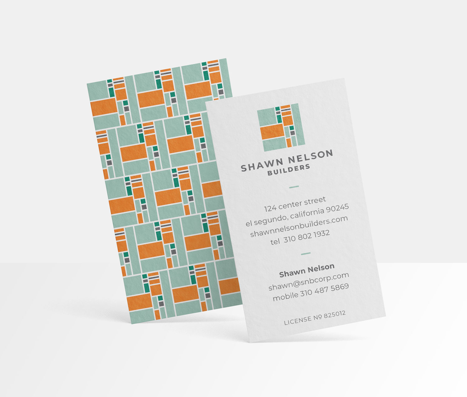
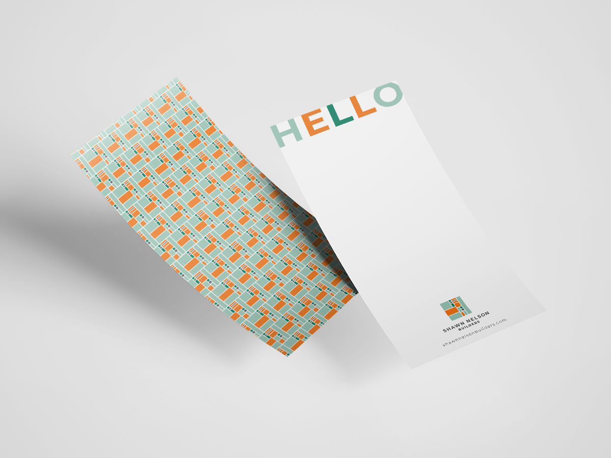
Utilize the logo as a distinctive pattern. Create a buckslip for handwritten notes that extends above the portfolio book to reveal a HELLO.
Business Card, Buckslip and Postcard
S T R A T E G Y, T H E N B R A N D I N G
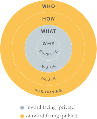
A strong brand is rooted in brand strategy, which means having well-articulated Purpose, Vision, Core Values and Positioning statements.
We helped Shawn Nelson Builders identify, then articulate three unique differentiators:
Disciplined Approach – Our disciplined approach and project controls provide more certainty and comfort for our client.
Focus on Manhattan Beach – we know how to overcome the challenges of building in a prestigious, highly-regulated, dense, beach community.
Social Proof – Premier architects and designers trust us which means clients can trust us. We are not for everybody.
P O S I T I O N I N G S T A T E M E N T
From the three unique differentiators above, we developed a positioning statement for communicating who hires Shawn Nelson Builders and why.
We build bespoke Manhattan Beach homes for discerning homeowners. Premier architects and designers value our disciplined approach to the complex home-building process.
B R A N D P E R S O N A L I T Y
Before developing the visual brand identity, we established five brand personality attributes to guide all future marketing communication materials and activities.
Niche
Crafted
Disciplined
Best-in-class
Trusted
Optimistic

by davidlecours | Feb 18, 2019
/ SERVICES
Brand Strategy
Naming
Brand Identity
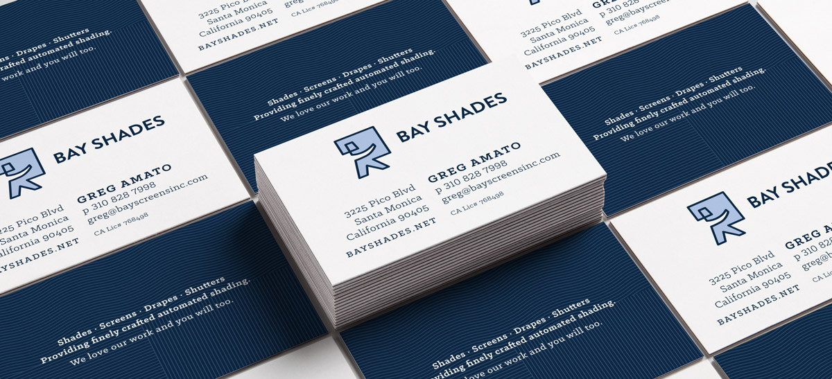
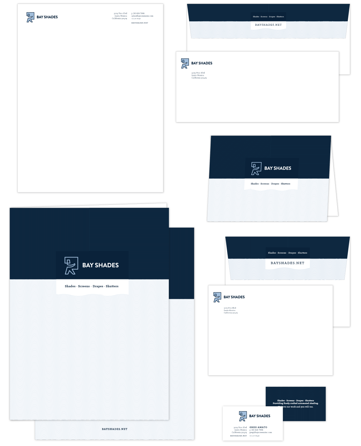
Stationery
Print Collateral
Brand Style Guide
/ OBJECTIVE
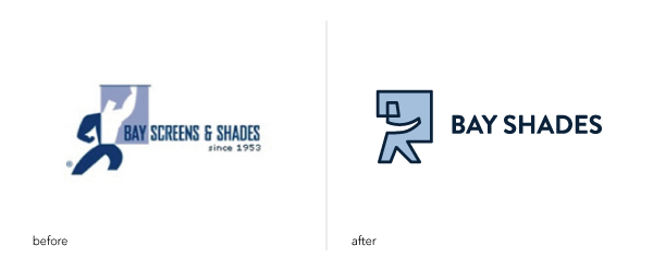
Refresh the brand identity of this Santa Monica firm to attract premier architects, interior designers, and general contractors.
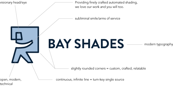
Bay Shades’ new positioning: Providing finely crafted automated shading, we love our work and you will to.
/ IDEA
Redesign their logo to make it more modern and fresh while maintaining visual continuity through color and their service-man icon.
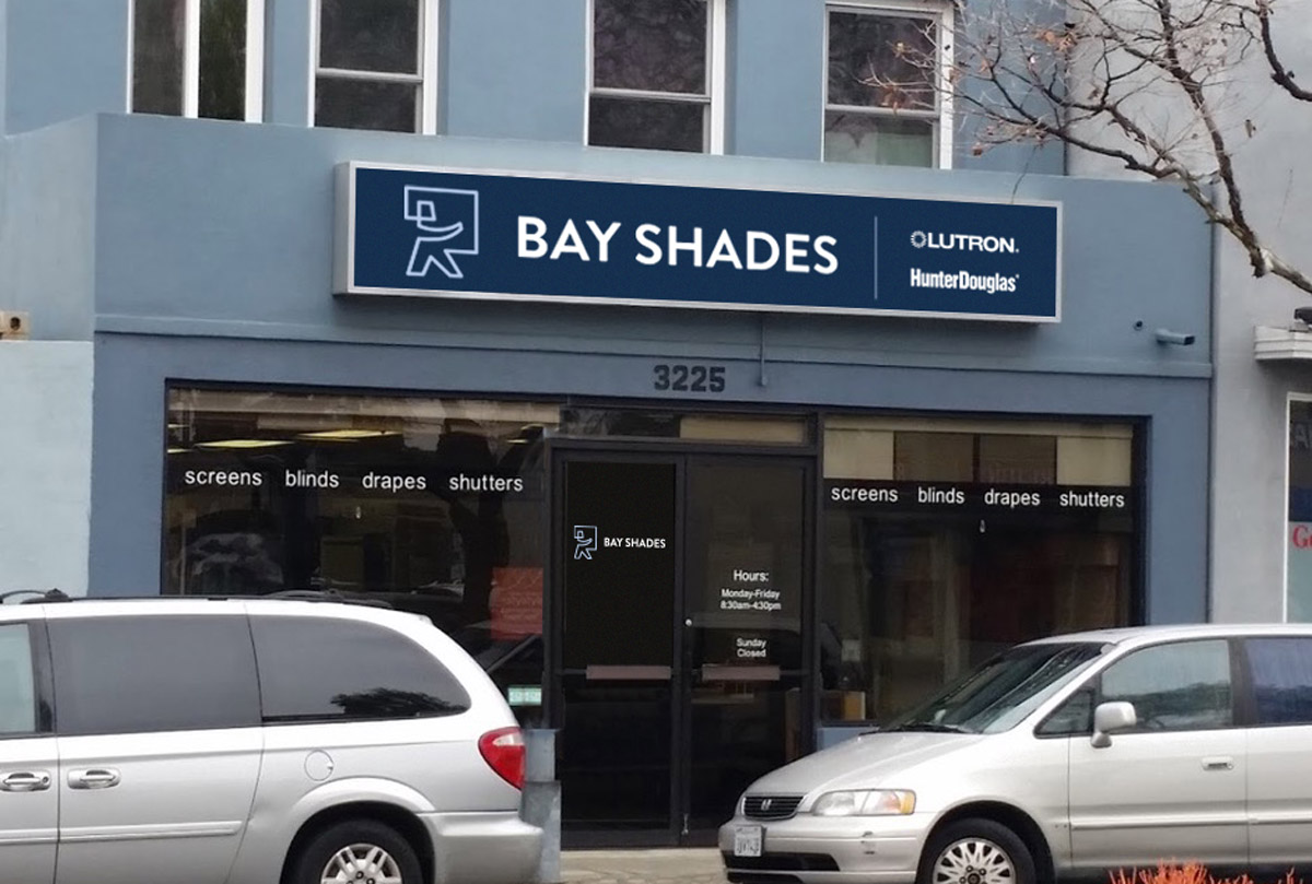
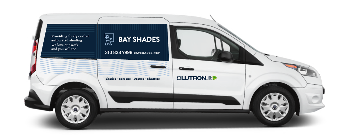
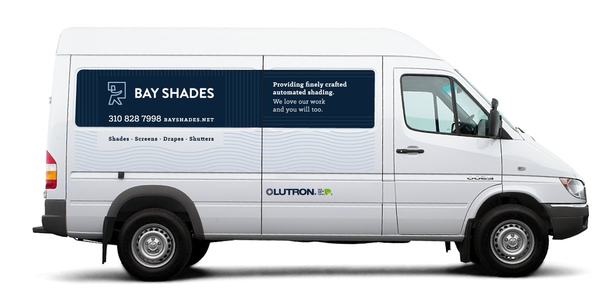
Signage & Vehicle Graphics
I wanted you to know business is up 72% currently and has been hovering at 50% above for a few months. While I cannot pinpoint the cause the effect is dramatic, fun, challenging, and rewarding. Thanks for the inertia. You had a lot to do with it and I appreciate your effort and support.
Greg Amato
Owner, Bay Shades
