by davidlecours | Jun 5, 2021
BRAND FOUNDATION & WEBSITE
/ SERVICES
Brand Foundation
Collateral
Voice & Messaging
Experience Design
Web Development
VISIT WEBSITE
/ OBJECTIVE
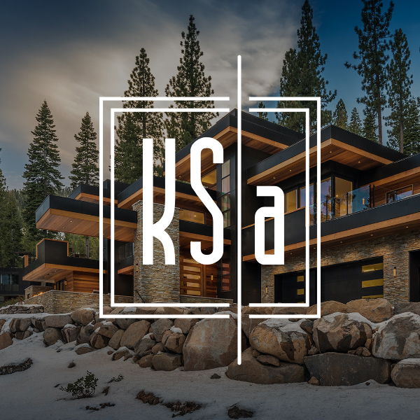
After completing brand strategy, messaging, and project descriptions, we designed SOQ and proposal templates. These looked so good, KSA hired us to redo their website.
The new website creates a better mobile experience, features the team, and shows off a curated global portfolio of homes.
/ IDEA
KSA already had a strong logo and color palette. With such powerful project photography, we kept the design of the website “quiet” so that their work, not ours, is what gets noticed.
Brand foundation & messaging by LecoursDesign.
We love designing timeless homes and building lasting relationships.
/ CORE VALUES
Weave Creativity and Reality
Our work is as buildable as it is innovative.
Collaborate with Courage
Build on the strengths of our practice through gratitude and teamwork.
Details Make the Design
Paying attention to details embeds character in our work.
Be Humble
Remain open to brilliance emerging from unexpected sources.
Communicate with Candor
Transparency, truth, and vulnerability are essential when interacting with clients
and teammates.
/ BRAND PERSONALITY
Before designing the website, we created five brand personality attributes to guide all future marketing communication materials:
Distinctive
Imaginative
Timeless
Approachable
Passionate
by davidlecours | Jan 24, 2021
BRANDING & WEBSITE / CASE STORY
/ SERVICES
Discovery & Recommendations
Brand Foundation
Brand Identity
Collateral
Voice & Messaging
Digital Marketing
Web Design & Development
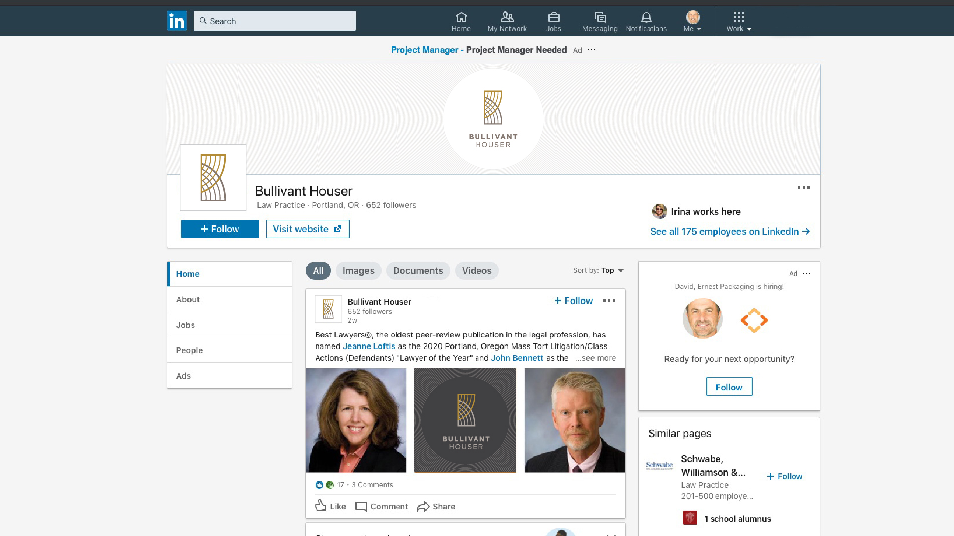
VISIT WEBSITE
Website Design and Development
by davidlecours | Apr 21, 2020
/ SERVICES
Discovery & Recommendations
Brand Foundation
Brand Identity
Collateral
Voice & Messaging
Digital Marketing
Web Design & Development
VISIT WEBSITE
/ OBJECTIVE
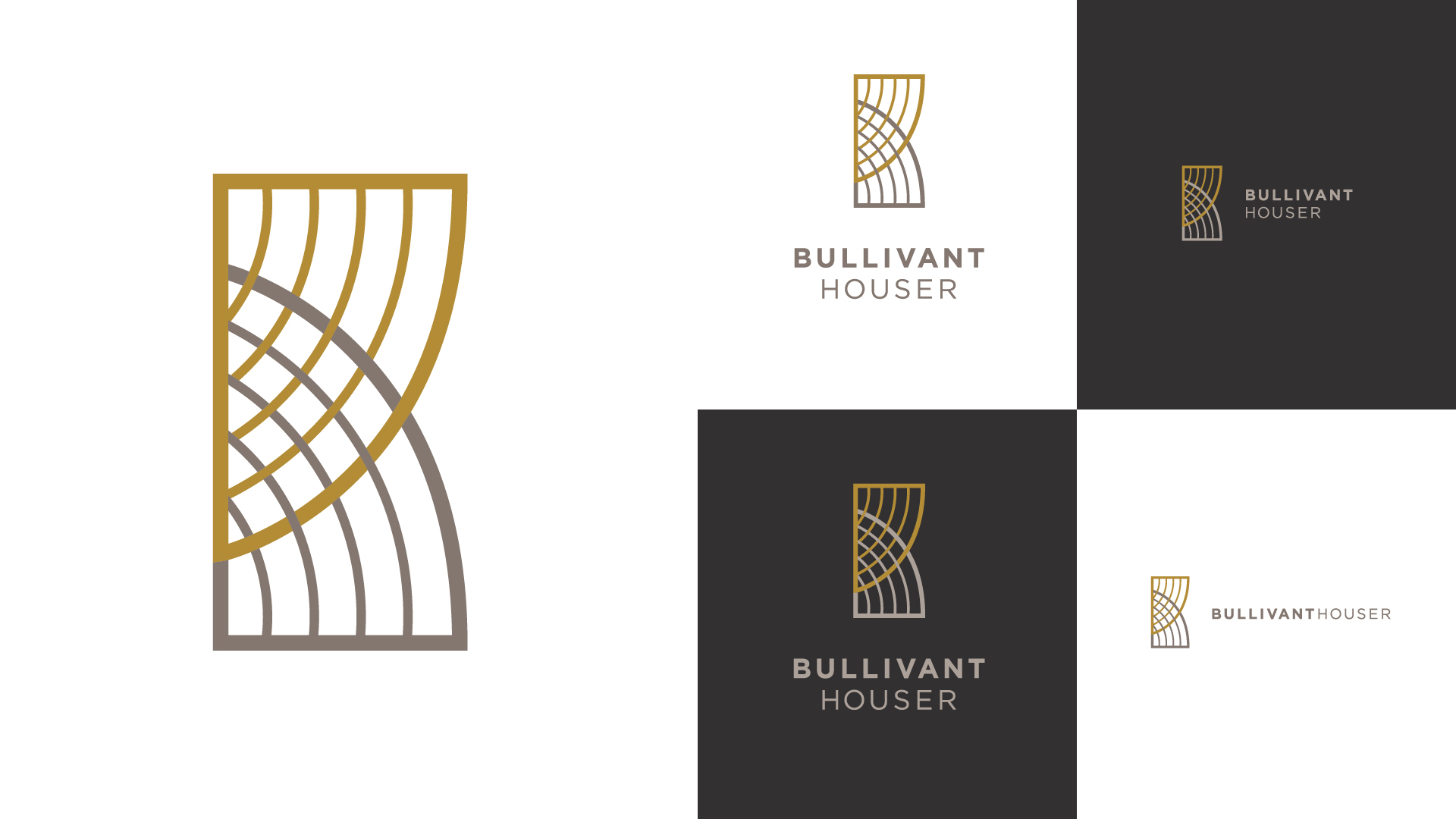
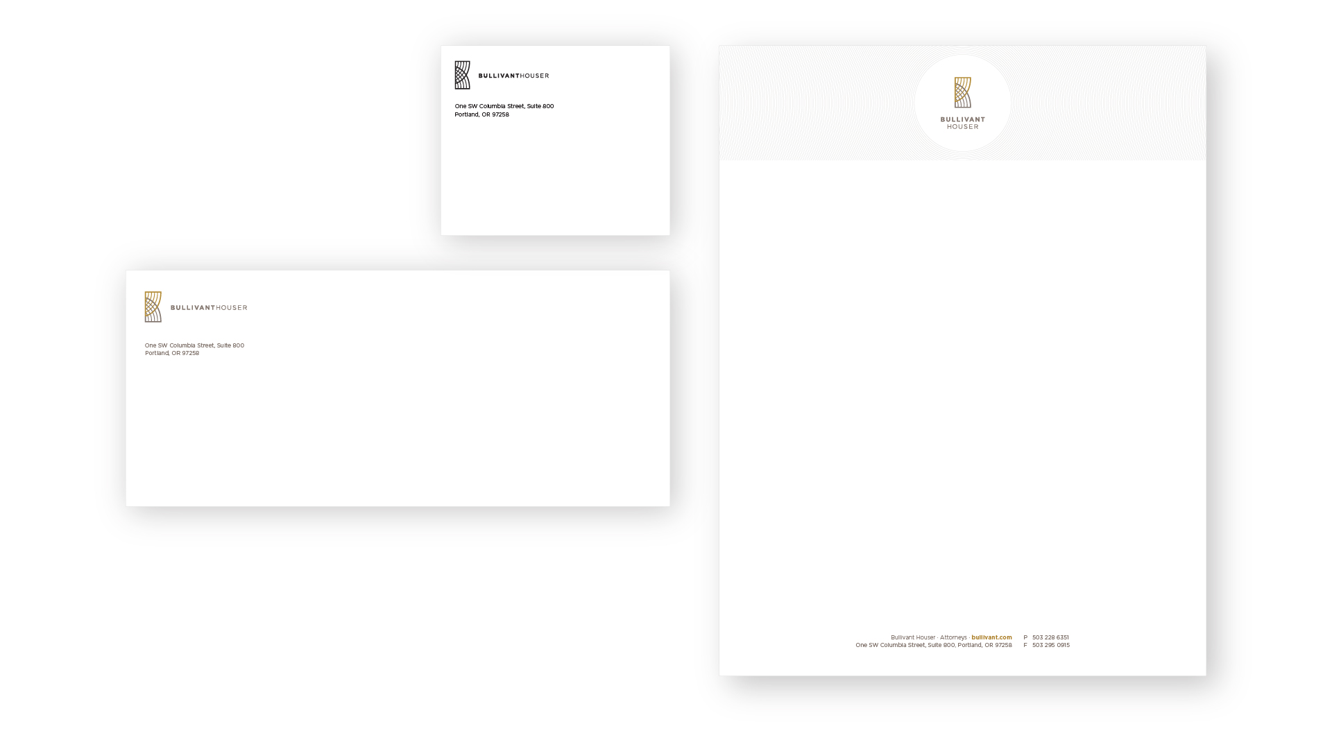
With significant transformation in the last 10 years, this law firm’s brand was stuck where it had been; not where they’re going.
New offices, strategic plan, core values, vision, purpose, positioning, and a refined brand name — this was the time to create a new visual identity.
/ IDEA
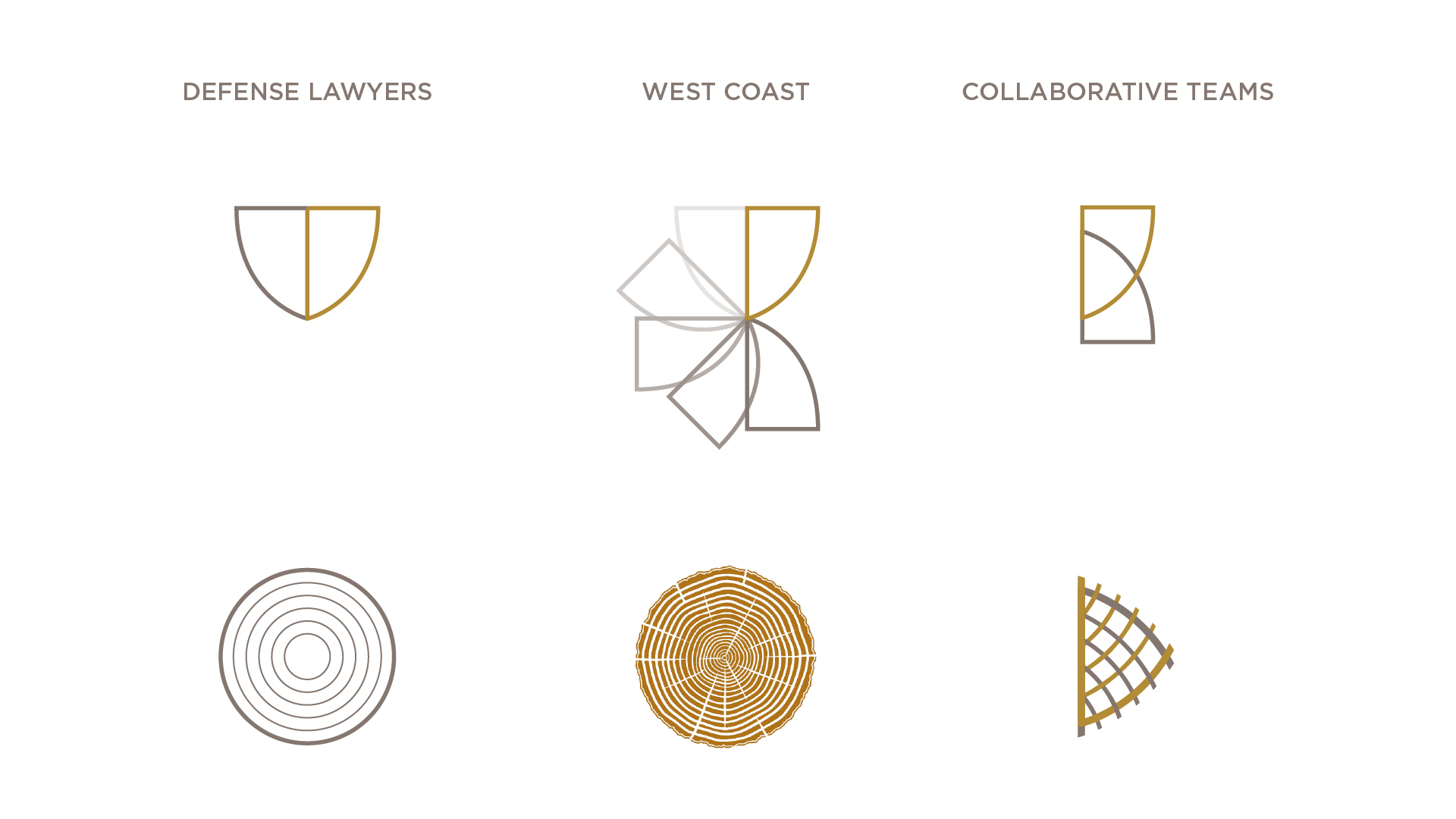
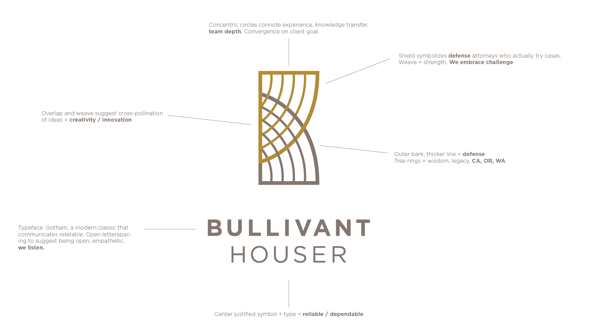
We created new branding grounded in this positioning: West Coast, Defense Lawyers, and Collaborative Teams.
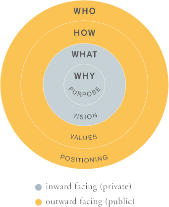
S T R A T E G Y, T H E N B R A N D I N G
A strong brand is rooted in brand strategy, which means having well-articulated Purpose, Vision, Core Values and Positioning statements.
During a half-day workshop with the branding committee, we engaged in group prioritization exercises to narrow a lengthy list of firm attributes to three unique differentiators:
West Coast – We have deep knowledge of the law in CA, OR, and WA.
Defense lawyers with hands-of trial experience – We actually go to trial,
Collaborative Teams – Many minds contribute to resolve our client’s challenging legal issues
P O S I T I O N I N G S T A T E M E N T
From those three unique differentiators, we developed a positioning statement that defines the firm type (West Coast defense lawyers), how it is unique (hands-on trial experience and collaborative teams).
We are a West Coast firm of defense lawyers with hands-on trial experience. Our collaborative teams guide clients in resolving challenging legal issues.
C O R E V A L U E S
We Are a Team
By working closely together, we achieve the best possible outcomes for our clients.
We Are Respectful
Mutual respect is the cornerstone of how we interact with each other and our clients.
We Are Tenacious
We rise to every challenge —perseverance, determination, and grit define us.
We Are Fun
We are serious about our work, but we don’t take ourselves too seriously.
We Are Creative
Partnering with clients, we explore all possibilities to achieve successful outcomes.
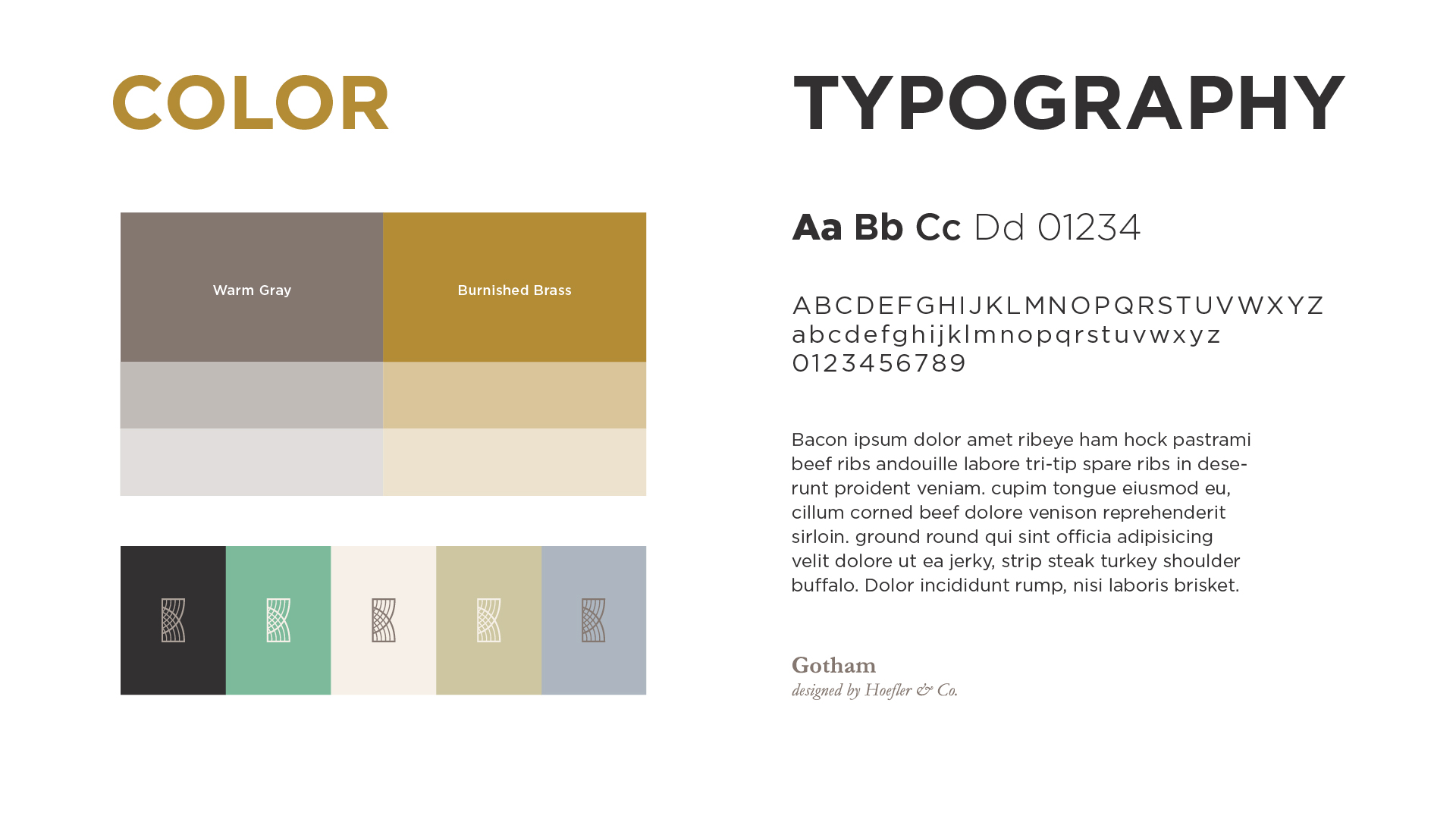
B R A N D P E R S O N A L I T Y
Before developing the visual brand identity, we established five brand personality attributes to guide all future marketing communication materials and activities.
Authentic/Relatable
Innovative
Reliable/Trusted
Tenacious
Fun/Playful
by davidlecours | Feb 18, 2019
/ SERVICES
Brand Strategy
Naming
Brand Identity
Stationery
Print Collateral
Brand Style Guide
/ OBJECTIVE
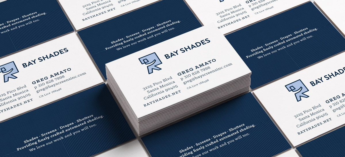
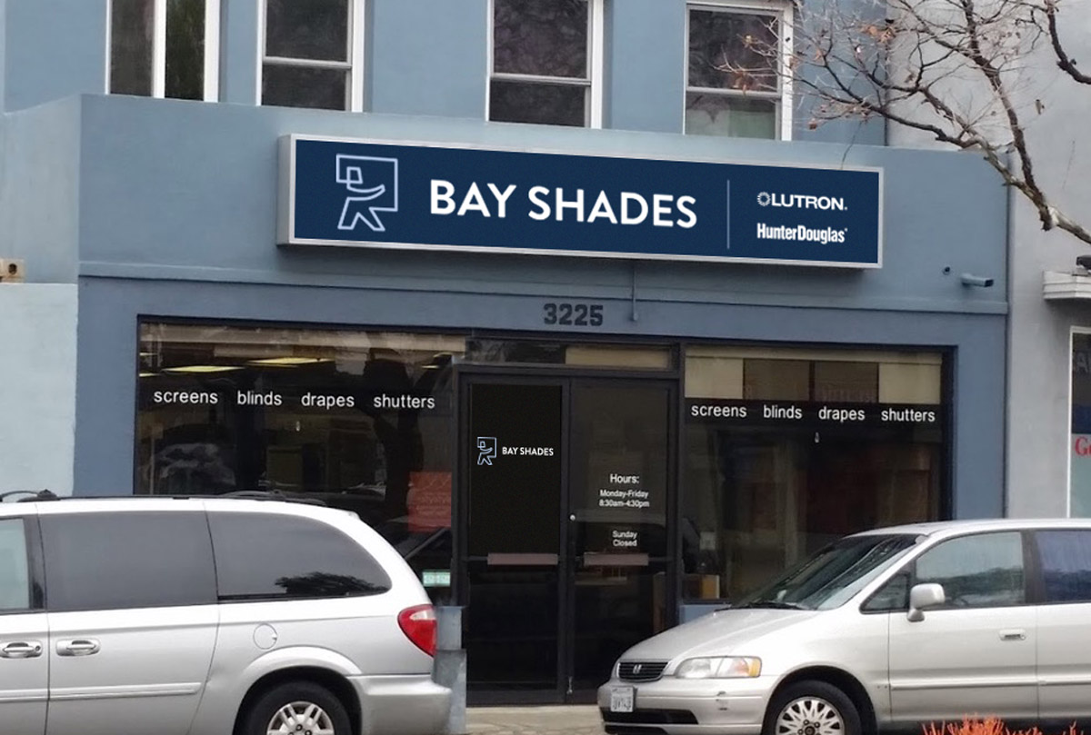
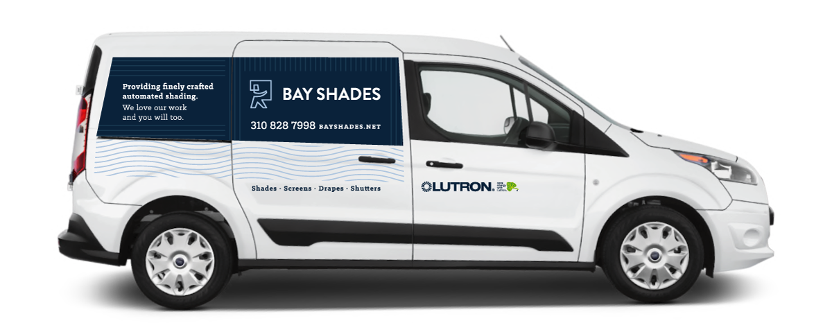
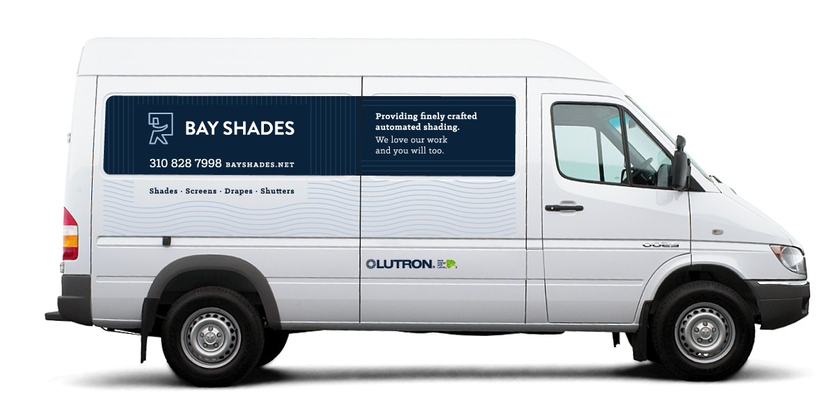
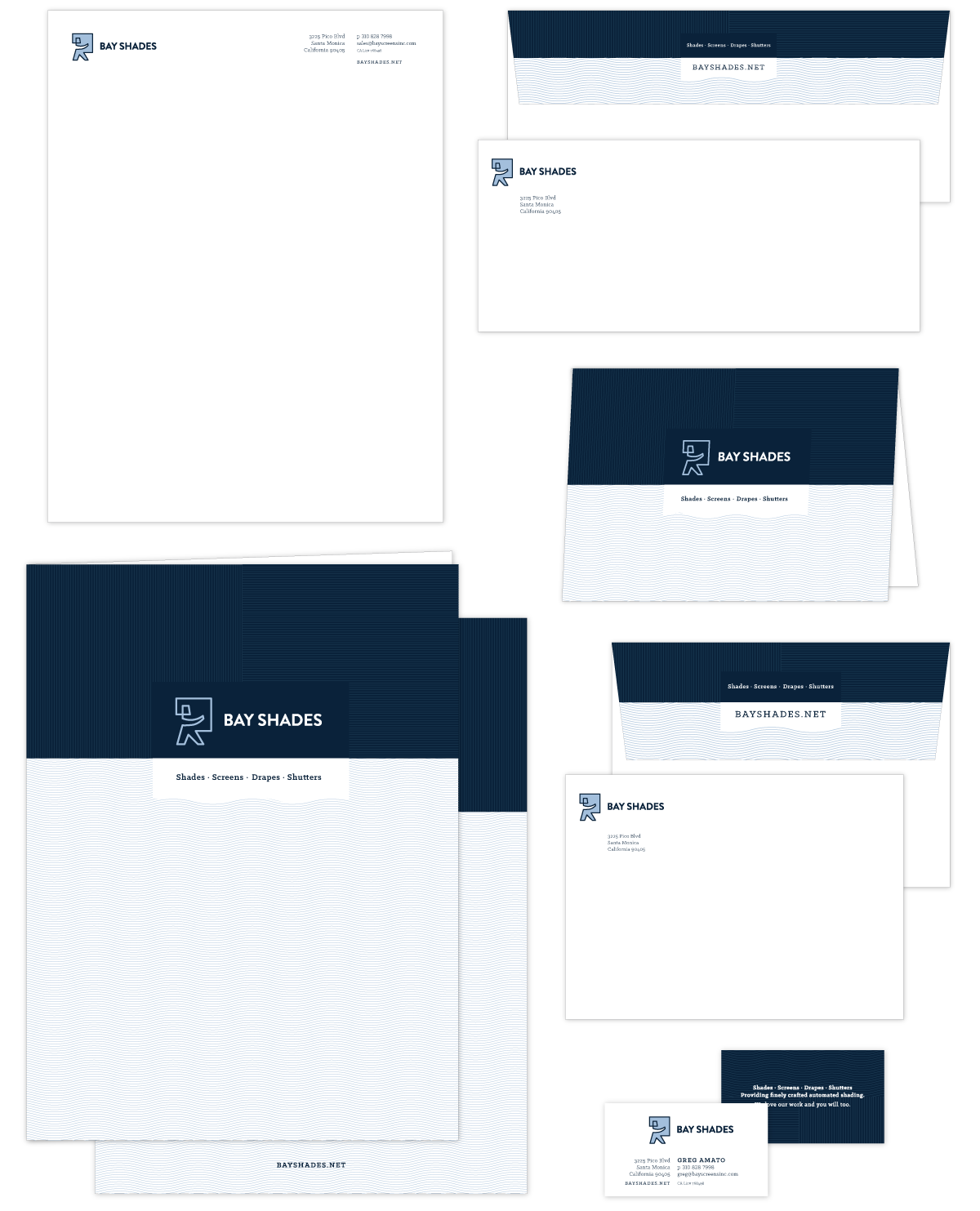
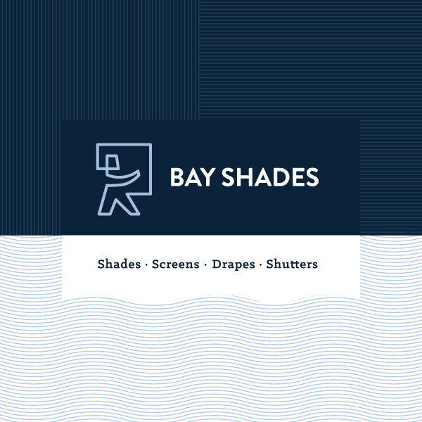
Refresh the brand identity of this Santa Monica firm to attract premier architects, interior designers, and general contractors.
Bay Shades’ new positioning: Providing finely crafted automated shading, we love our work and you will to.
/ IDEA
Redesign their logo to make it more modern and fresh while maintaining visual continuity through color and their service-man icon.
Signage & Vehicle Graphics
I wanted you to know business is up 72% currently and has been hovering at 50% above for a few months. While I cannot pinpoint the cause the effect is dramatic, fun, challenging, and rewarding. Thanks for the inertia. You had a lot to do with it and I appreciate your effort and support.
Greg Amato
Owner, Bay Shades
by Emily Castillo | Jan 5, 2019
/ SERVICES
Discovery & Recommendations
Strategy
Brand Foundation
Voice & Messaging
Brand Identity
Print Collateral
Digital Marketing
Website Design & Development
VISIT WEBSITE
/ AWARDS
SMPS MCA Awards:
✶ Best Rebrand
✶ Best Website
✶ Best Recruiting & Retention Promotion
/ BACKGROUND
After speaking at the SMPS Pacific Regional Conference in Portland, David was approached by Irina, the marketing director at Murray, Smith & Associates, Inc. (MSA), a nine-office, 155-person civil engineering firm in the Northwest. Handing him her business card, she confessed,
I know, we need your help.
/ CHALLENGE
While MSA marketing team members understood the value of branding, several owners were reluctant to invest in a rebrand. Business was strong and memories of a failed attempt at DIY rebranding and a false start with a consultant unfamiliar with A/E/C marketing lingered.
/ SOLUTION
To help MSA make an informed decision, we proposed the firm commit only to the Discovery Phase, including a review of its strategic plan, a brand audit rating 75 brand touchpoints, personal interviews with recent hires, and a competitive audit.
Brand foundation & messaging by LecoursDesign.
Imaginative
Fun
Dependable
Relateable
Sincere
/ THREE UNIQUES
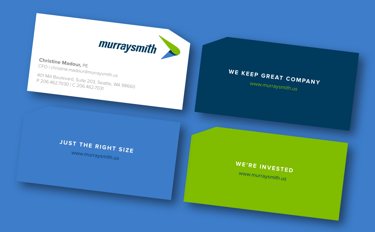
Just the right size – We are large enough to employ diverse talent to solve your biggest challenges, yet small enough to genuinely care.
We’re Invested – We live where we work; we take project success personally.
We keep great company – We take care of our people, so they can take care of you.
/ CORE VALUES
We workshopped seven core values, which we later expressed on craft beer coasters. Each coaster is letterpressed with a value on the front, and more detail about its meaning on the back.
We make it happen. (Service)
We invest in us. (Improvement)
Our work goes on the fridge. (Quality)
Multiple Minds > 1 (Collaboration)
Work that works for you. (Flexibility)
We Engineer Fun (Fun)
We Give a $#!T (Passion)
We are a public infrastucture engineering firm, crafting the communities we live in.
/ BEFORE REBRAND > BUSINESS CARD
Nine months after the rebrand, Murraysmith had a 40% increase in staff growth, a 30% increase in gross revenue, & 12+ new clients.
“You always have been so fantastic in what you did for us; more so, the story behind Murraysmith and how you went about the process, and how we are able to align where we are going. The story, foundation, and process are more important than anything else. You are and have been amazing so it is easy to give you great recommendations.”
–Chris Rayasam
Chief Executive Officer, Murraysmith