by davidlecours | Nov 7, 2022
/ SERVICES
Discovery & Recommendations
Brand Foundation
Brand Identity
Collateral
Voice & Messaging
Digital Marketing
VISIT WEBSITE
/ OBJECTIVE
Like most start-ups, AEC Advisors used minimal viable branding for its first few years. But the firm has ambitious plans and needed a re-brand to communicate where they are headed, not where they’ve been.
LecoursDesign was hired because we are branding and AEC industry experts; Our clients are also AEC Advisors clients.
/ IDEA
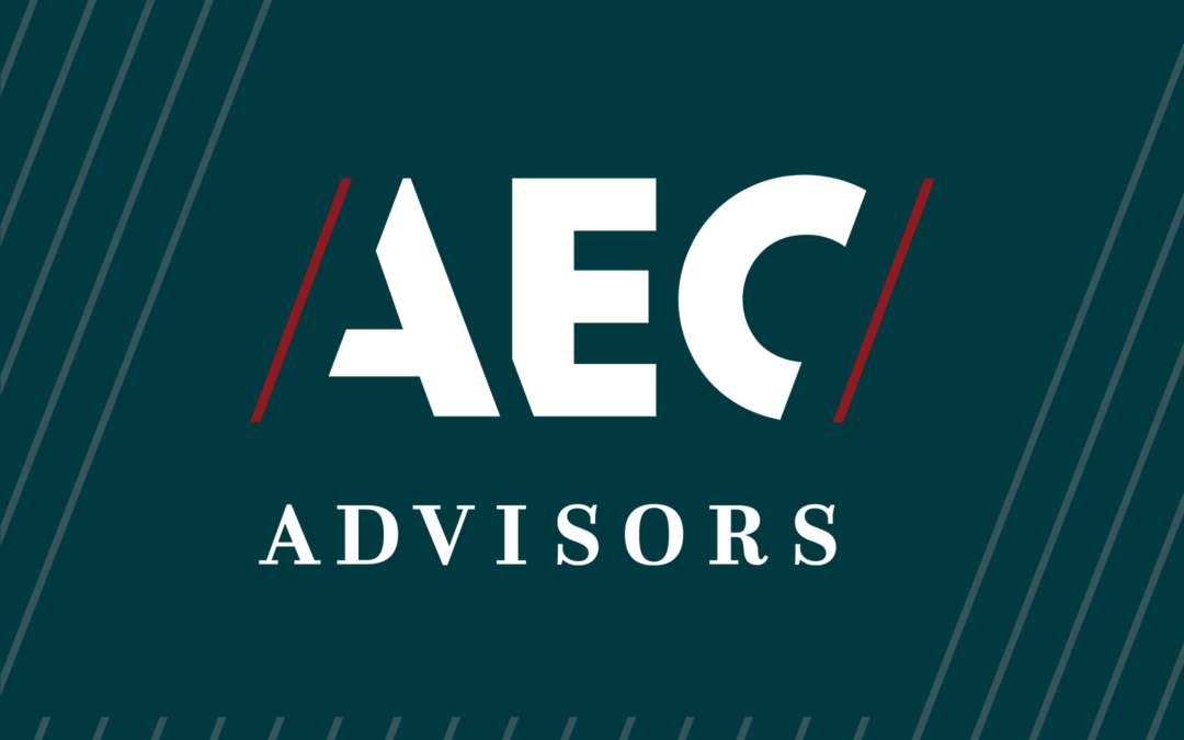
Architecture, Engineering, Construction, or Consulting is often written A/E/C. The new logo is a play on this. The angle up and to the right is also a graphical reference of adding financial value (something that AEC Advisors do).
Brand foundation & messaging by LecoursDesign.
We help A/E/C firm leaders to confidently address financial issues and opportunities, so they can focus on clients, projects, and people.
We elevate our industry to be the most respected and valuable, over the next decade.
/ CORE VALUES
Share your individual best for the benefit of all.
Combining diverse strengths powers our team to reach elevated outcomes.
Aim to surpass your former self.
Small incremental improvements compound into radical transformation.
Use empathy as your superpower.
Understanding others’ needs is our first priority. Then we provide authentic advice.
Make integrity contagious.
Every choice we make reflects who we are; as individuals and as a firm.
Be responsive; Act intentionally.
We are responsive with our team as well as our clients.
/ BRAND PERSONALITY
We’ve established five brand personality attributes to guide all future marketing communication materials and activities:
Focused
Trusted
Sincere
Best-in-Class
Progressive
As AEC Advisors, we focus on M&A and corporate finance. The industry trusts our data, expertise, and network to build stakeholder value.
“LecoursDesign did our rebranding, website, and office renovation design. We could not be happier. David is the kind of person who really gets to know his clients and puts together branding options that speak to your firm’s culture. The initial process of learning who we were, and the audit he did of our clients, was the most valuable part. We learned more about what we need to do to achieve our goals than we anticipated.”
Josh Lahre
Co-Founder & Partner, AEC Advisors
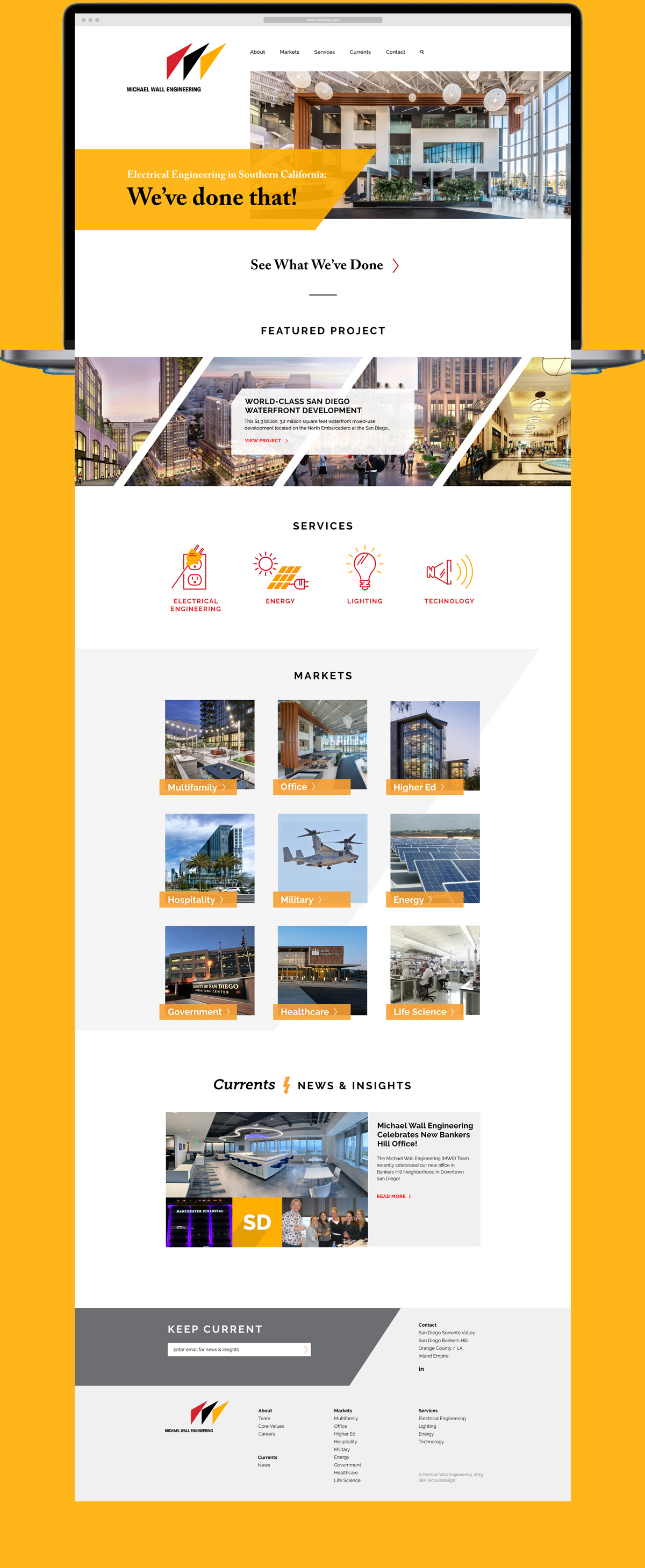
by davidlecours | May 20, 2020
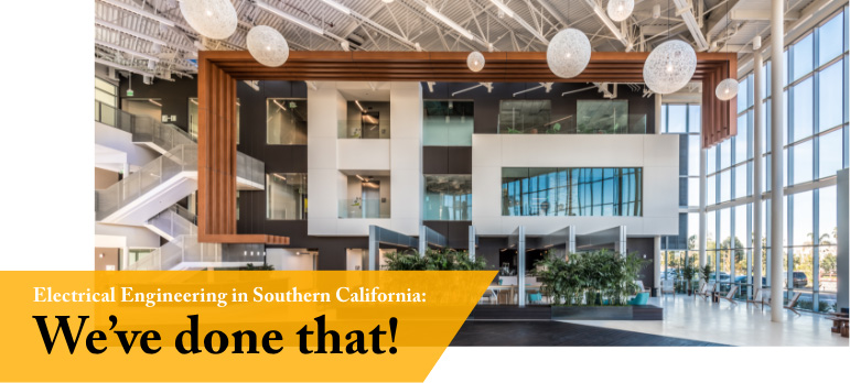
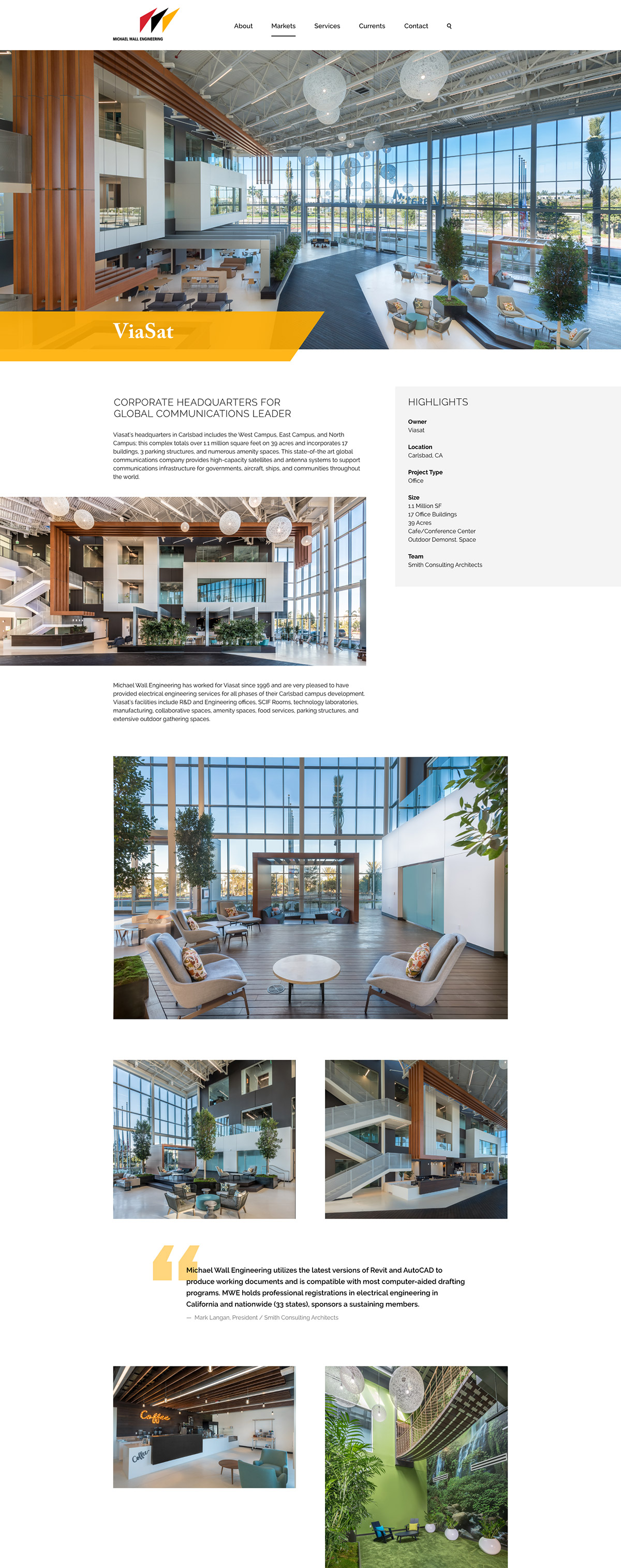
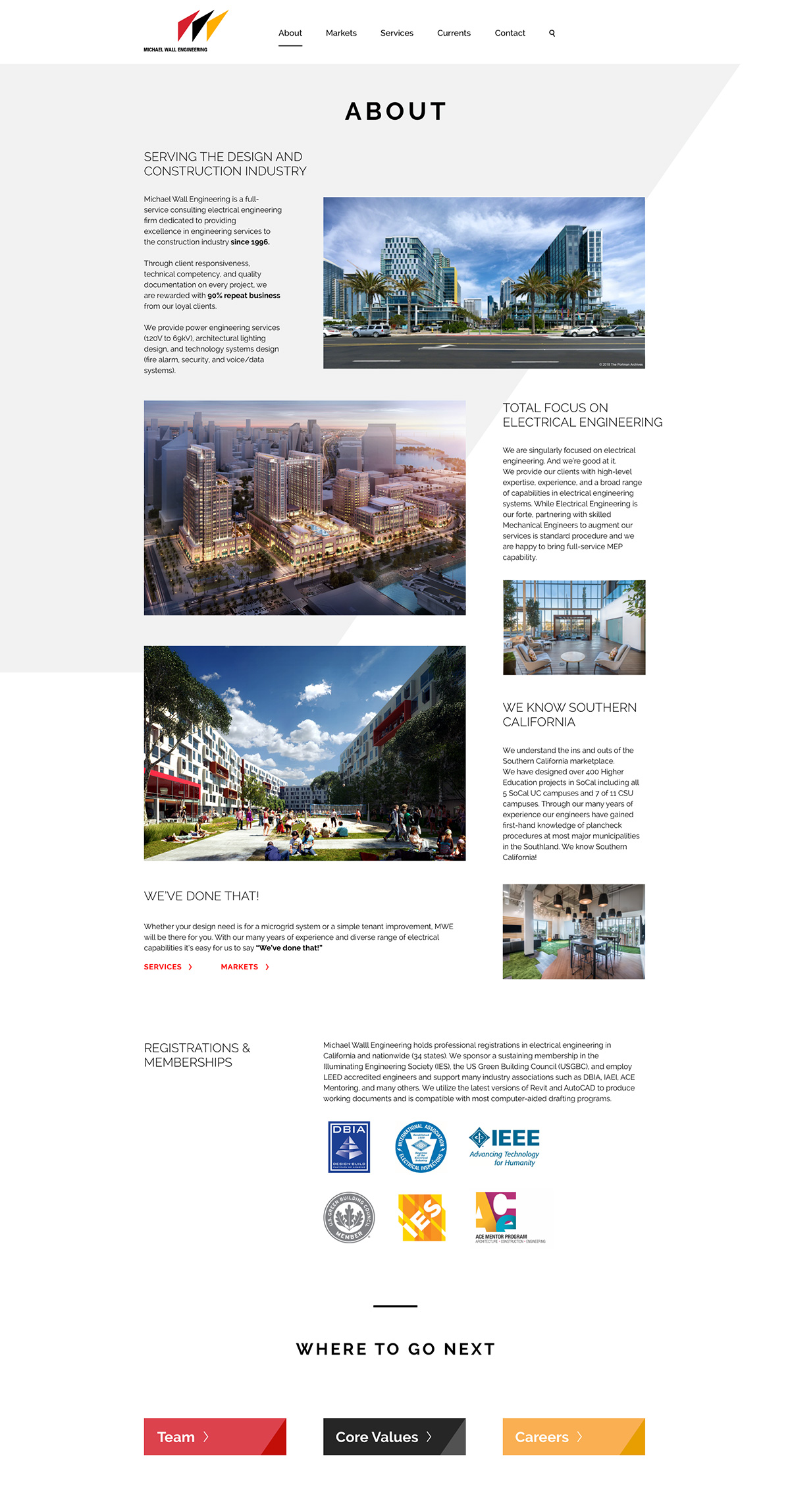
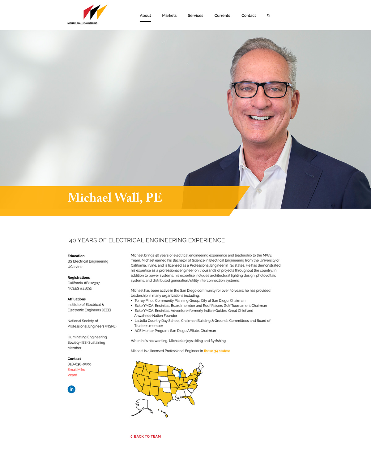
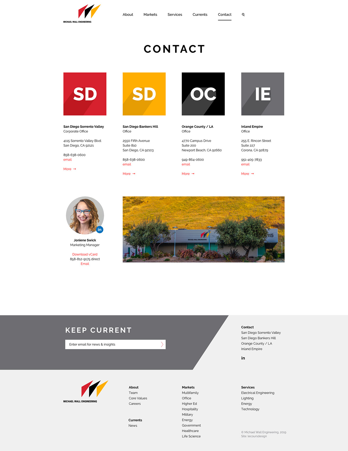
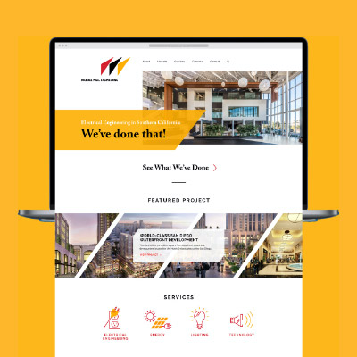
Michael Wall Engineering
We’ve Done That, Twice!
C L I E N T
Michael Wall Engineering (MWE)
See Site
S E R V I C E S
Discovery, Insights & Recommendations,
Positioning, Core Values, Website Design,
Website Development
T H E B R I E F
The original website we designed for MWE in 2012 was dated, especially on mobile. As part of a larger marketing overhaul, we launched a new responsive website for a great experience on desktop, tablet and mobile.
C R E A T I V E C O N C E P T
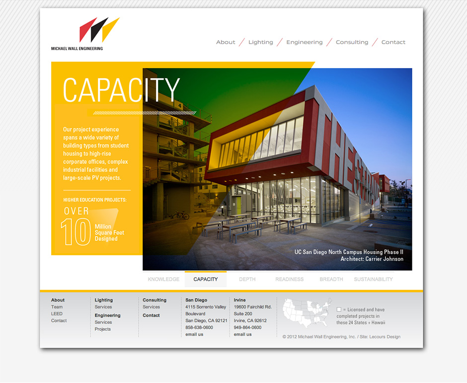
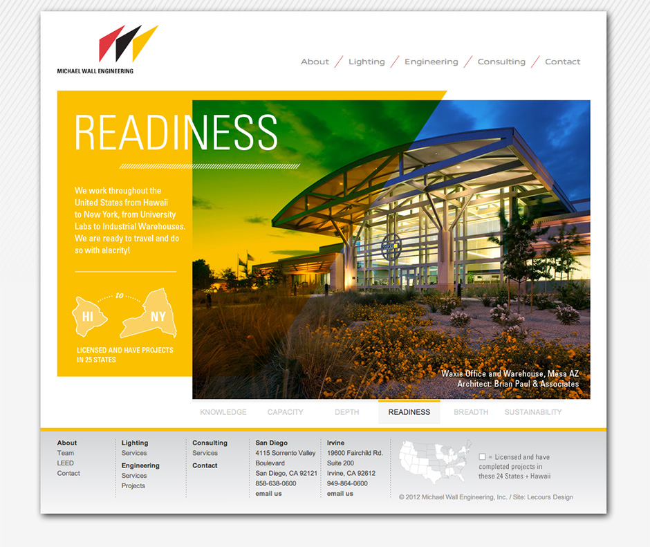
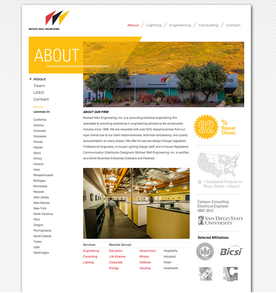
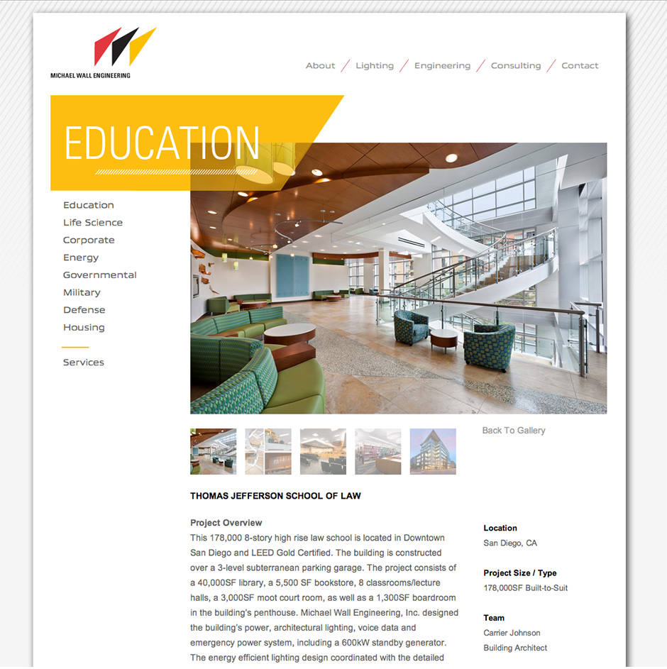
MWE already had a bold logo and color palette. We embraced the angle of the “3 sails” logo and the saturated red, yellow and black throughout the new site.
Results
3 months before launch (old site) vs. 3 months after launch (new site).
We are very happy with the site and get lots of positive feedback from clients, recruits, and employees. It’s been very beneficial to our business especially during this time when we can’t interact with folks in person.”
–Michael Wall, PE, Principal
T H R E E U N I Q U E S
Lecoursdesign led a half-day workshop with firm leaders to generate a lengthy list, then narrow firm attributes to three unique differentiators:
Electrical Engineering – We are singularly focused on electrical engineering, not mechanical and plumbing.
Southern California – We understand the ins and outs of the Southern California marketplace.
We’ve Done That! – With deep expertise in a diverse range of electrical capabilities, it’s easy for us to say, “we’ve done that!”
P O S I T I O N I N G S T A T E M E N T
From the three uniques, we developed a positioning statement that differentiates MWE from their competition.
B R A N D P E R S O N A L I T Y
Before designing the website, we created five brand personality attributes to guide all future marketing communication materials.
Approachable
Dependable
Accomplished
Imaginative
Sophisticated
Old Site (Before Redesign)
by davidlecours | Apr 21, 2020
/ SERVICES
Discovery & Recommendations
Brand Foundation
Brand Identity
Collateral
Voice & Messaging
Digital Marketing
Web Design & Development
VISIT WEBSITE
/ OBJECTIVE
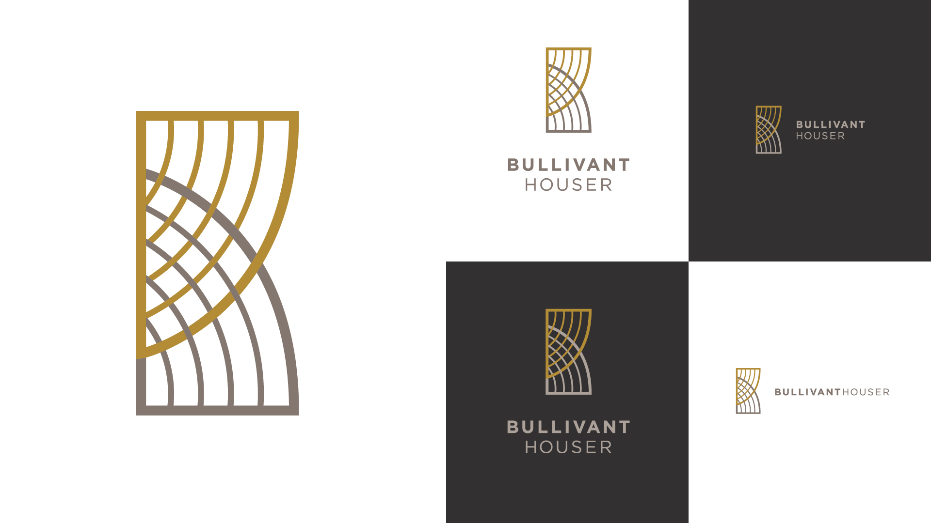
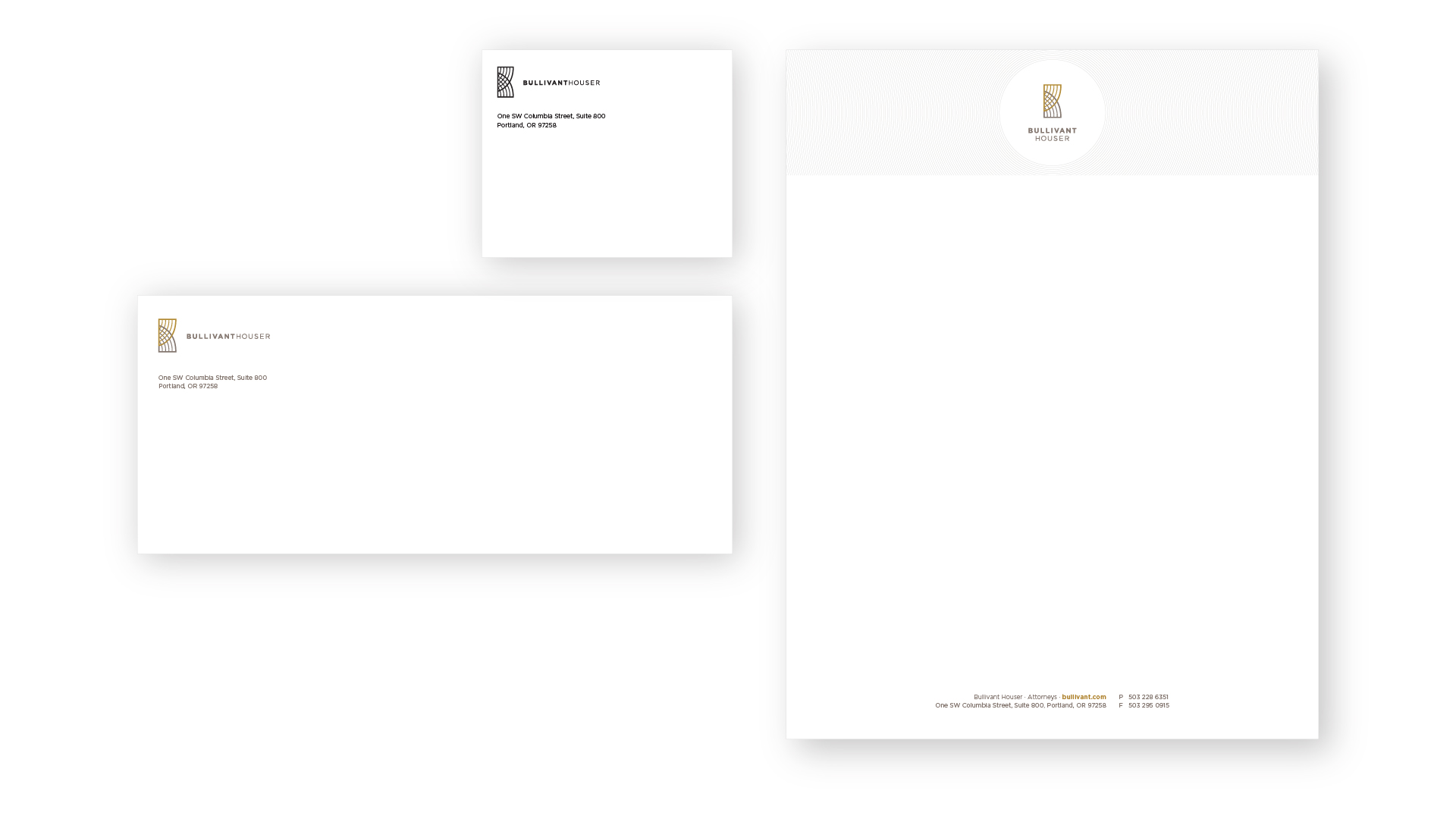
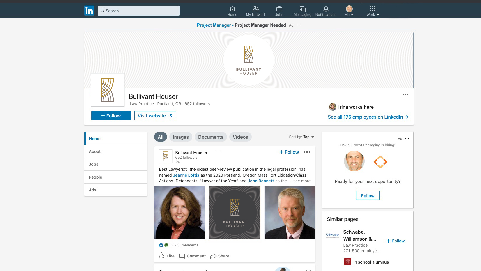
With significant transformation in the last 10 years, this law firm’s brand was stuck where it had been; not where they’re going.
New offices, strategic plan, core values, vision, purpose, positioning, and a refined brand name — this was the time to create a new visual identity.
/ IDEA
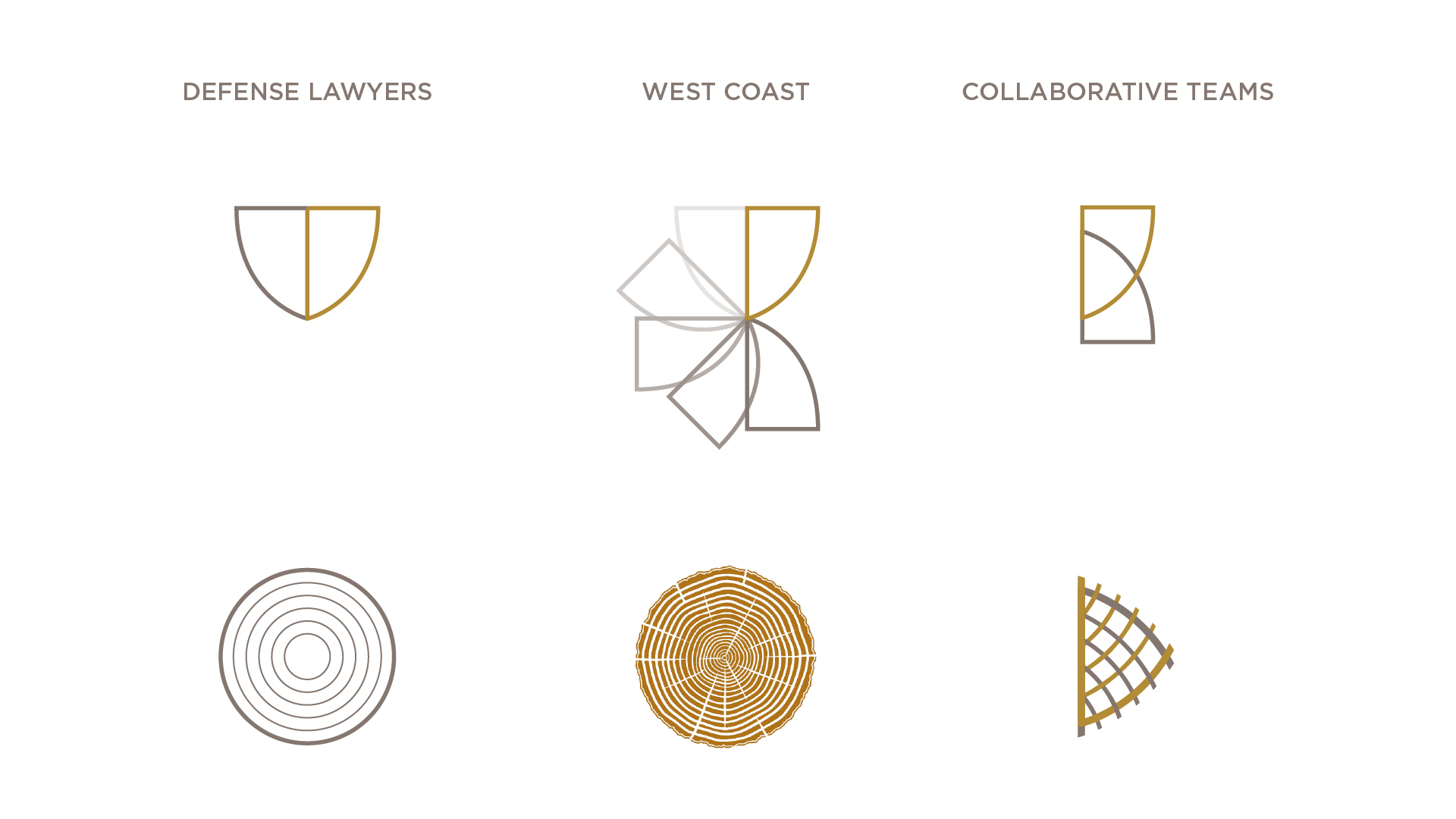
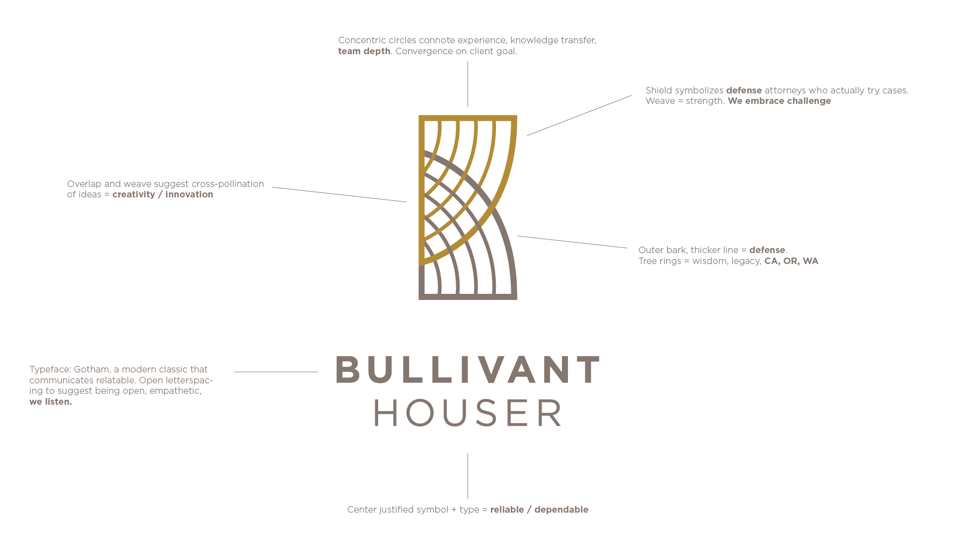
We created new branding grounded in this positioning: West Coast, Defense Lawyers, and Collaborative Teams.
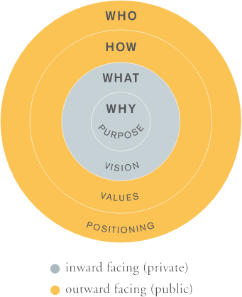
S T R A T E G Y, T H E N B R A N D I N G
A strong brand is rooted in brand strategy, which means having well-articulated Purpose, Vision, Core Values and Positioning statements.
During a half-day workshop with the branding committee, we engaged in group prioritization exercises to narrow a lengthy list of firm attributes to three unique differentiators:
West Coast – We have deep knowledge of the law in CA, OR, and WA.
Defense lawyers with hands-of trial experience – We actually go to trial,
Collaborative Teams – Many minds contribute to resolve our client’s challenging legal issues
P O S I T I O N I N G S T A T E M E N T
From those three unique differentiators, we developed a positioning statement that defines the firm type (West Coast defense lawyers), how it is unique (hands-on trial experience and collaborative teams).
We are a West Coast firm of defense lawyers with hands-on trial experience. Our collaborative teams guide clients in resolving challenging legal issues.
C O R E V A L U E S
We Are a Team
By working closely together, we achieve the best possible outcomes for our clients.
We Are Respectful
Mutual respect is the cornerstone of how we interact with each other and our clients.
We Are Tenacious
We rise to every challenge —perseverance, determination, and grit define us.
We Are Fun
We are serious about our work, but we don’t take ourselves too seriously.
We Are Creative
Partnering with clients, we explore all possibilities to achieve successful outcomes.
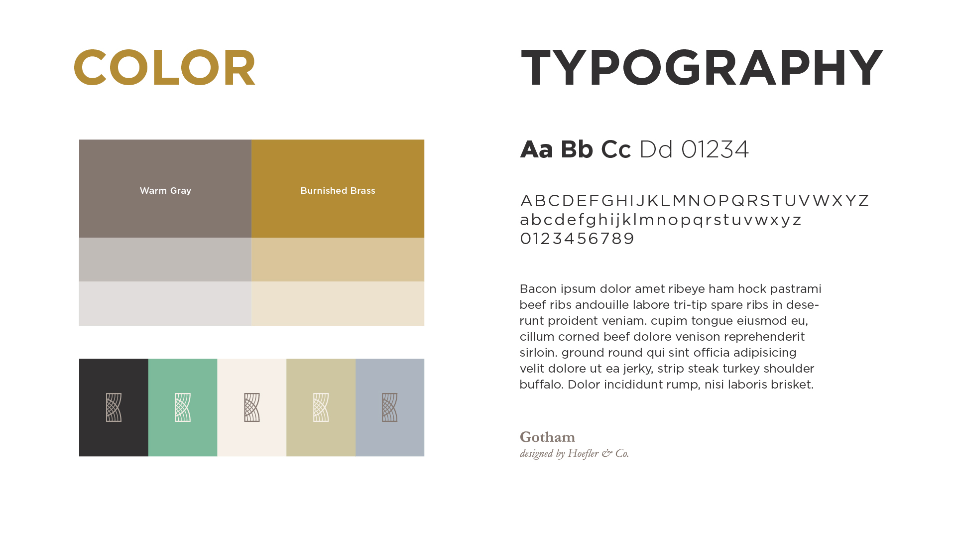
B R A N D P E R S O N A L I T Y
Before developing the visual brand identity, we established five brand personality attributes to guide all future marketing communication materials and activities.
Authentic/Relatable
Innovative
Reliable/Trusted
Tenacious
Fun/Playful
by davidlecours | Oct 21, 2019
/ SERVICES
Website Planning
Prototyping
Design
Custom Illustrations
Development
VISIT WEBSITE
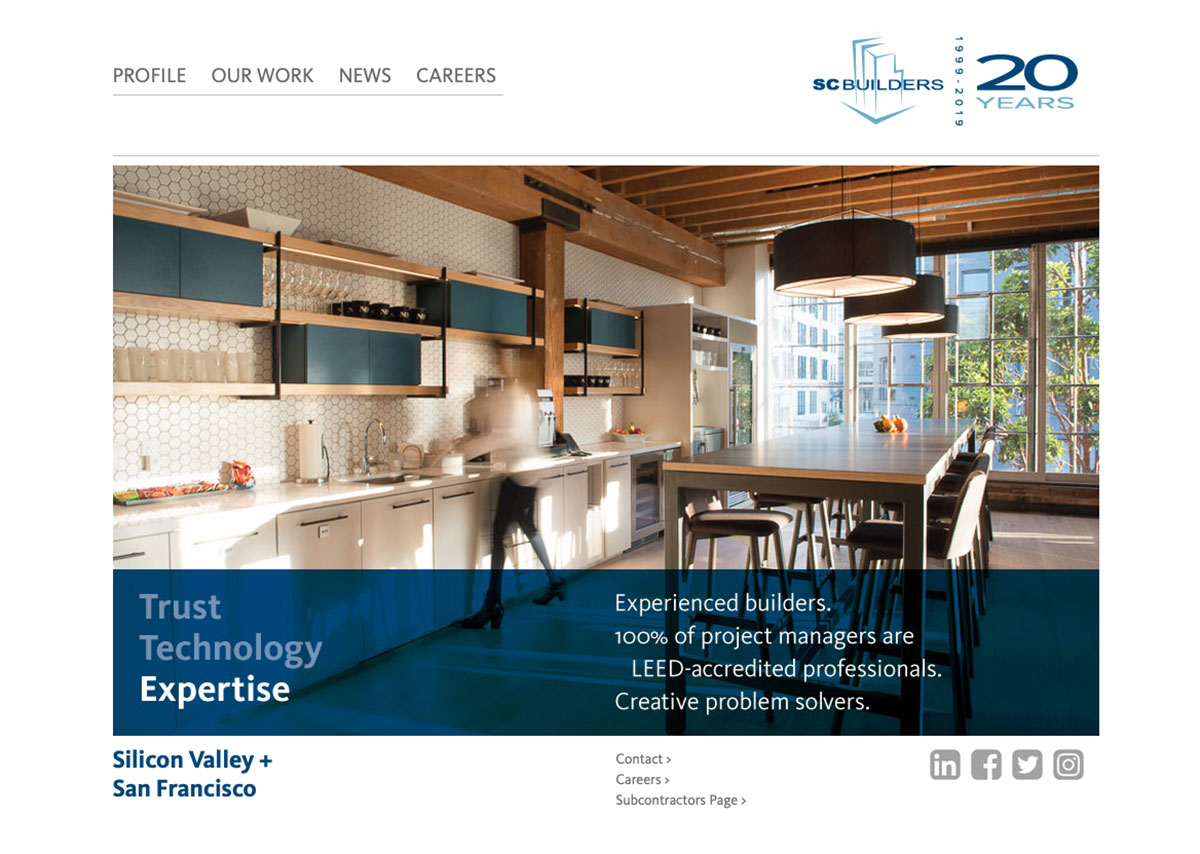
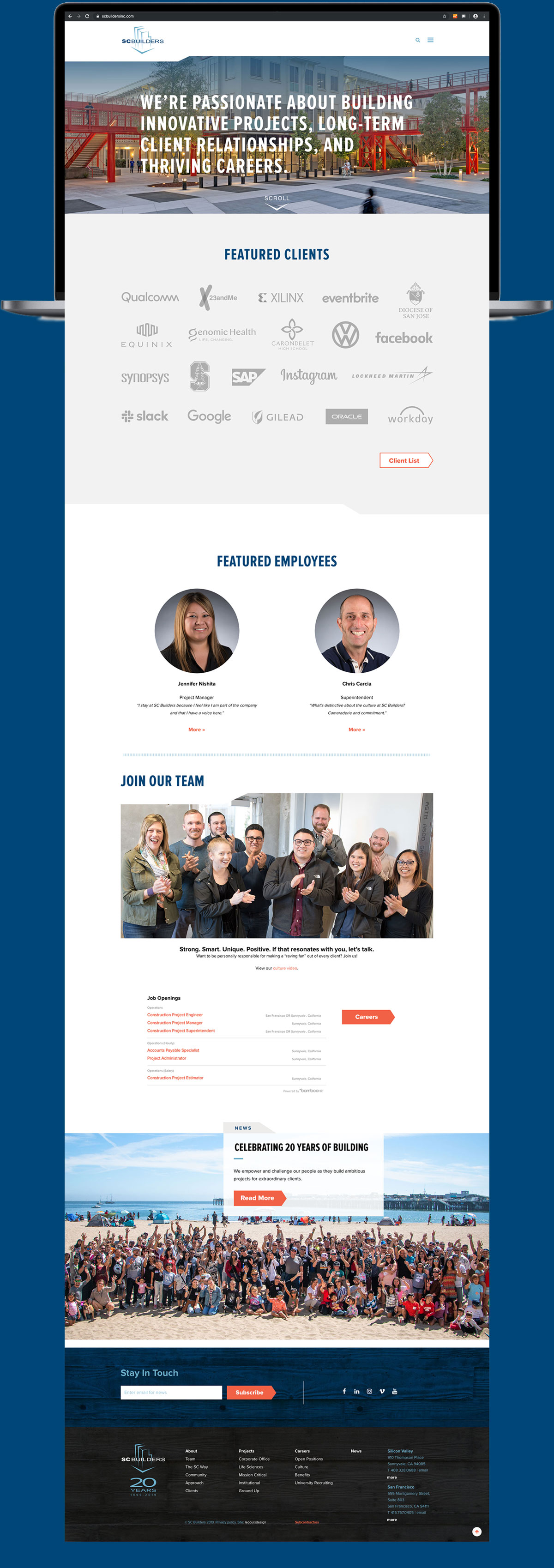
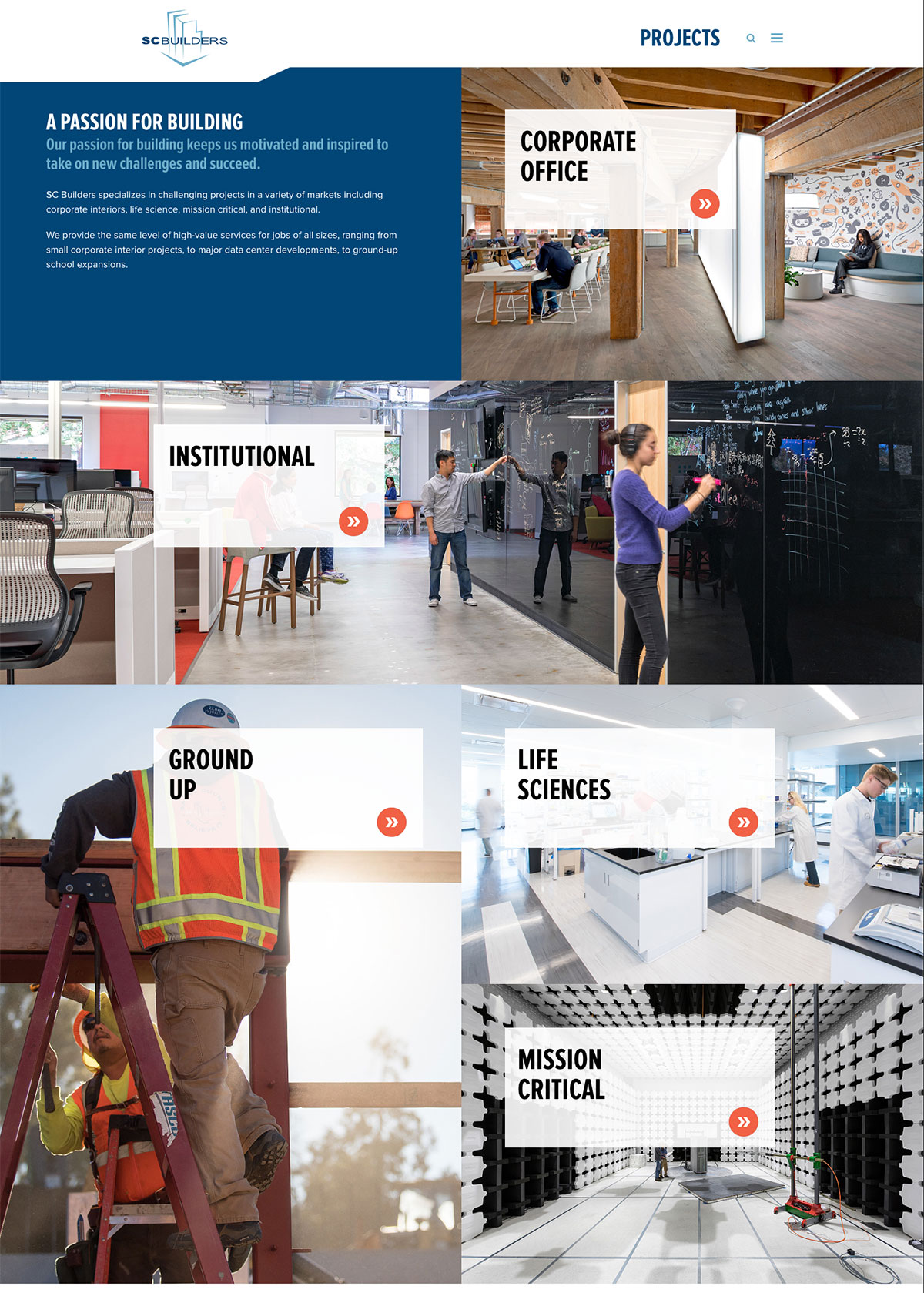
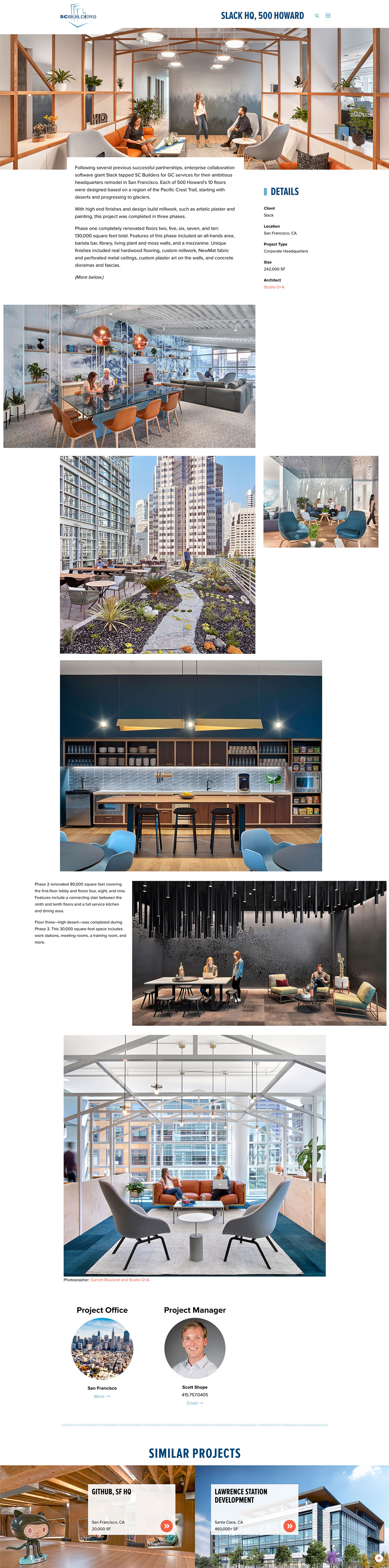
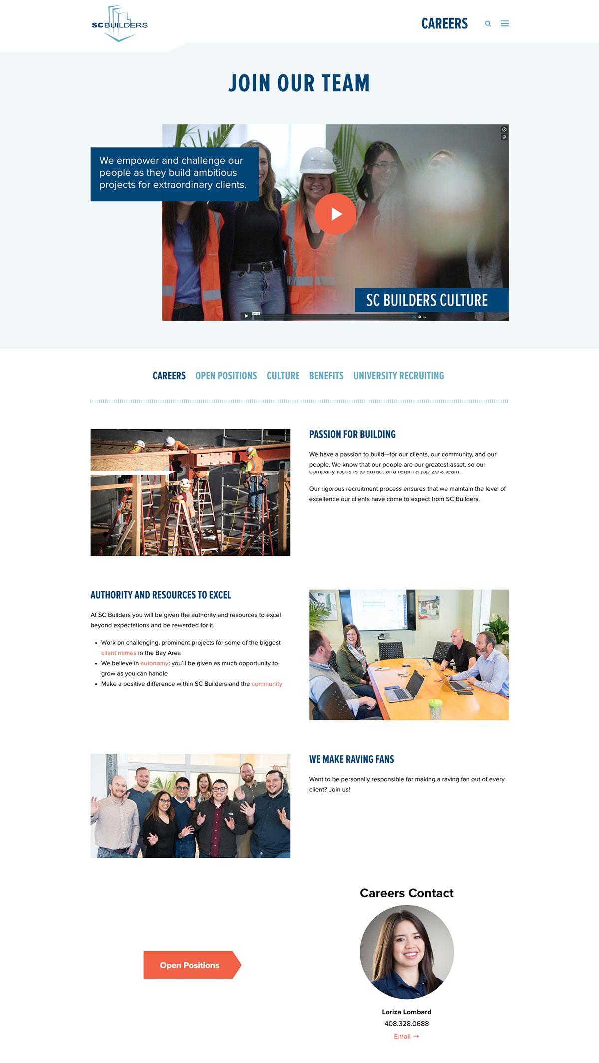
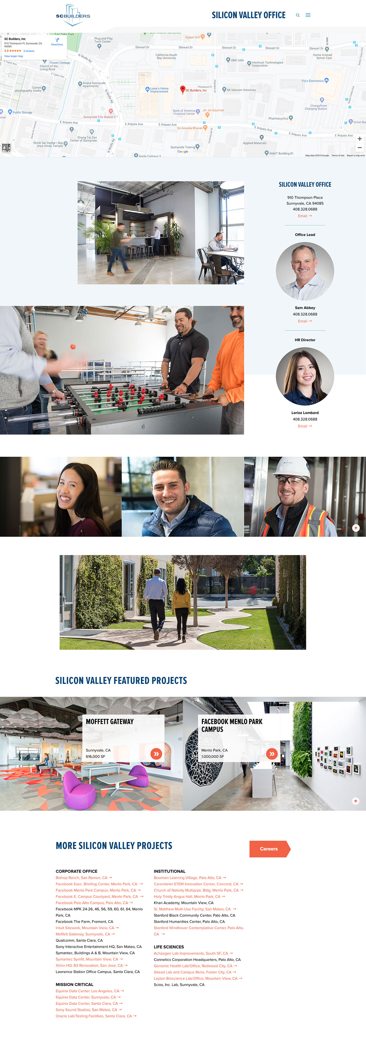
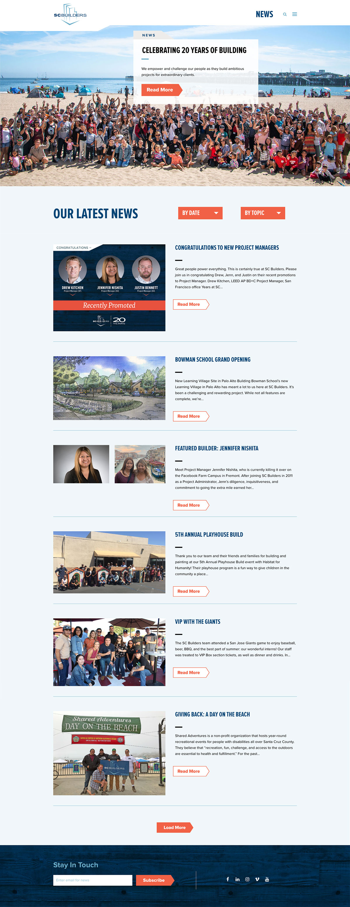
/ OBJECTIVE
We needed to create a site to hire and retain top commercial construction talent, establish branding for the website that becomes the benchmark for all SC Builders’ marketing communications, and boost repeat business from existing clients.
/ IDEA
By developing an evolved Careers section featuring outstanding SC staff to attract talent. We utilize video to allow prospects to hear directly from SC Builders staff.
Results
6 months after launch of new site vs. 6 months before
The new website looks AWESOME!!!!! It is honestly, hands down one of the best ones I’ve seen in the past few months. Vibrant, easy to read fonts, easy to move through it, great employee testimonials – I’m using it as an example for a couple clients in the next two weeks. Seriously – great job! I hope you get huge kudos and positive response because I was blown away. And I’ve seen a lot of websites.”
I was already familiar with SC Builders, but the website made it much easier for me to make the decision—it reinforced my decision. I’ve noticed that other construction companies have unclear or inconvenient websites with hodgepodge information, but I really appreciated your clear user interface. It felt like the content had a natural and logical flow. All the questions I had were answered.
Graphic Elements, Buttons
by davidlecours | Jan 5, 2019
/ SERVICES
Discovery & Recommendations
Strategy
Brand Foundation
Voice & Messaging
Brand Identity
Print Collateral
Digital Marketing
Website Design & Development
VISIT WEBSITE
/ AWARDS
SMPS MCA Awards:
✶ Best Rebrand
✶ Best Website
✶ Best Recruiting & Retention Promotion
/ BACKGROUND
After speaking at the SMPS Pacific Regional Conference in Portland, David was approached by Irina, the marketing director at Murray, Smith & Associates, Inc. (MSA), a nine-office, 155-person civil engineering firm in the Northwest. Handing him her business card, she confessed,
I know, we need your help.
/ CHALLENGE
While MSA marketing team members understood the value of branding, several owners were reluctant to invest in a rebrand. Business was strong and memories of a failed attempt at DIY rebranding and a false start with a consultant unfamiliar with A/E/C marketing lingered.
/ SOLUTION
To help MSA make an informed decision, we proposed the firm commit only to the Discovery Phase, including a review of its strategic plan, a brand audit rating 75 brand touchpoints, personal interviews with recent hires, and a competitive audit.
Brand foundation & messaging by LecoursDesign.
Imaginative
Fun
Dependable
Relateable
Sincere
/ THREE UNIQUES
Just the right size – We are large enough to employ diverse talent to solve your biggest challenges, yet small enough to genuinely care.
We’re Invested – We live where we work; we take project success personally.
We keep great company – We take care of our people, so they can take care of you.
/ CORE VALUES
We workshopped seven core values, which we later expressed on craft beer coasters. Each coaster is letterpressed with a value on the front, and more detail about its meaning on the back.
We make it happen. (Service)
We invest in us. (Improvement)
Our work goes on the fridge. (Quality)
Multiple Minds > 1 (Collaboration)
Work that works for you. (Flexibility)
We Engineer Fun (Fun)
We Give a $#!T (Passion)
We are a public infrastucture engineering firm, crafting the communities we live in.
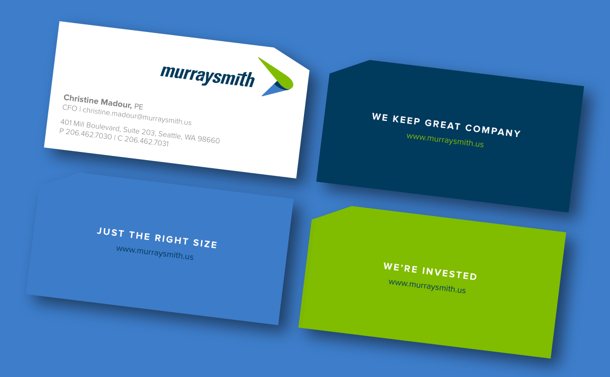
/ BEFORE REBRAND > BUSINESS CARD
Nine months after the rebrand, Murraysmith had a 40% increase in staff growth, a 30% increase in gross revenue, & 12+ new clients.
“You always have been so fantastic in what you did for us; more so, the story behind Murraysmith and how you went about the process, and how we are able to align where we are going. The story, foundation, and process are more important than anything else. You are and have been amazing so it is easy to give you great recommendations.”
–Chris Rayasam
Chief Executive Officer, Murraysmith