by davidlecours | May 20, 2020
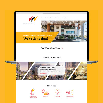
Michael Wall Engineering
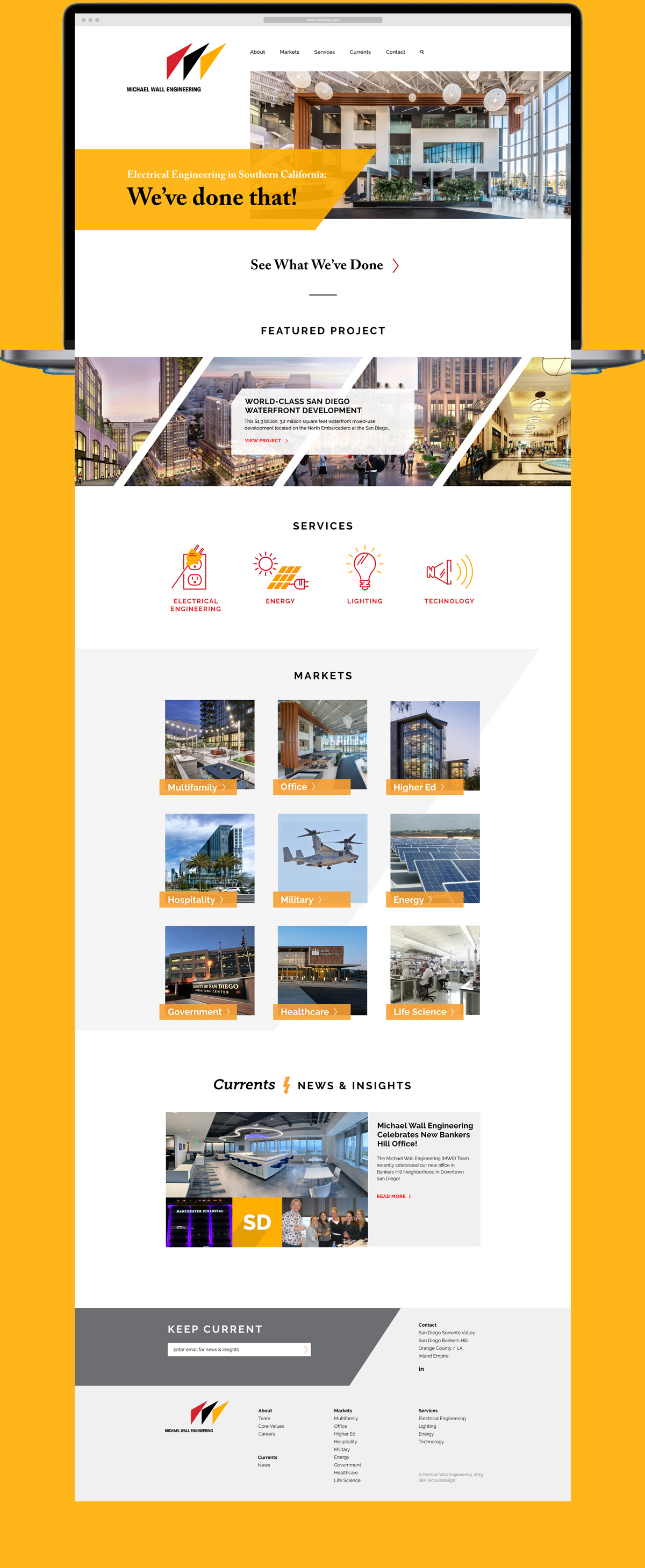
We’ve Done That, Twice!
C L I E N T
Michael Wall Engineering (MWE)
See Site
S E R V I C E S
Discovery, Insights & Recommendations,
Positioning, Core Values, Website Design,
Website Development
T H E B R I E F
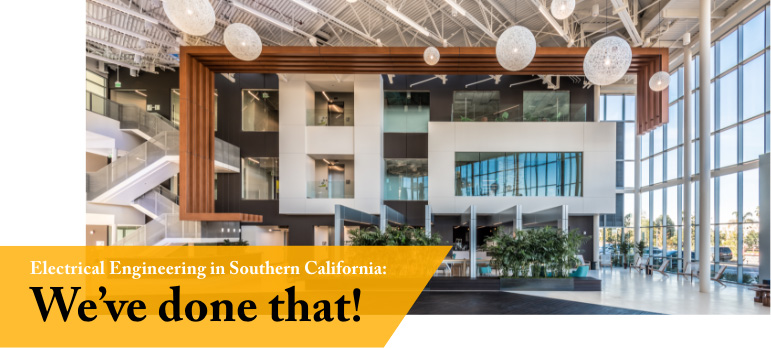
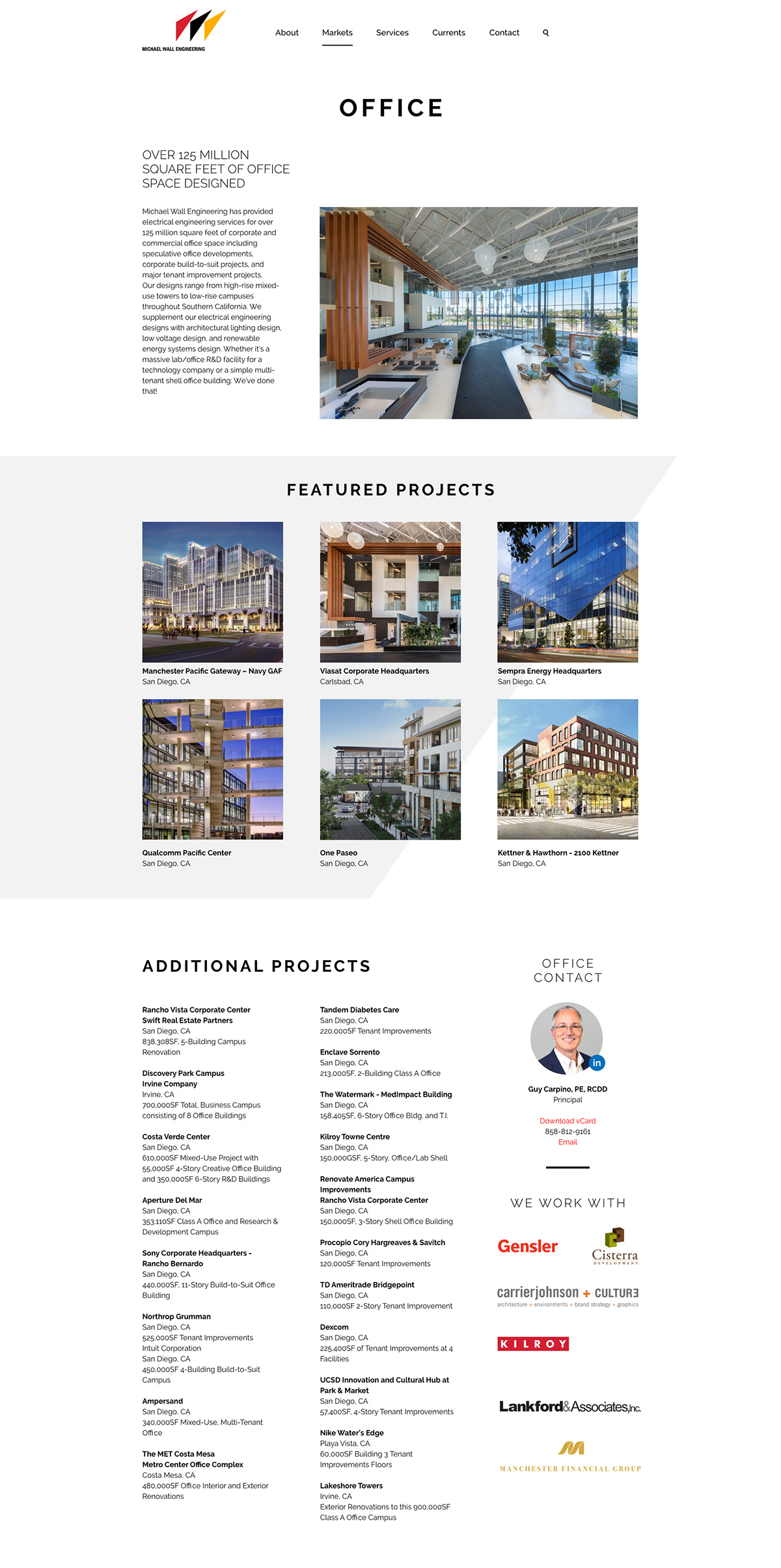
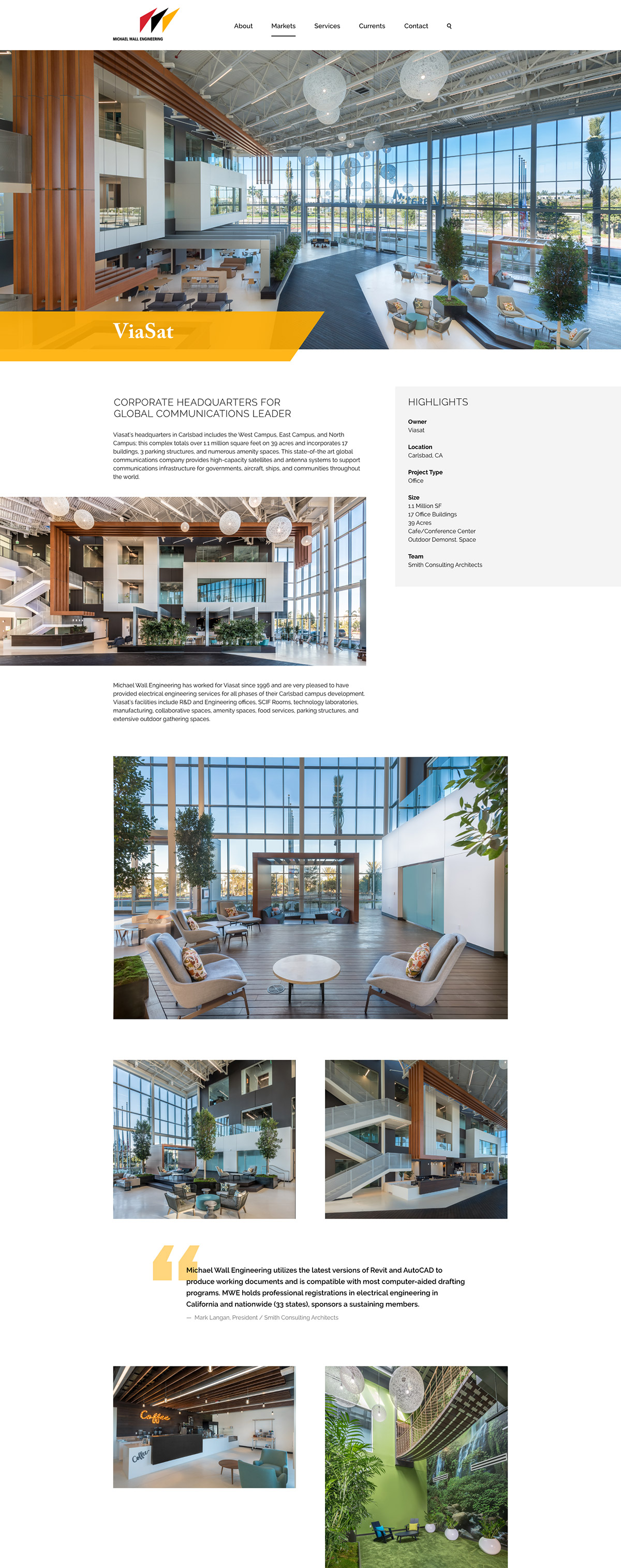
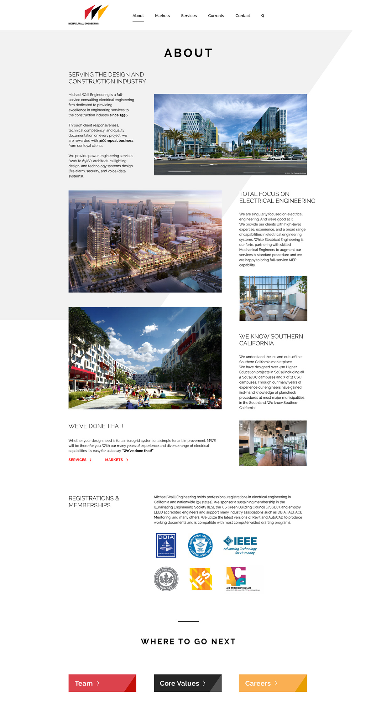
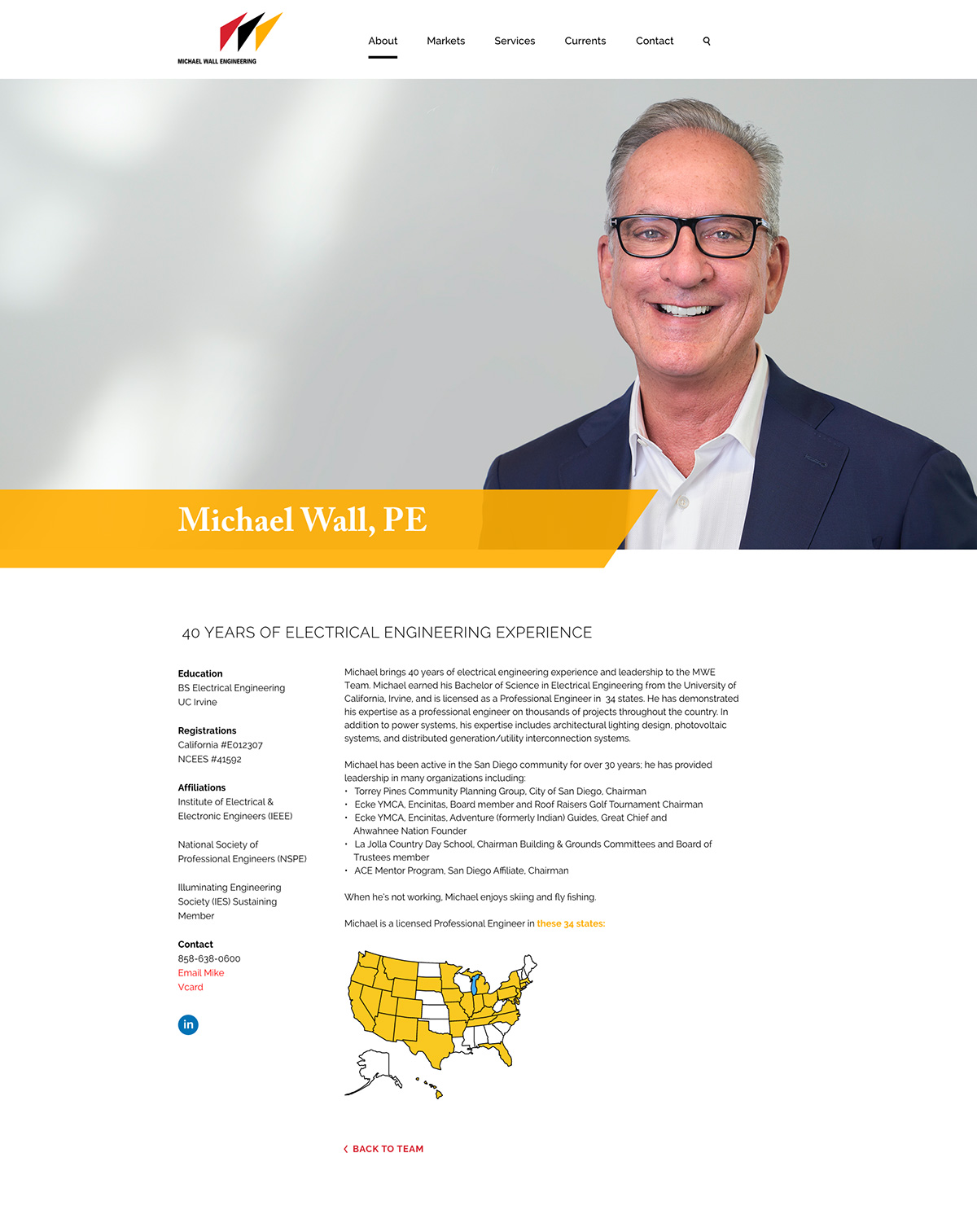
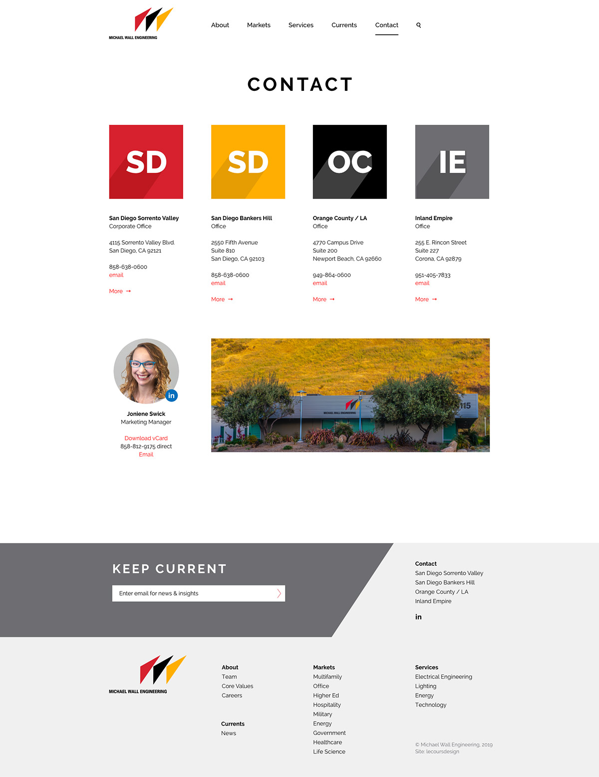
The original website we designed for MWE in 2012 was dated, especially on mobile. As part of a larger marketing overhaul, we launched a new responsive website for a great experience on desktop, tablet and mobile.
C R E A T I V E C O N C E P T
MWE already had a bold logo and color palette. We embraced the angle of the “3 sails” logo and the saturated red, yellow and black throughout the new site.
Results
3 months before launch (old site) vs. 3 months after launch (new site).
We are very happy with the site and get lots of positive feedback from clients, recruits, and employees. It’s been very beneficial to our business especially during this time when we can’t interact with folks in person.”
–Michael Wall, PE, Principal
T H R E E U N I Q U E S
Lecoursdesign led a half-day workshop with firm leaders to generate a lengthy list, then narrow firm attributes to three unique differentiators:
Electrical Engineering – We are singularly focused on electrical engineering, not mechanical and plumbing.
Southern California – We understand the ins and outs of the Southern California marketplace.
We’ve Done That! – With deep expertise in a diverse range of electrical capabilities, it’s easy for us to say, “we’ve done that!”
P O S I T I O N I N G S T A T E M E N T
From the three uniques, we developed a positioning statement that differentiates MWE from their competition.
B R A N D P E R S O N A L I T Y
Before designing the website, we created five brand personality attributes to guide all future marketing communication materials.
Approachable
Dependable
Accomplished
Imaginative
Sophisticated
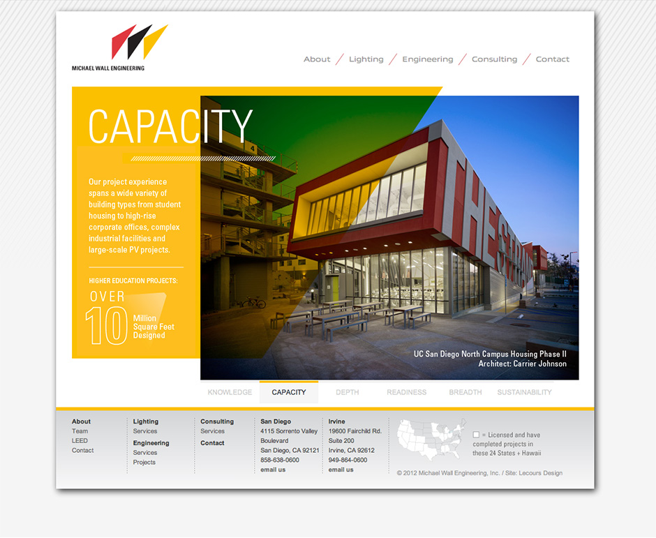
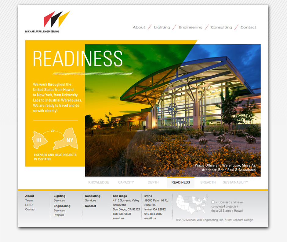
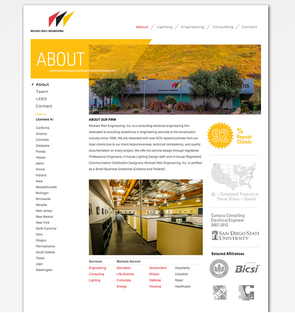
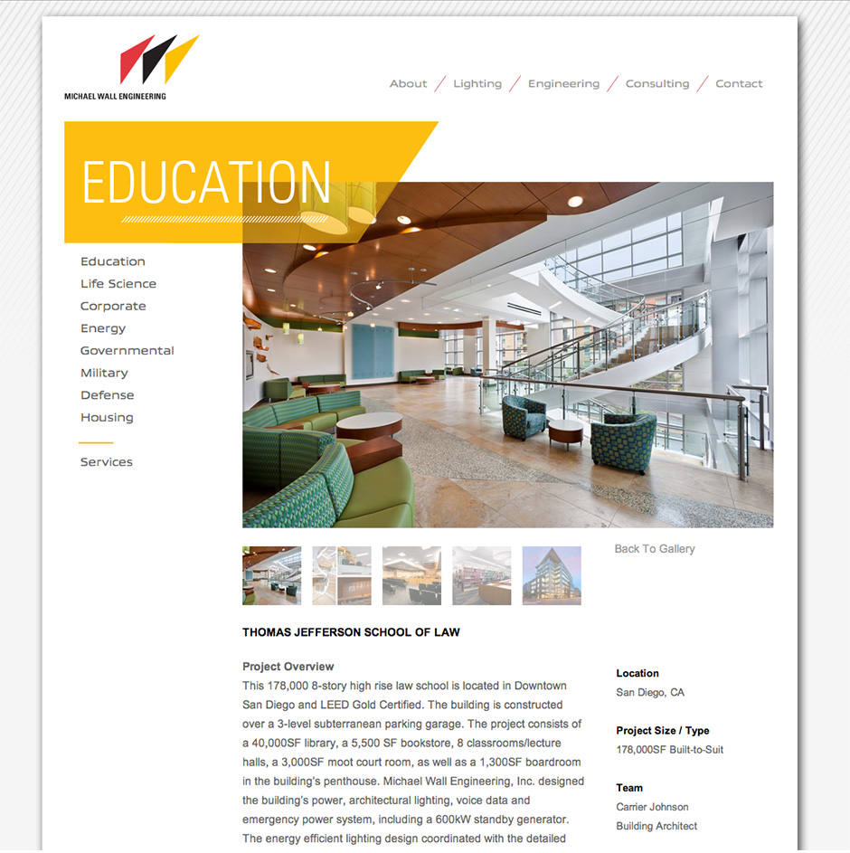
Old Site (Before Redesign)
by davidlecours | Jan 30, 2020
C L I E N T
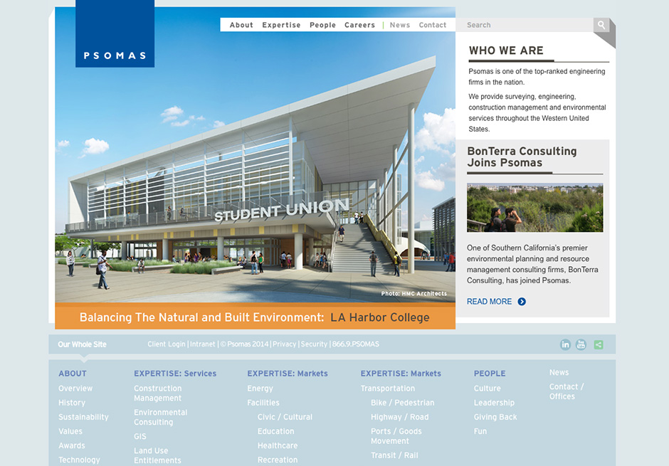
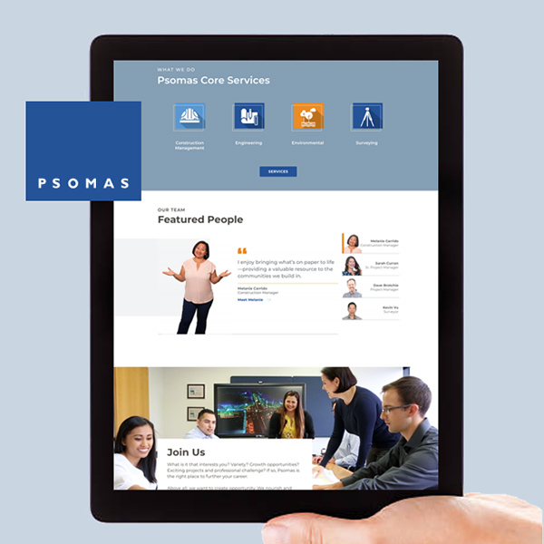
Psomas
View the actual site
S E R V I C E S
Website Strategy, Design and Development
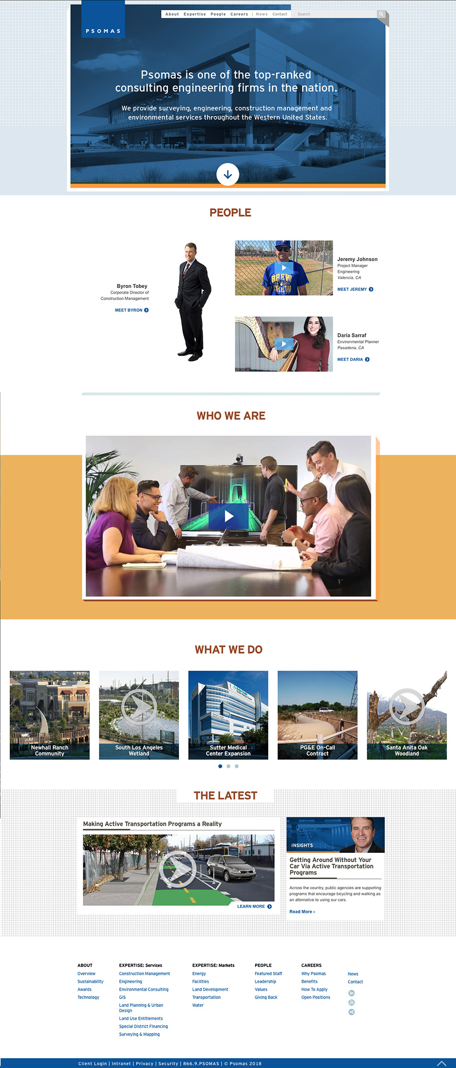
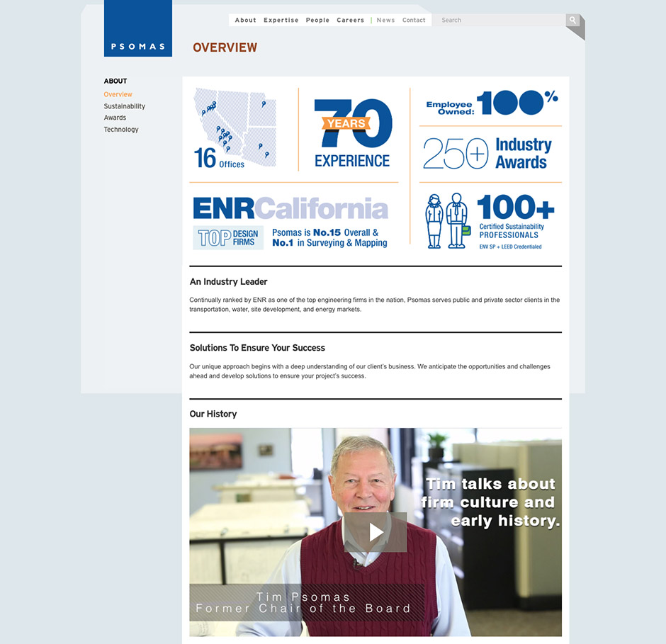
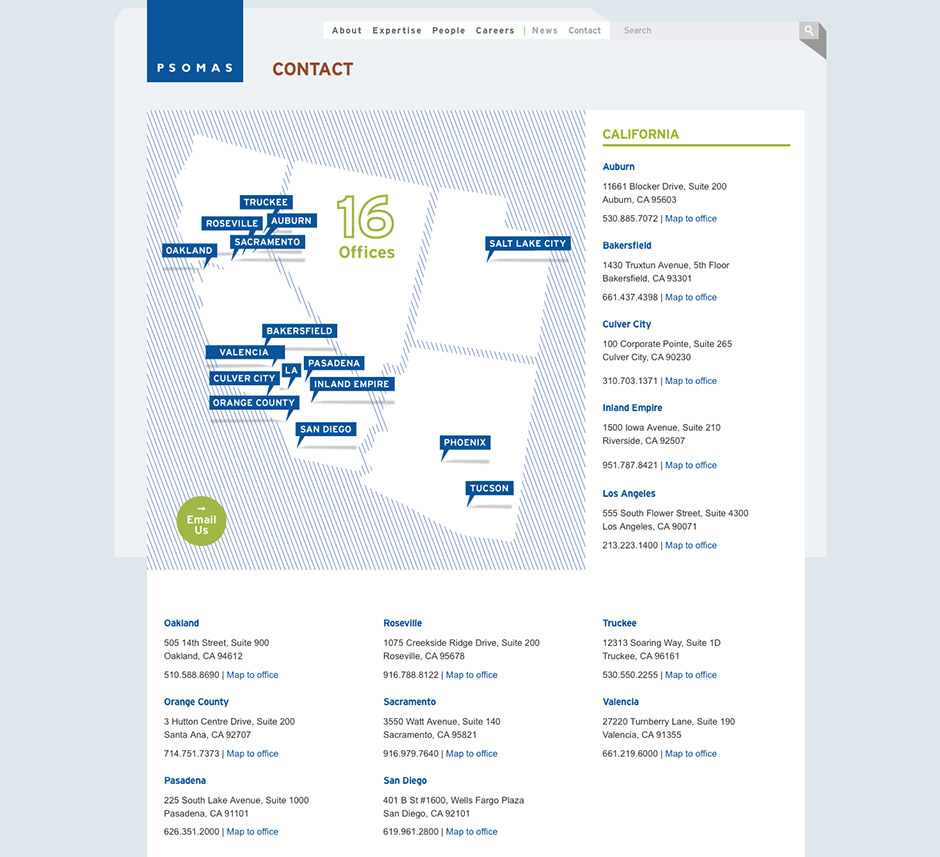
T H E B R I E F
After designing the two previous versions of the Psomas website, LecoursDesign were thrilled to have the opportunity to design and develop the latest iteration.
C R E A T I V E C O N C E P T
The site features a full-width design to immerse the visitor. An updated color palette complements the core brand colors. Custom icons were designed for the core services. A simplified design helps the photography and copywriting be more impactful.
Results
3 months before launch (old site) vs. 3 months after launch (new site).
Previous Versions of the Psomas Website
by davidlecours | Oct 21, 2019
/ SERVICES
Website Planning
Prototyping
Design
Custom Illustrations
Development
VISIT WEBSITE
/ OBJECTIVE
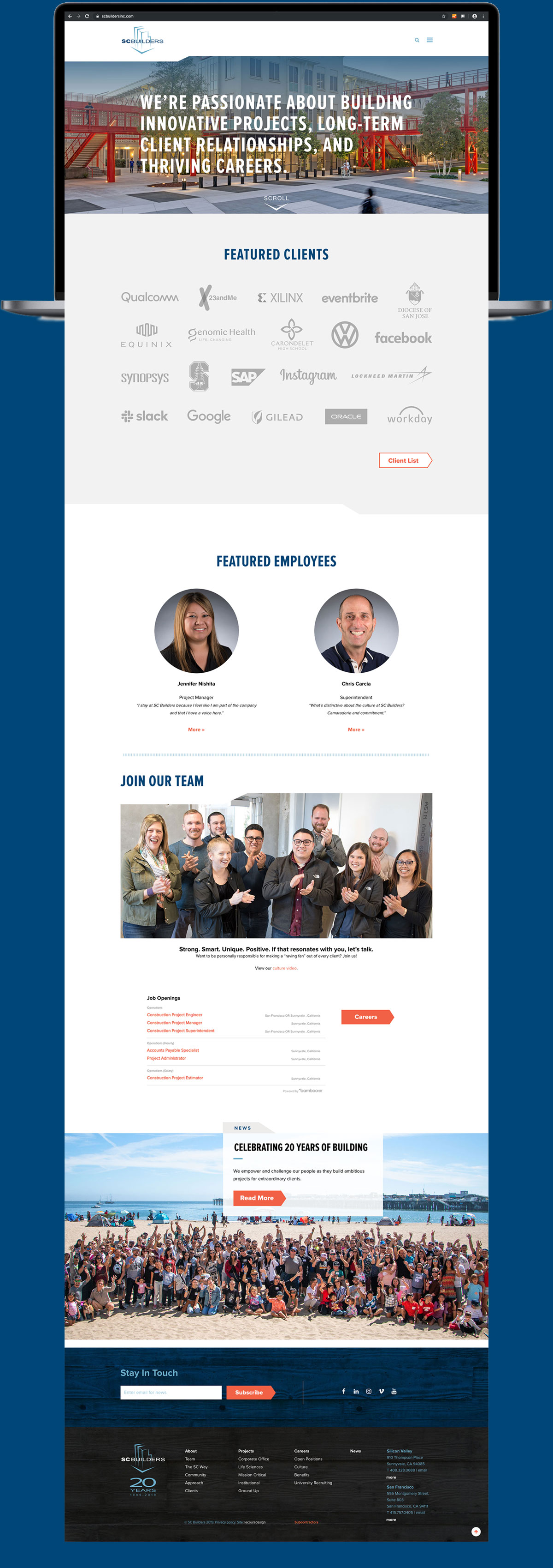
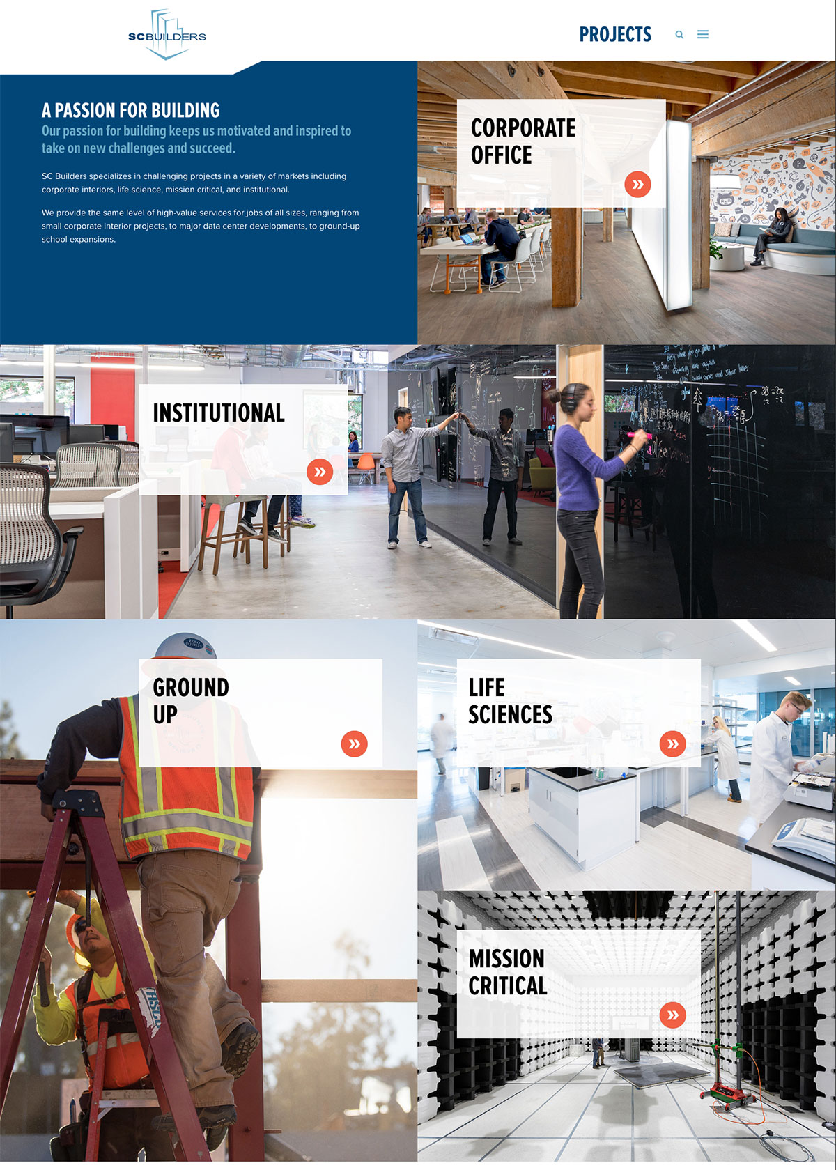
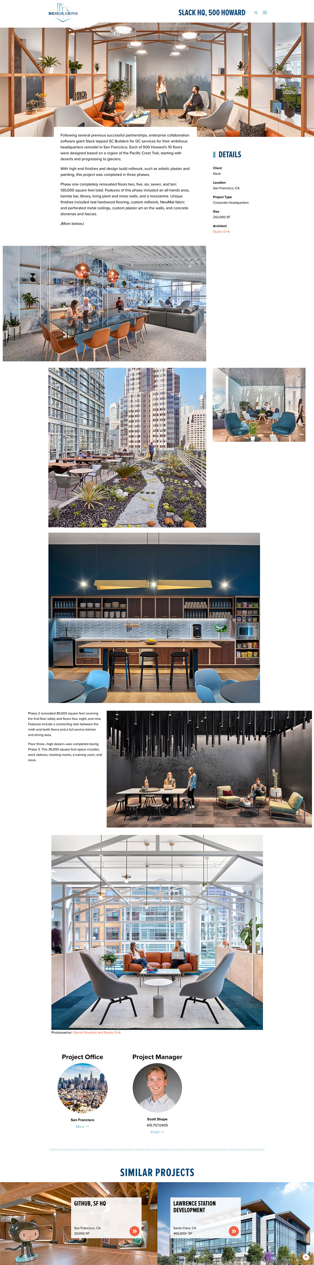
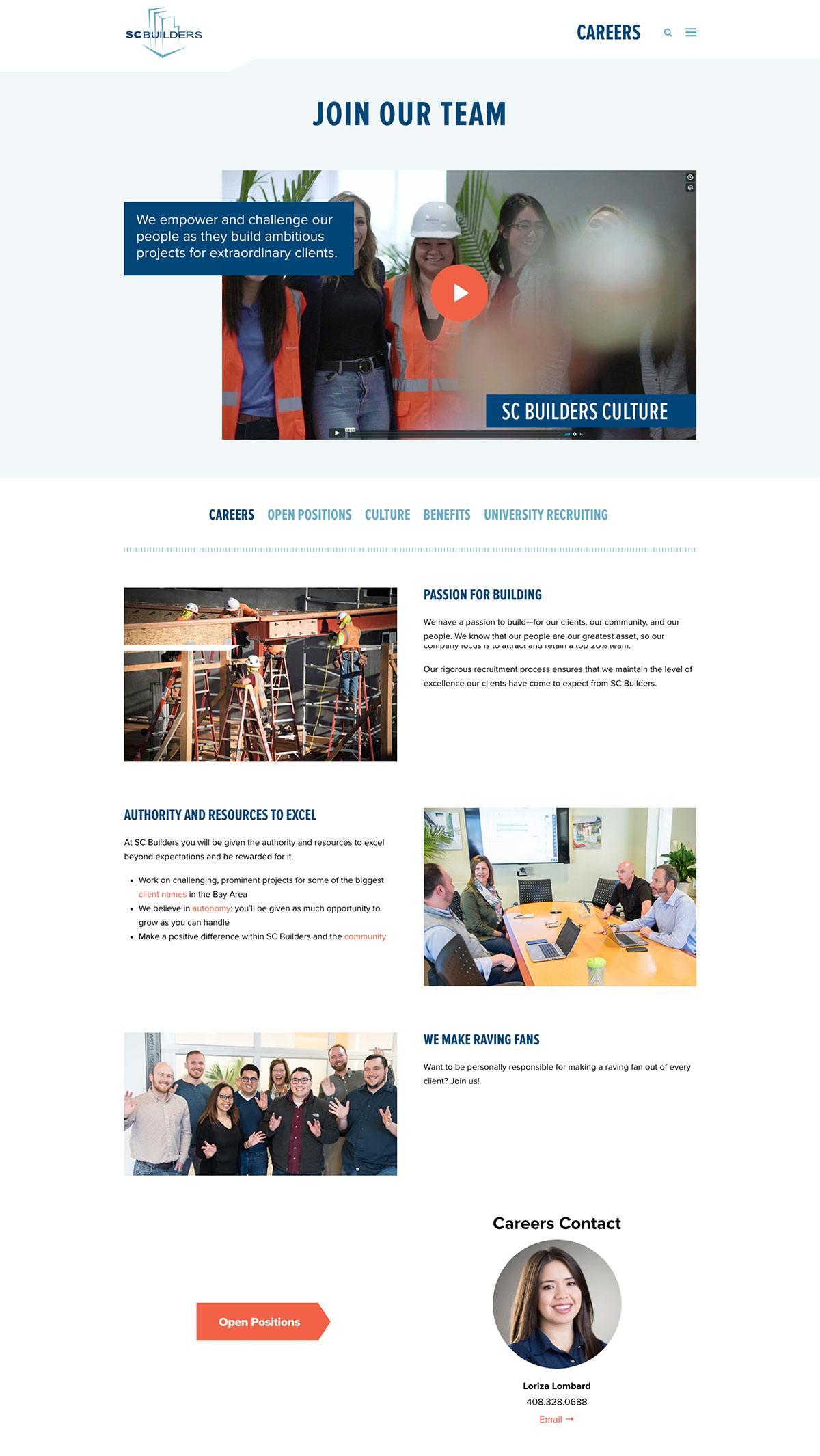
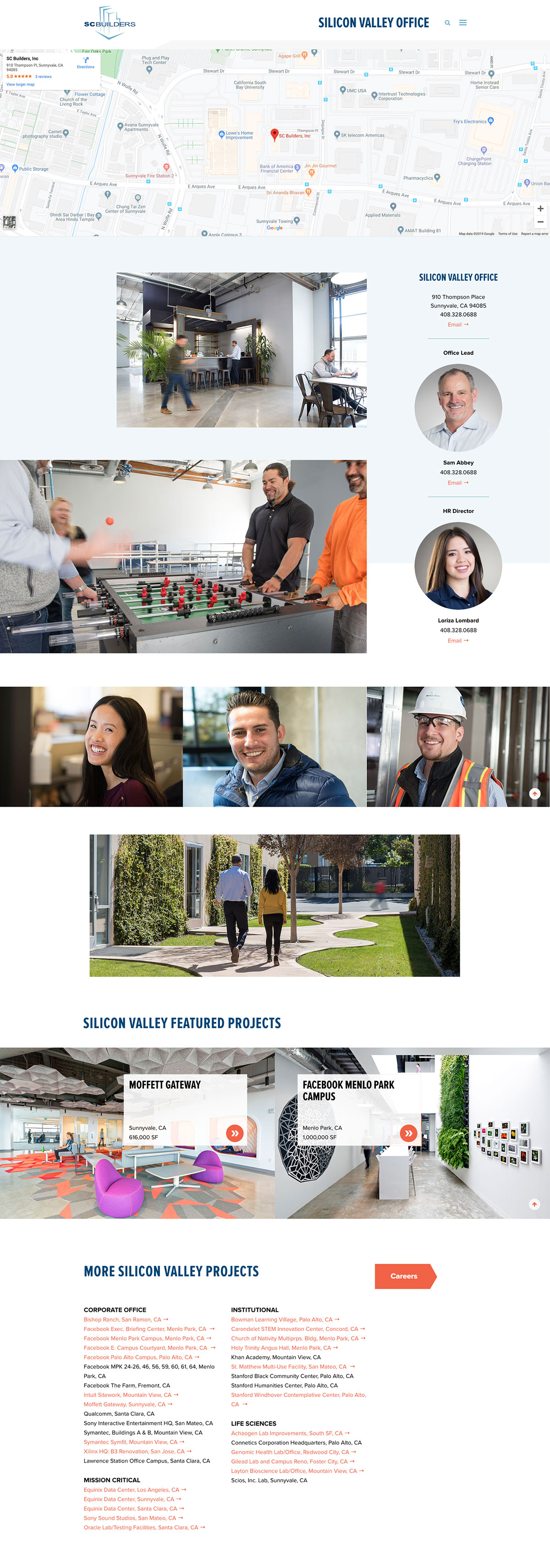
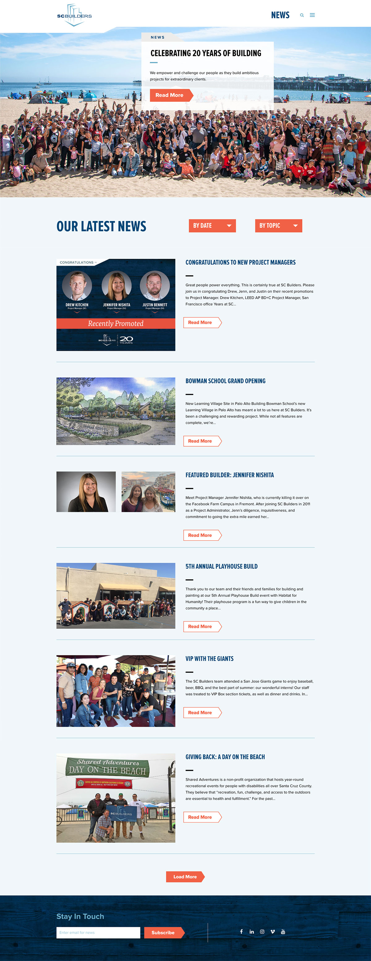
We needed to create a site to hire and retain top commercial construction talent, establish branding for the website that becomes the benchmark for all SC Builders’ marketing communications, and boost repeat business from existing clients.
/ IDEA
By developing an evolved Careers section featuring outstanding SC staff to attract talent. We utilize video to allow prospects to hear directly from SC Builders staff.
Results
6 months after launch of new site vs. 6 months before
The new website looks AWESOME!!!!! It is honestly, hands down one of the best ones I’ve seen in the past few months. Vibrant, easy to read fonts, easy to move through it, great employee testimonials – I’m using it as an example for a couple clients in the next two weeks. Seriously – great job! I hope you get huge kudos and positive response because I was blown away. And I’ve seen a lot of websites.”
I was already familiar with SC Builders, but the website made it much easier for me to make the decision—it reinforced my decision. I’ve noticed that other construction companies have unclear or inconvenient websites with hodgepodge information, but I really appreciated your clear user interface. It felt like the content had a natural and logical flow. All the questions I had were answered.
Graphic Elements, Buttons
by davidlecours | Nov 30, 2018
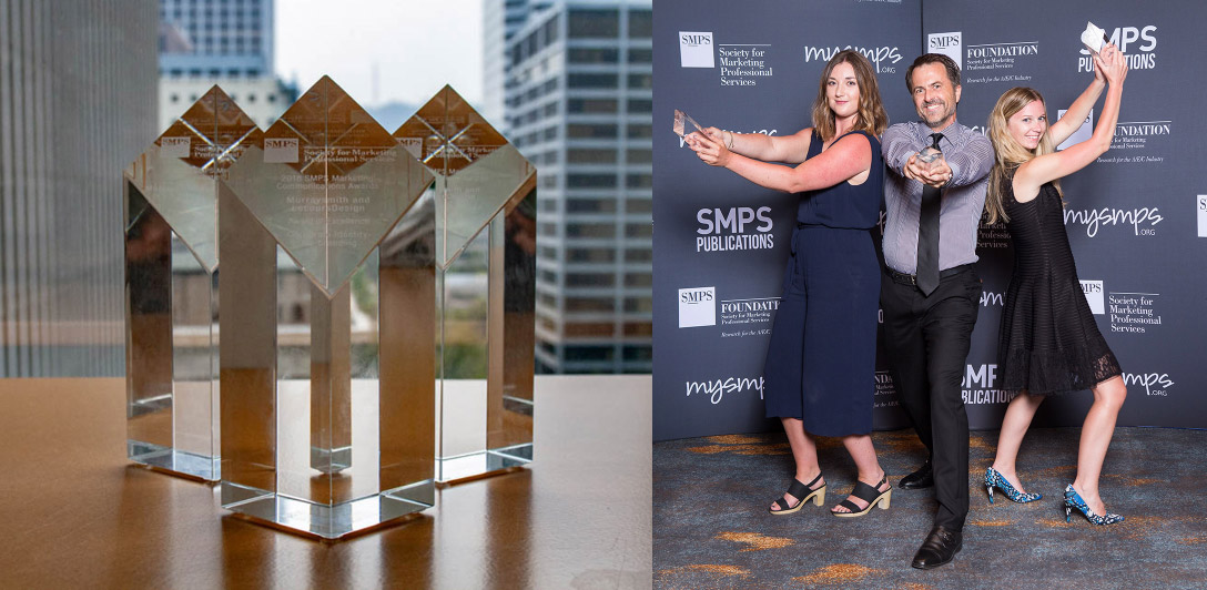
Murraysmith: Won Best Website at SMPS Marketing Communication Awards
/ SERVICES
Discovery & Recommendations
Strategy
Brand Foundation
Voice & Messaging
Brand Identity
Print Collateral
Digital Marketing
Website Design & Development
VISIT WEBSITE
/ OBJECTIVE
After speaking at the SMPS Pacific Regional Conference in Portland, David was approached by Irina, the marketing director at Murray, Smith & Associates, Inc. (MSA), a nine-office, 155-person civil engineering firm in the Northwest. Handing him her business card, she confessed,
I know, we need your help.
/ IDEA
While MSA marketing team members understood the value of branding, several owners were reluctant to invest in a rebrand. Business was strong and memories of a failed attempt at DIY rebranding and a false start with a consultant unfamiliar with A/E/C marketing lingered.
To help MSA make an informed decision, we proposed the firm commit only to the Discovery Phase, including a review of its strategic plan, a brand audit rating 75 brand touchpoints, personal interviews with recent hires, and a competitive audit.
Results
9 months before website launch vs. 9 months after
The new website is the most important recruiting tool we have. Every candidate we talk with at career fairs and interviews mentions how impressive our website is and how they are excited to join the culture that is reflected on the site. In January, three out of 10 people hired sought us out because of our website. It makes my job easier.”
–Murraysmith HR Director
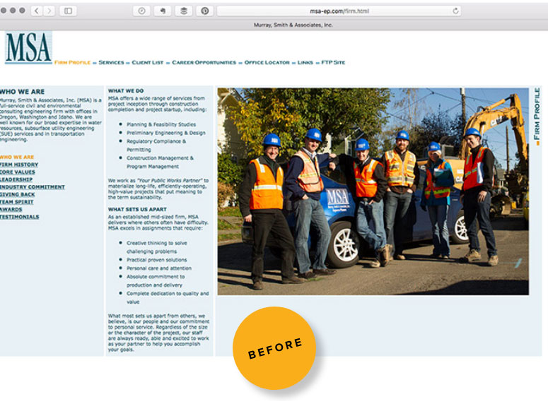
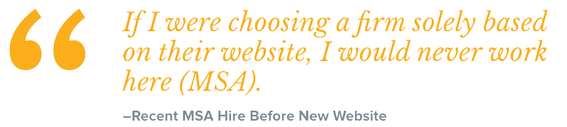
Current Site Repels Talent
When a recent hire declared, “If I were choosing a firm solely based on its website, I would never work here,” it was clearly time for a new site.
The existing site didn’t effectively convey the firm’s culture. Though there were lots of facts, it lacked emotional appeal. Small, dated images and an awkward navigation system contributed to a poor user experience. And the site wasn’t optimized for mobile and tablet users.
Primary Goal: the new site is to attract talent by showing what it’s like to work at Murraysmith.
Site Updates Are Impossible
Since the site was hard-coded without the use of a content management system (CMS), nobody within the firm could make updates. As a result, fresh content that users value and Google rewards in search rankings was not being added.
Goal: Instead of updating the site every twenty years, allow staff to update the site daily. Build a custom site, then train staff on a fun-to-use content management system.
S T R A T E G Y, T H E N D E S I G N
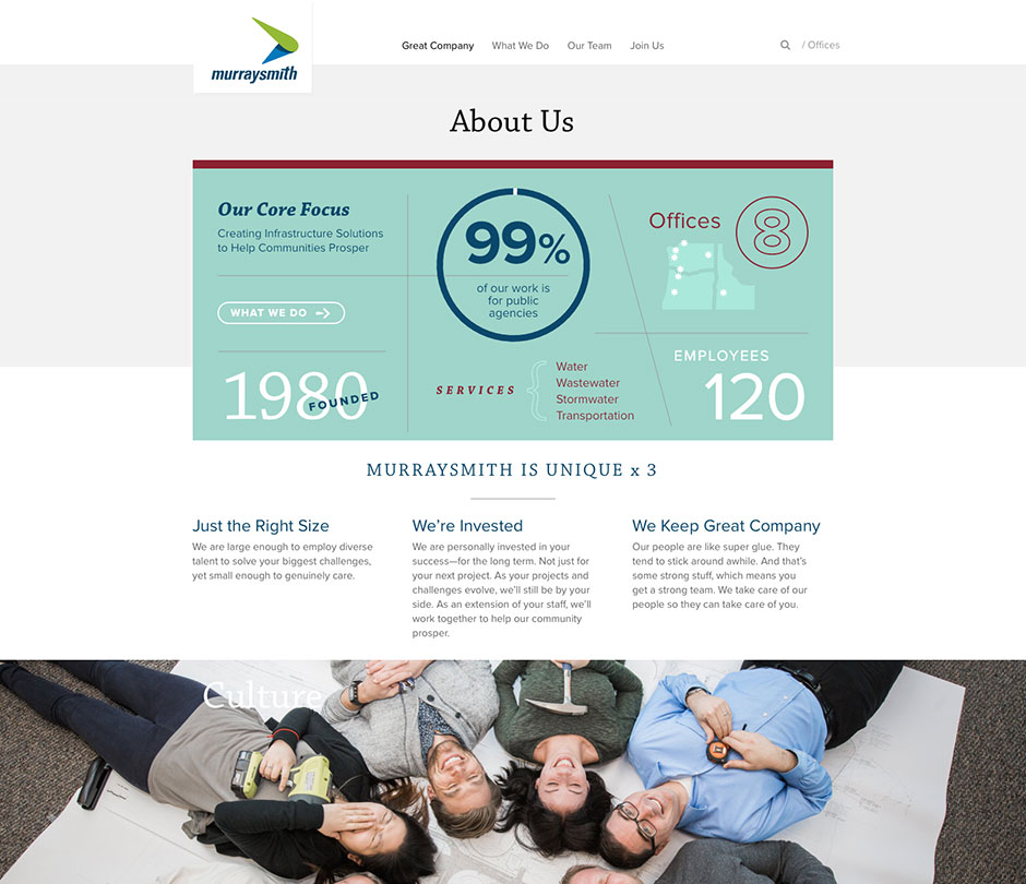
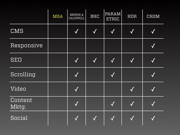
The project began with a Discovery Phase that included an audit of the current 20-year-old site as well as several competitor websites to assess how MSA compares in the digital landscape. This competitive audit revealed how much the site lacked in terms of modern website attributes.
Because a great website is rooted in brand strategy, we summarized the website strategy in a five-page strategic brief outlining the why, what, who (both users and internal resources), when and how of the new site.
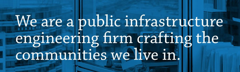
P O S I T I O N I N G S T A T E M E N T
From the strategic brief, we develop the positioning statement shown on the left.
It defines the firm type (engineering), who it serves (communities) and how it is unique (public infrastructure and we live where we work).
B R A N D P E R S O N A L I T Y
Before developing the new firm name and logo, we established five brand personality attributes to guide all future marketing communication materials and activities.
Imaginative
Dependable
Relatable
Sincere
Fun
U S E R P E R S O N A S
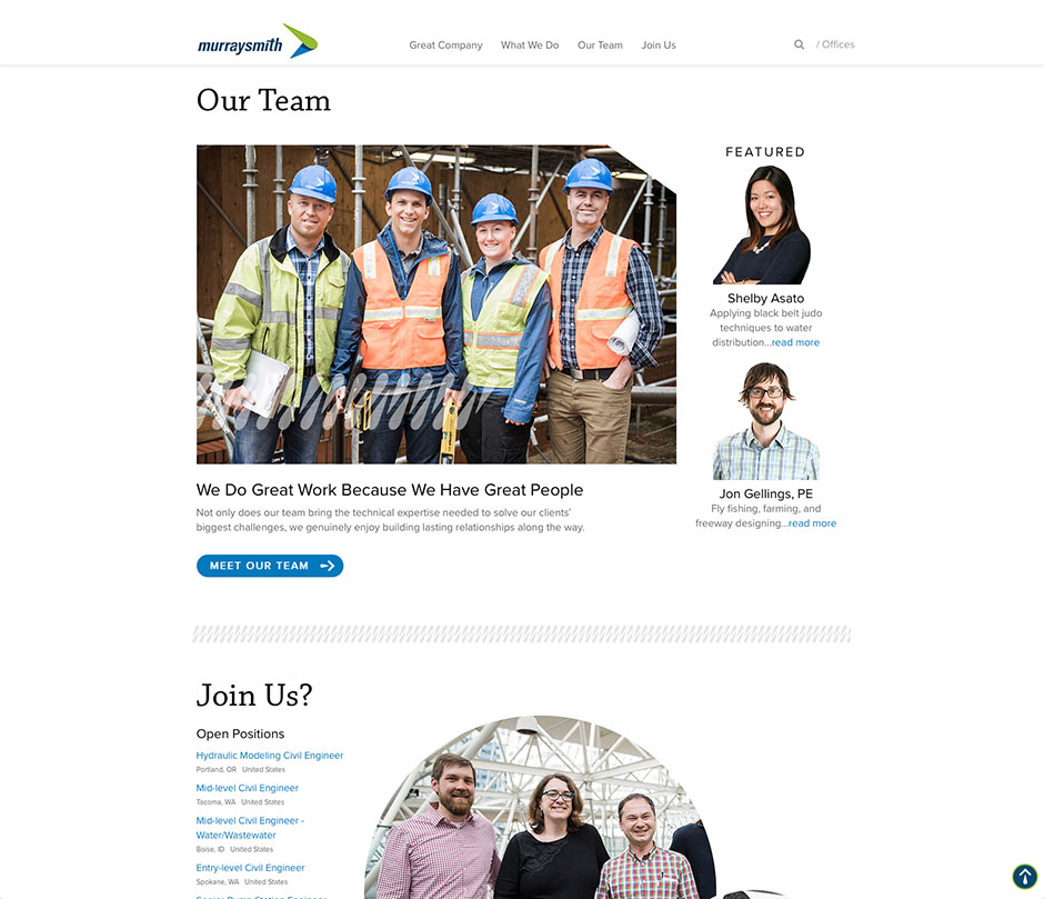
The primary goal of the new site was to attract talent by showcasing what it’s like to work at Murraysmith. To ensure the site effectively communicated with prospective employees, we developed two fictitious user personas.
Ben, 36 Seeks a Sr. Civil Engineer Role
Unhappy with slow advancement at a global firm, he knows he could become a senior leader quickly at Murraysmith. He wants to get to know the firm leaders he would be working with and see some hero projects.
Katie, 22 Seeks Engineer-in-Training Role
About to graduate from Oregon State, she finds a blog post on the Murraysmith site titled “How to Interview at Engineering Firms.” She wants to know if there are openings in her hometown of Boise, ID.
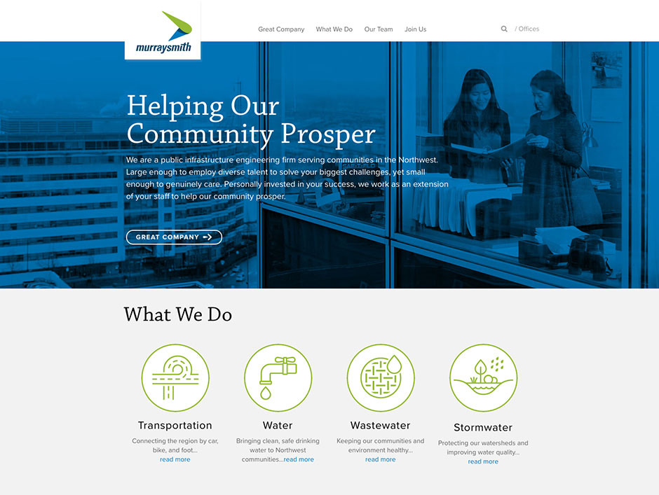
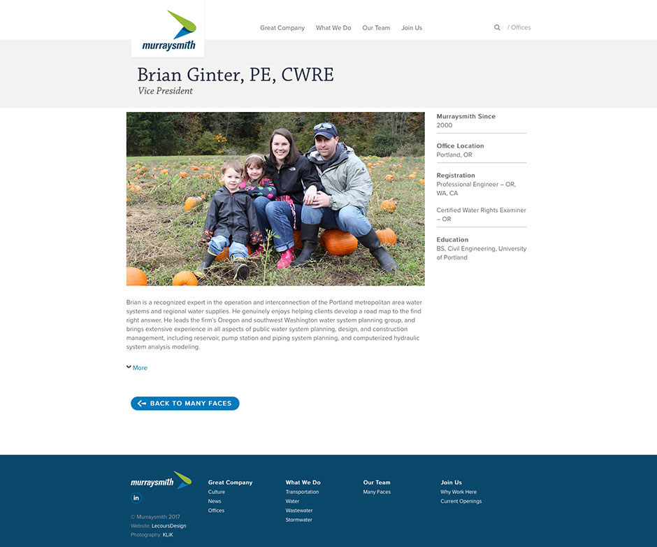
N E W D E S I G N A N D P H O T O G R A P H Y
Through graphic design, color and typography, the new site reflects the firm’s new core values, unique attributes and brand personality. Fresh, custom photography by Klik, demonstrates that MurraySmith is a fun place to work. The site’s responsive design provides an optimum user experience on desktop monitors, tablets and mobile devices. The main navigation at the top of each page is simple, with only four buttons and a powerful search feature. As users scroll down a page, the main navigation “sticks” to the top of the page to minimize scrolling. The footer of every page includes a sitemap to help users find exactly what they’re looking for and discover something new.
E A S Y T O U P D A T E
A custom, fun-to-use content management system allows staff to quickly update the site on an ongoing basis.
N E W U R L
For simplicity, memorability and consistency with the new Murraysmith brand name, we recommended a new URL:
www.murraysmith.us
The previous URL, www.msa-ep.com, automatically redirects to the new site.
Recognition
LecoursDesign/Murraysmith earned the “best website” award at the 2018 SMPS Marketing Communications Awards.
The website and rebranding is fresh and unique. Great research and planning, tied nicely to strategic plan! They clearly set out to rebrand their website as a recruitment/retention tool—did a good job at each stage. Outstanding results!”
–Awards Juror