by davidlecours | Nov 22, 2022
/ SERVICES
User Research
Experience Design
Web Development
Strategy
Digital Marketing
VISIT WEBSITE
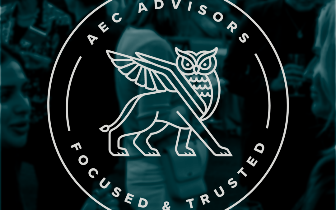
/ OBJECTIVE
The old AEC Advisors site, built on a generic template, was very limiting. As part of a rebrand, the new site includes event registration, job posts, Salesforce integration, and interactive sorting of all their deals.
AEC Advisors offers bespoke M&A and corporate finance consulting – the new website needed to reflect the range of their work.
/ IDEA
The angled graphic “up and to the right”, represents increased value. This is a visual theme used throughout the site. We utilized custom illustrations for services, professional photography & video, and elegant typography to communicate the best-in-class nature of AEC Advisors.
Thank you all for making this happen for our company. Helping us elevate our brand and hit our goal to roll it out at our biggest event of the year: the CEO Summit. I tell people that hiring LecoursDesign was the best decision we made to take us to the next level.
Tyler Albright
Co-Founder & Partner, AEC Advisors
by davidlecours | Dec 15, 2021
/ SERVICES
User Research
Experience Design
Strategy
Web Development
VISIT WEBSITE
/ OBJECTIVE
The old site was built on a proprietary CMS that bundled the website, email marketing, and event marketing — making changes and updating the site was difficult.
“If we cringe looking at our own site, then so do prospective clients and employees.”
/ IDEA
The new site is visually and strategically consistent with the rebrand. Now it uses video to attract clients and talent to the unique culture of the company. We increased the image sizes, added custom illustrations, used new typography, and introduced a mobile-first navigation system for a seamless mobile and desktop experience.
by davidlecours | Jul 29, 2021
/ SERVICES
Digital Strategy
Web Design
Web Development
VISIT WEBSITE
/ AWARDS
SMPS San Diego Awards:
✶ Best Website
/ OBJECTIVE
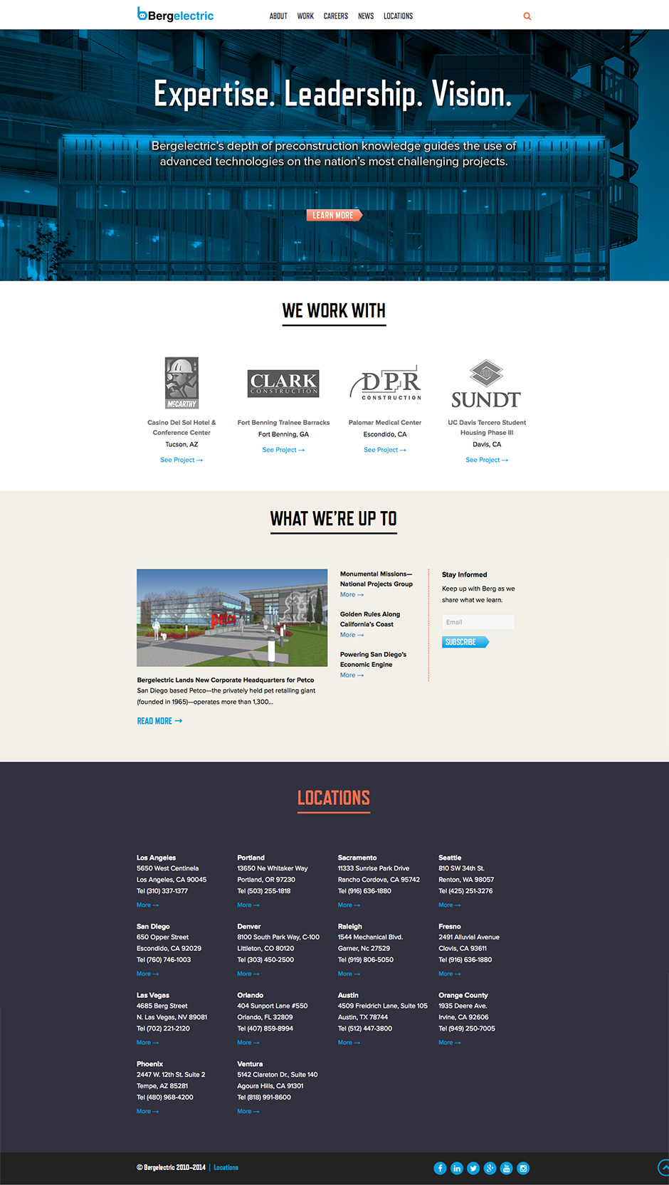
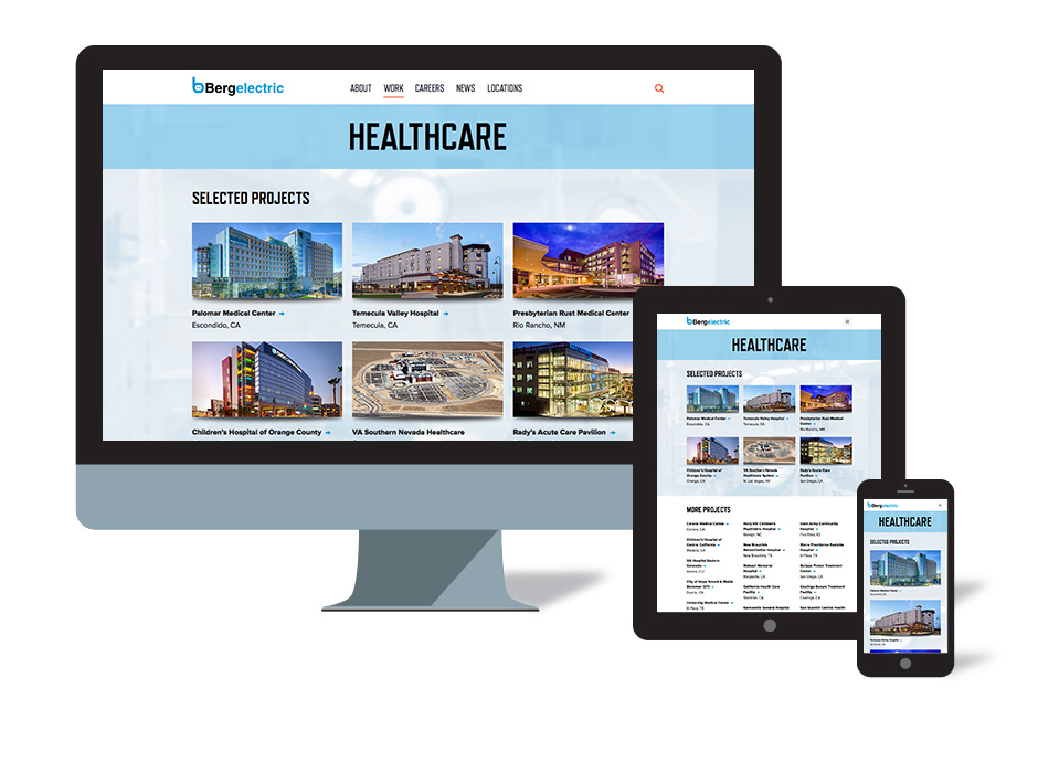
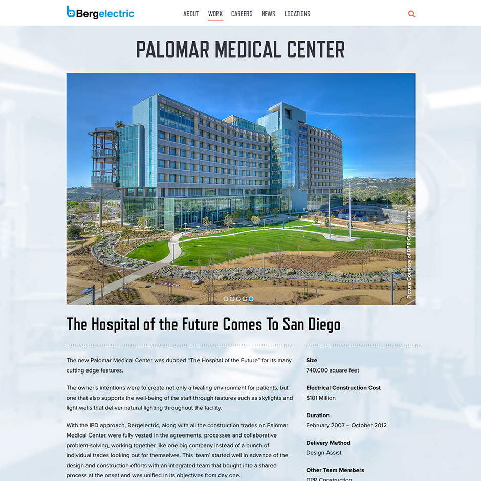
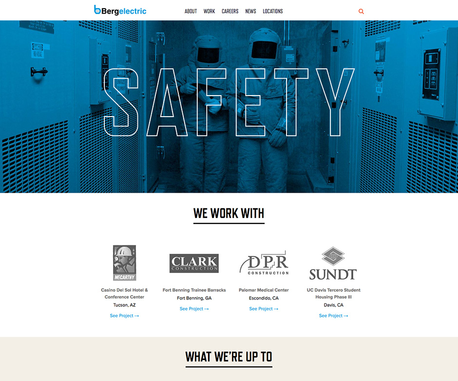
Six years after designing the SMPS San Diego “Best Website” for Bergelectric, it was time to redesign the site to help the company grow from 2800 to 3200 people.
/ IDEA
The new site uses video to attract talent and clients to the unique culture of the company. We increased the image sizes, added custom illustrations, new typography, and introduced a mobile-first navigation system for a seamless mobile and desktop experience.
Six months before VS. Six months after the new site:
Previous Site, also by LecoursDesign
by davidlecours | Jun 5, 2021
BRAND FOUNDATION & WEBSITE
/ SERVICES
Brand Foundation
Collateral
Voice & Messaging
Experience Design
Web Development
VISIT WEBSITE
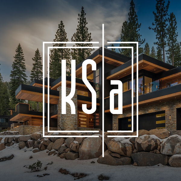
/ OBJECTIVE
After completing brand strategy, messaging, and project descriptions, we designed SOQ and proposal templates. These looked so good, KSA hired us to redo their website.
The new website creates a better mobile experience, features the team, and shows off a curated global portfolio of homes.
/ IDEA
KSA already had a strong logo and color palette. With such powerful project photography, we kept the design of the website “quiet” so that their work, not ours, is what gets noticed.
Brand foundation & messaging by LecoursDesign.
We love designing timeless homes and building lasting relationships.
/ CORE VALUES
Weave Creativity and Reality
Our work is as buildable as it is innovative.
Collaborate with Courage
Build on the strengths of our practice through gratitude and teamwork.
Details Make the Design
Paying attention to details embeds character in our work.
Be Humble
Remain open to brilliance emerging from unexpected sources.
Communicate with Candor
Transparency, truth, and vulnerability are essential when interacting with clients
and teammates.
/ BRAND PERSONALITY
Before designing the website, we created five brand personality attributes to guide all future marketing communication materials:
Distinctive
Imaginative
Timeless
Approachable
Passionate
by davidlecours | May 20, 2020
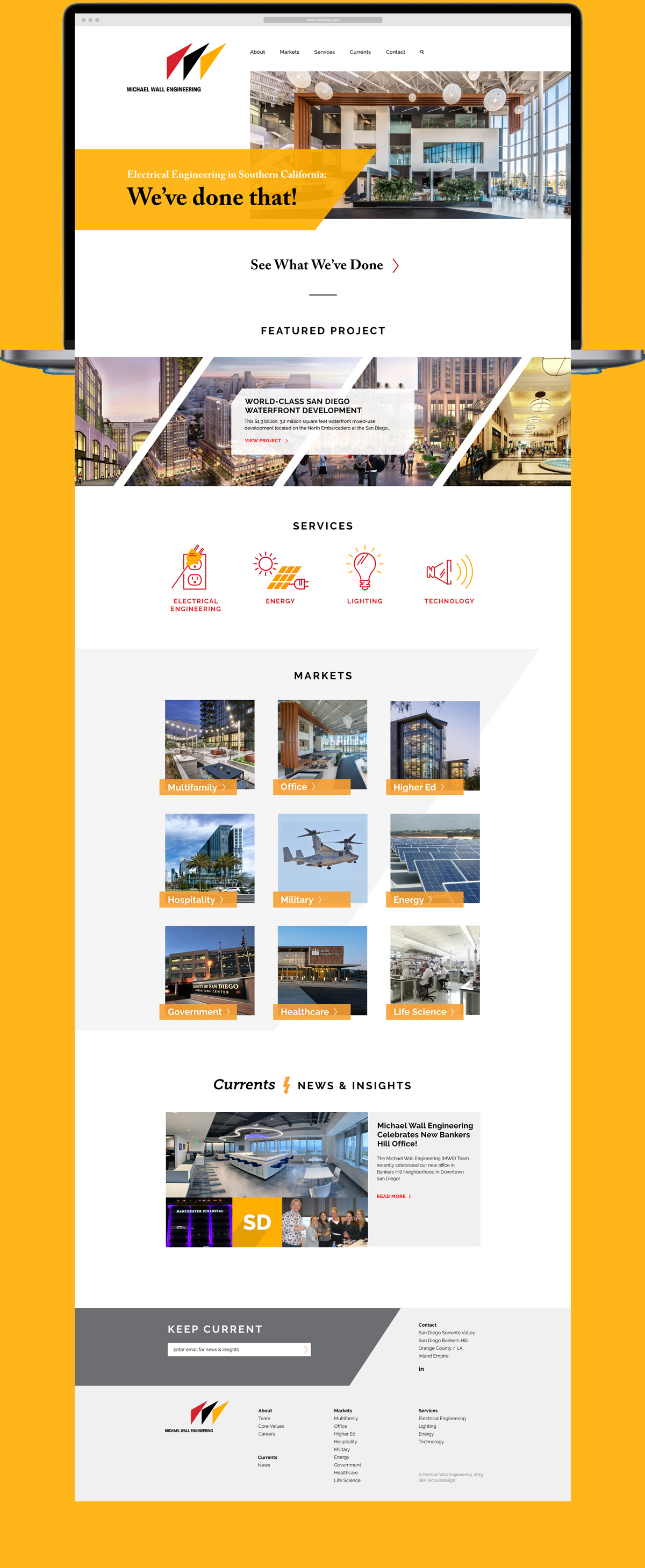
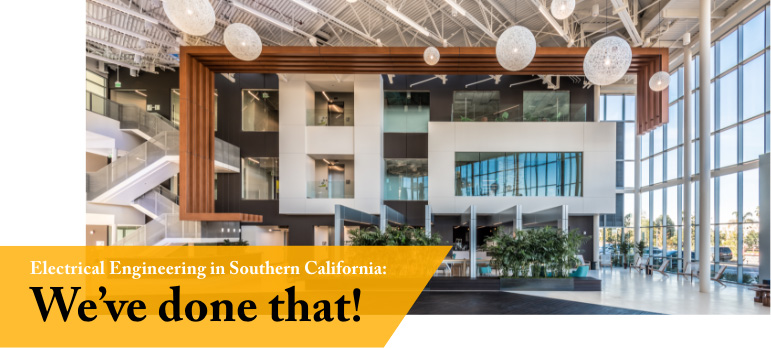
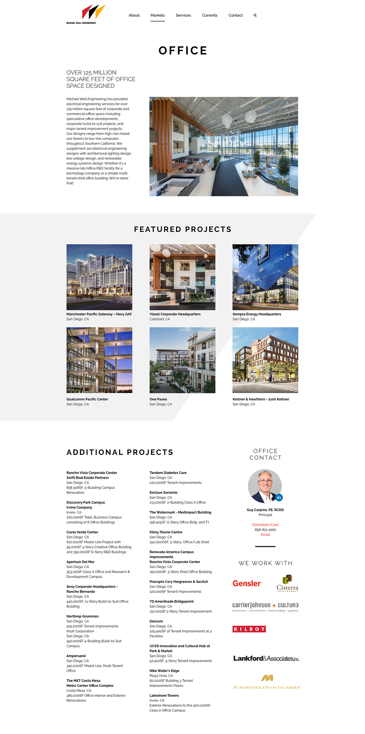
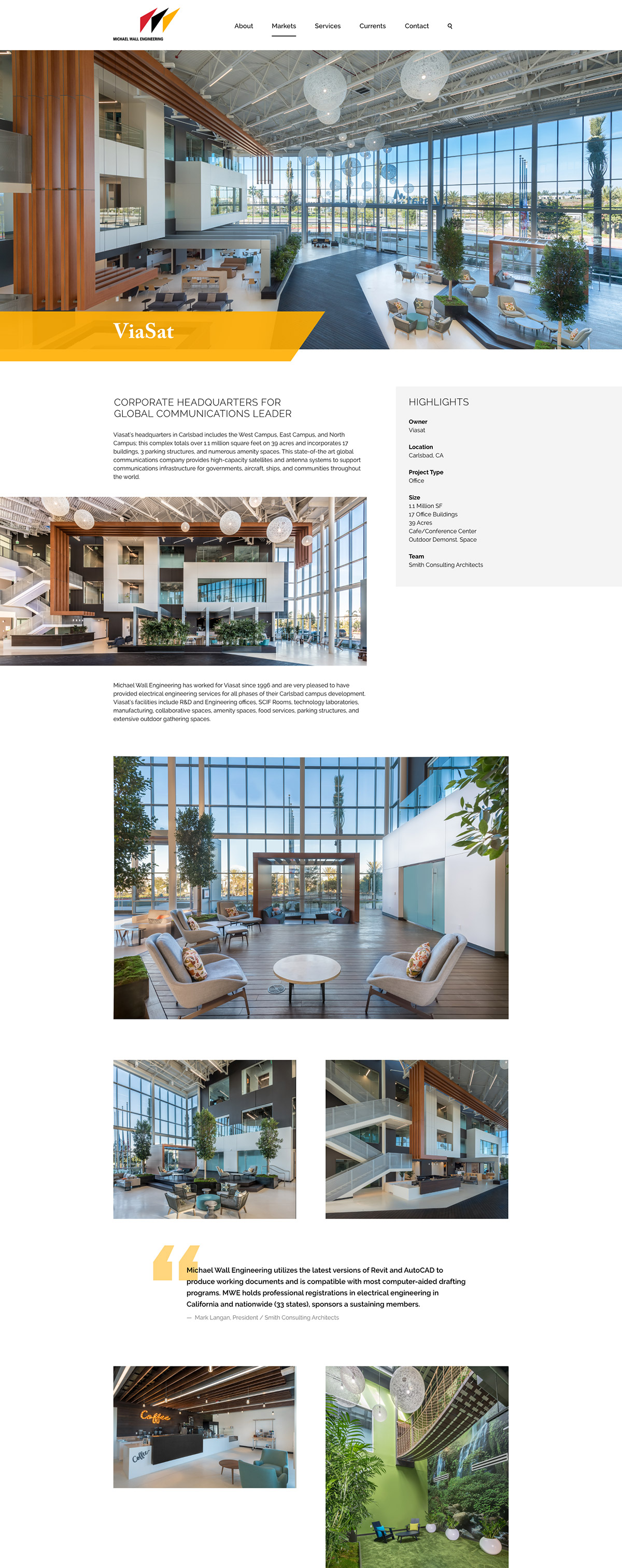
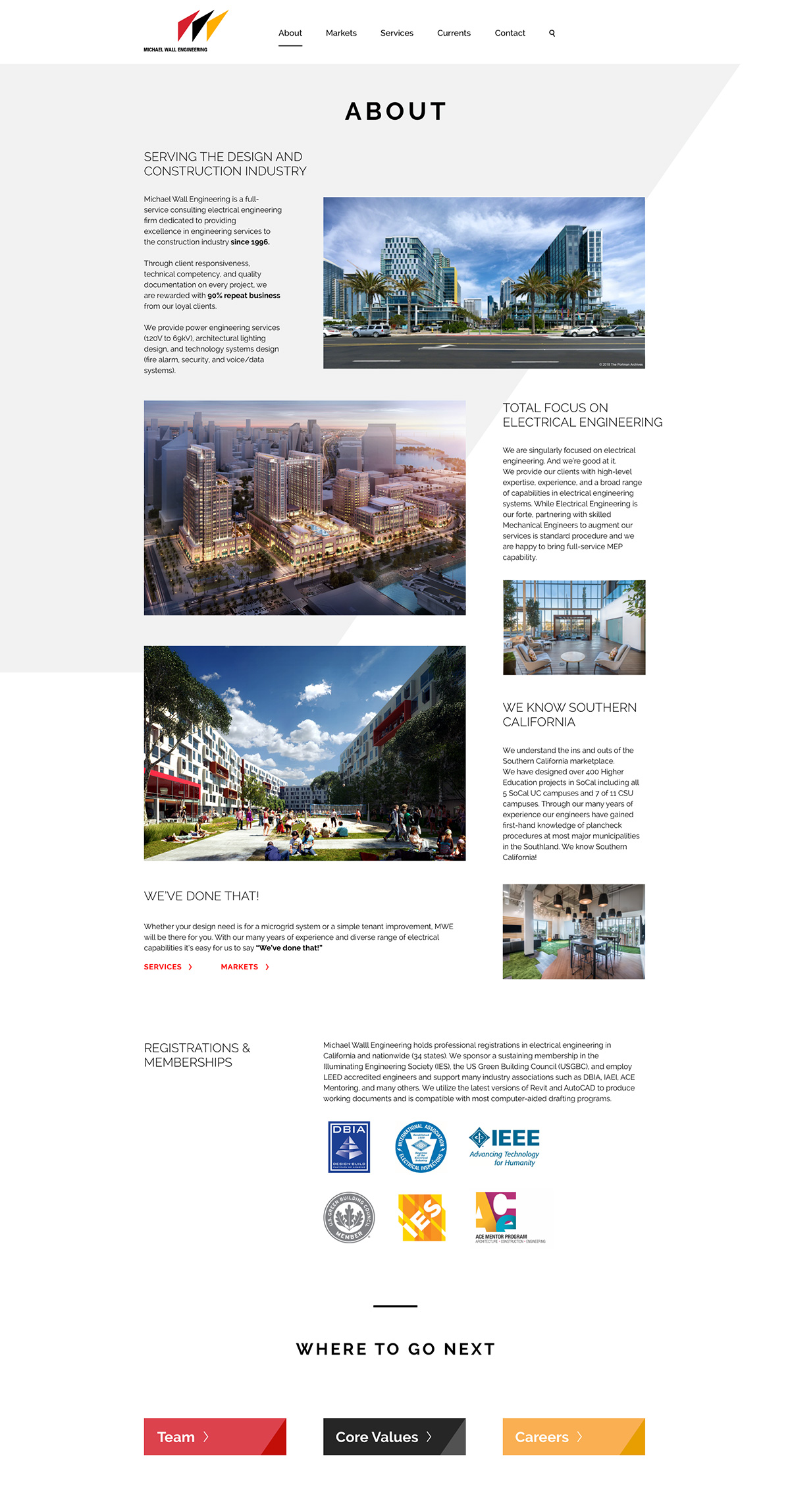
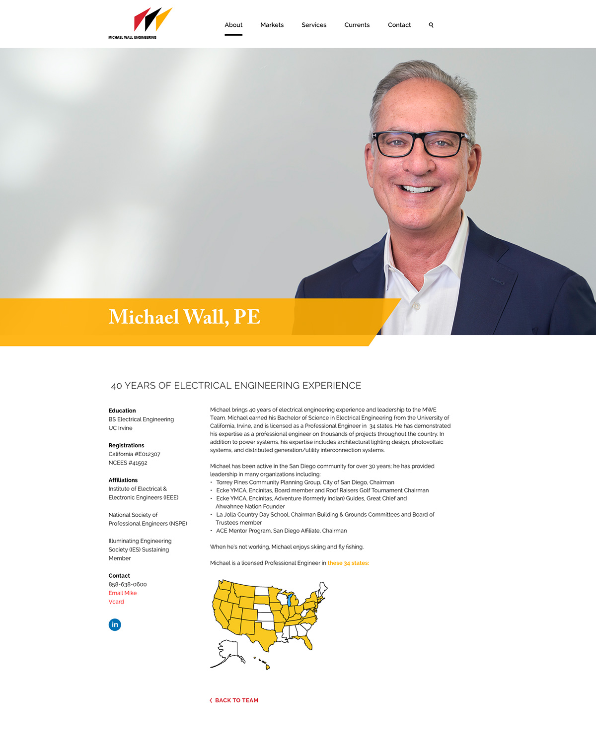
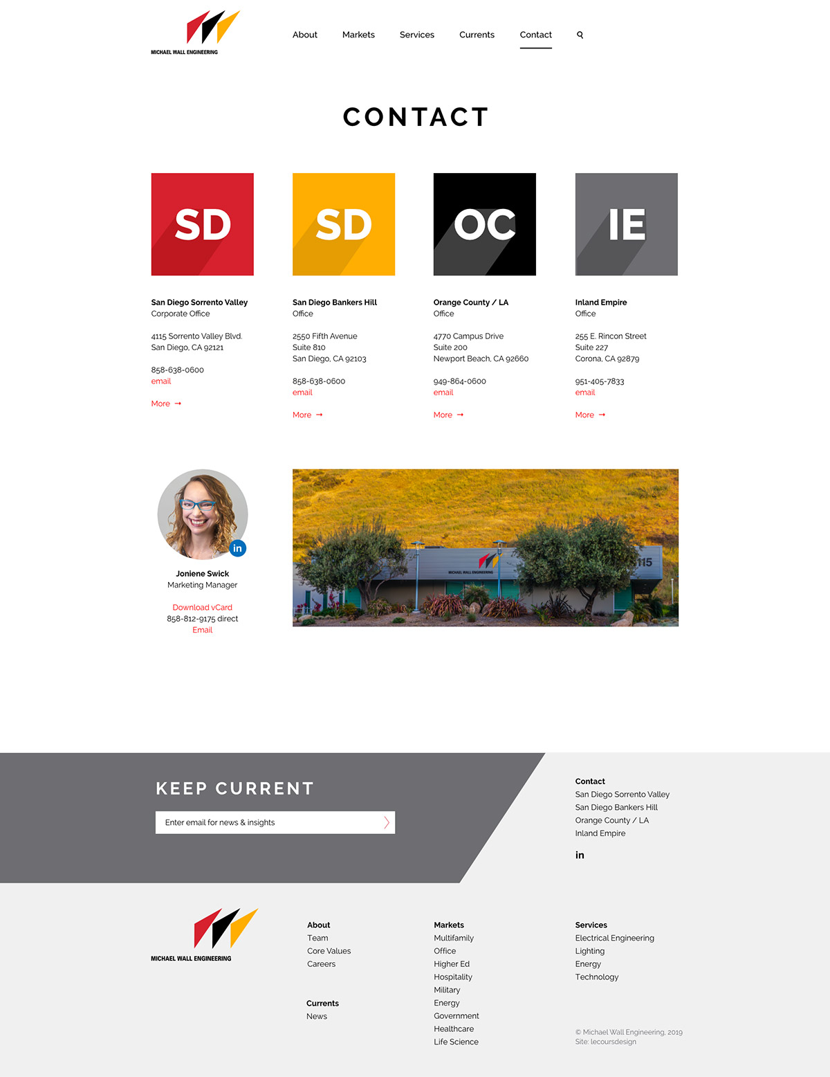
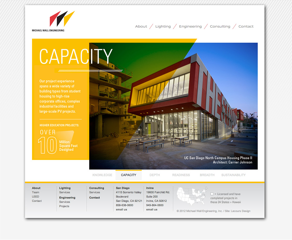
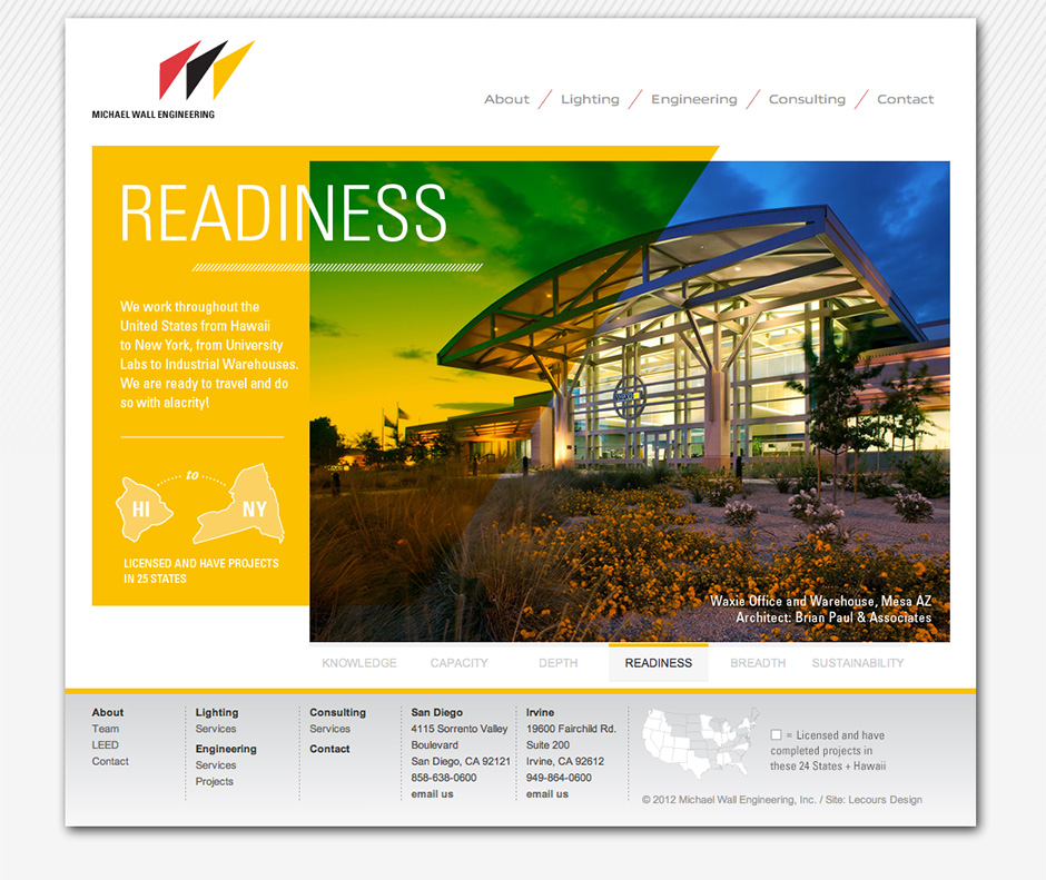
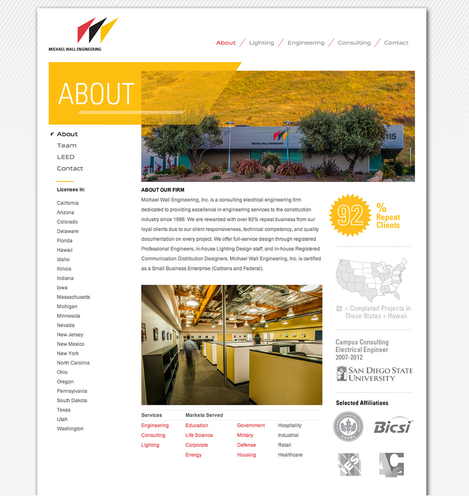
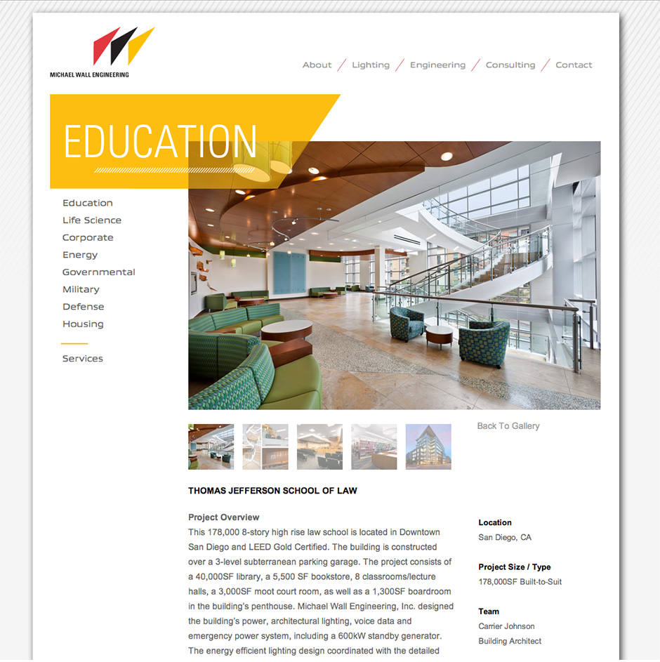
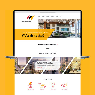
Michael Wall Engineering
We’ve Done That, Twice!
C L I E N T
Michael Wall Engineering (MWE)
See Site
S E R V I C E S
Discovery, Insights & Recommendations,
Positioning, Core Values, Website Design,
Website Development
T H E B R I E F
The original website we designed for MWE in 2012 was dated, especially on mobile. As part of a larger marketing overhaul, we launched a new responsive website for a great experience on desktop, tablet and mobile.
C R E A T I V E C O N C E P T
MWE already had a bold logo and color palette. We embraced the angle of the “3 sails” logo and the saturated red, yellow and black throughout the new site.
Results
3 months before launch (old site) vs. 3 months after launch (new site).
We are very happy with the site and get lots of positive feedback from clients, recruits, and employees. It’s been very beneficial to our business especially during this time when we can’t interact with folks in person.”
–Michael Wall, PE, Principal
T H R E E U N I Q U E S
Lecoursdesign led a half-day workshop with firm leaders to generate a lengthy list, then narrow firm attributes to three unique differentiators:
Electrical Engineering – We are singularly focused on electrical engineering, not mechanical and plumbing.
Southern California – We understand the ins and outs of the Southern California marketplace.
We’ve Done That! – With deep expertise in a diverse range of electrical capabilities, it’s easy for us to say, “we’ve done that!”
P O S I T I O N I N G S T A T E M E N T
From the three uniques, we developed a positioning statement that differentiates MWE from their competition.
B R A N D P E R S O N A L I T Y
Before designing the website, we created five brand personality attributes to guide all future marketing communication materials.
Approachable
Dependable
Accomplished
Imaginative
Sophisticated
Old Site (Before Redesign)