by davidlecours | Jan 29, 2015 | Branding

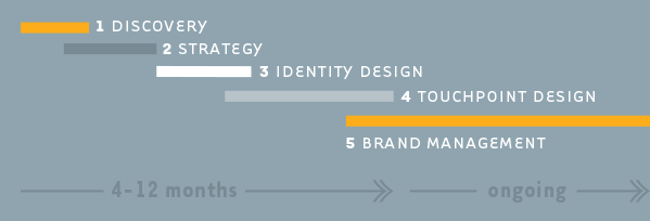
This posts answers the frequently-asked-question, “What is the process for branding an Architecture / Engineering / Construction firm?” There are five main phases: Discovery, Strategy, Identity Design, Touchpoint Design, and Brand Management.
1. Discovery: Auditing & Research
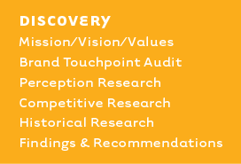 Much like a M.D., a branding consultant shouldn’t prescribe a course of treatment without diagnosing the problem first. The Discovery Phase allows us to diagnose by looking backward before building a forward-looking brand.
First, we examine the fundamental building blocks of your strategic plan: Mission, Vision and Values. Your Mission is your purpose, why your firm exists. Your Vision is where the firm is headed, what you want to be in five years. Values define how you will reach your vision, the guiding principles that keep you focused. If Mission, Vision and Values are not solid, we don’t move forward.
The Brand Touchpoint Audit allows us to review the top 75 points of contact that a potential client or employee would encounter with your brand. We rate each touchpoint, and have you do the same.
The benefit of working with an outside consultant is perspective. It’s very difficult to “read the label if you are inside the jar.” One of the ways we bring perspective is conducting perception research. This typically involves interviewing principals, project managers, new hires, teaming partners, and clients. We want to find out how the brand is currently being perceived. In short, what is your reputation?
Competitive Research examines how you compare to your competitors. With a bias towards strengths, we are not blind to weaknesses in searching for competitive advantage. We analyze which markets and services are opportunities for you to lead.
We also enjoy discovering how, when, and why the firm was founded. Hopefully this historical research will uncover a great origin story. Or, there may have been some key turning points in the firm’s history to inspire the brand moving forward.
The deliverable in phase one is a Findings & Recommendations Report. It is the summary of the perviously mentioned items with prioritized recommendations on what to do next.
2. Strategy: Differentiation & Planning
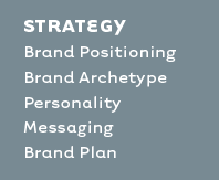 The foundation of a great brand is positioning. Positioning is the mindspace you occupy in your target audience’s head. What do potential clients and employees think when they hear your firm’s name?
Positioning is simply where your firm fits in the marketplace. There must be a compelling reason for targeted clients to choose your firm over your competition. A positioning statement should be easy for employees to say (simple, real language, not clichéd flowery b.s.) Positioning statements answer what you do, who for, competitive advantage, and benefit to customer. Here’s ours, as an example: LecoursDesign is a branding firm helping A/E/C firms attract great clients and employees.
Positioning is the hub of your branding strategy. All marketing communication should radiate out from this hub.
“Effective brand strategy provides a central, unifying idea around which all behaviors, actions, and communications are aligned…the best brand strategies are so differentiated and powerful that they deflect the competition.” ““Alina Wheeler from Designing Brand Identity
The deliverables in phase two are: Messaging and Planning. Messaging could include a positioning statement, “About The Firm” wording, a tagline, naming of services and markets, values communication, or a branded process. Planning outlines specific branding initiatives with timelines and budgets.
3. Identity Design: Naming & Logo Design
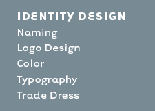 Clients love this phase because they get to witness the birth of tangible brand assets. Who doesn’t love a cuddly new firm name, swaddled up in a new logo, with fresh colors, fonts, and trade dress?
Branding doesn’t always require our assistance in firm name development. Which is a shame because very little thought, or strategy goes into the typical A/E/C firm name. Out of ego, or because it’s the norm, firms are often named after founding principals. Or, the sad consolation prize is an acronym firm name. Acronyms are terrible firm names because they lack personality, soul, and memorability. But wait, what about URS, NBBJ, SOM, HDR, HOK, you ask? Well, none of these firm names began as acronyms. Only after the fatigue of having to say, or write “Hellmuth, Obata + Kassabaum” ad naseum, did the firm nickname, “HOK,” become their actual brand name.
Naming is a fun process that begins with clarifying firm values, positioning, and personality. We prefer to define 5″“7 values or personality attributes to be communicated through the brand name. Then we generate at least 50 possible names for each attribute. Some are silly and would never work, but they can often inspire better ideas. The best way to come up with a great name, is to generate a lot of names. Often a name may show up on multiple lists. Or, we play the mash-up game combining words, prefixes, suffixes to generate new names. We narrow down to a dozen or so finalists and do an informal trademark search to check the legal, social media, and domain name availability. From there, we typically present 5″“7 finalists to the client. We then work with the client to narrow it down to 2-3 candidates for their intellectual property attorney to conduct a formal trademark search.
Logo development also begins with values, positioning and personality. Ideally, the symbol/logo/brandmark/trademark/brand signature (whatever you want to call it) should visually communicate the essence of the brand. What it shouldn’t communicate is what you do. In other words, it shouldn’t communicate that you practice architecture because there is nothing unique about this. The more you identify with your business category (architecture in this example), the more you become a commodity. So no T-squares, pencils, CAD or BIM references in your logo, ok?
During the logo exploration phase, we’ll develop pages and pages of loose sketches. Then we refine the top contenders in Adobe Illustrator. We like to present seven logo explorations in black and white to our clients. More than seven is overwhelming and causes choice fatigue. Fewer than seven suggests a lack of rigor. We present in black and white because it is a great equalizer. The moment color is introduced, biases towards, or against, certain colors cloud the evaluation process.
We refine the top two logo finalists on a business card and on-screen to simulate web use. Often, we simulate the logo being applied to vehicle or building signage as well. At this point, we add color. If the firm decides to register their trademark, their intellectual property attorney can do a search using the two finalists. Once the final logo and color is chosen, we will develop a color palette of primary use colors and secondary use colors for future marketing communications. We develop a recommended typography palette to encourage consistent font usage across the firm. If words are the content, then fonts are the voice. We want all marketing to be communicated in a consistent voice.
4. Touchpoint Design: Brand Application
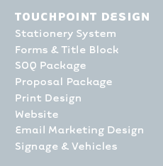 After establishing the core brand identity, it’s now time to apply the new look across all brand touchpoints. Touchpoints are all the ways a prospective employee, client, or teaming partner may encounter your brand. You never know which touchpoint: business card, blog post, job site sign, etc. will be the gateway of introduction to your brand. Since first impressions matter, make all touchpoints the best your budget allows. The brand plan you created in phase one determines your prioritized list of touchpoints needing attention.
We typically begin with the business card. Especially in this digital era of LinkedIn and smart phones, a quality business card is a tactile symbol to represent the quality of your architecture, engineering or construction. For us, the exercise of designing a 3.5-inch x 2-inch business card forces us to be very deliberate about design decisions. The business card design informs the entire stationery system: letterhead (print & .doc), envelope, labels, note cards, and internal forms.
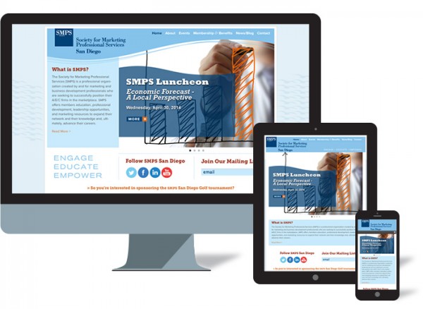
The first project we recommend is the firm website. A great website attracts, demonstrates, connects, and converts visitors into clients or employees. Your website should serve as the hub of all digital marketing communication, and much of your print communication. The site needs to be optimized for all screen sizes, so we recommend responsive design to create a great user experience on phones, tablets and desktop computers.
Frequently we get asked to design the firm’s forms, reports, and construction document title blocks. Since these are typically the only deliverables of an A/E firm, they need to look and feel worthy of your fees.
Print marketing collateral: SOQ packages, a proposal template, brochures, project/market/service sheets get designed next. From there, we may design the firm’s building signage, job site signs, and vehicle graphics.
5. Brand Management: Protecting Your Investment
 The introduction of a new brand requires a significant investment of time and dollars ($50k”“$250k). You want to protect this investment with effective brand management. This begins with the introduction and rollout of your new brand.
We always recommend that clients protect their intellectual property by registering their trademark with the United States Patent and Trademark office or uspto.gov. An intellectual property attorney will be glad to help you with this or you can try to handle it yourself.
Of all the phases and steps mentioned above, the process is nearly identical for an entirely new brand as for a re-brand. But introduction and rollout of a re-brand is unique. People like best what they know most. So, change can be difficult for those attached to the old brand. Before the re-brand is launched publicly, you need to do some internal education for employees, clients, and teaming partners. Even better if they were aware of the re-brand from the beginning so it isn’t a shocking change when it launches. Explaining why the change was needed, the process of development, and why the new is better than the old, will go a long way in building internal support for the rollout.
In a perfect world, all your new brand touchpoints would roll out simultaneously. But we recognize that printing schedules, budgets, and not wanting to throw away existing materials sometimes prevent this. You have more control over timing with digital items. So, we recommend that the website, email blasts, email signatures, and social media channels all be updated prior to launch. Key business development and marketing leaders and Principals should all have new business cards. But you could wait to replace all staff business cards until the old ones are nearly used up.
The introduction should be a big deal. It’s a great opportunity to make an impression on past, present, and future clients. Having an Open House or Launch Party is a great way to build goodwill among your clients, teaming partners, and employees. There are also opportunities to get an article published about the new brand.
To help ensure ongoing integrity of your brand communications, we always recommend a Brand Style Guide. This can be a 2-page to 24-page document to encourage consistency across multiple offices, and even multiple languages. Think of this guide as a “cookbook” showing you how to cook up effective marketing communication using the required “ingredients,” your brand assets. It should be flexible enough to not hamper creativity. At minimum, the brand style guide must include information on logo usage, color, typography, nomenclature, trade dress (distinctive patterns or packaging), paper, imagery, and editorial tone. The Brand Style Guide can be distributed to employees as a PDF, or live as a series of pages,downloadable files on a company intranet.
Conclusion
While the results of all our branding projects are different, following the same process allows for continual improvement. From Discovery, Strategy, Identity Design, Touchpoint Design, to Brand Management, the best results come from clients that are curious, open-minded, and candid. Being informed is always helpful too, which is why we wrote this guide.

by davidlecours | Jun 23, 2014 | Branding

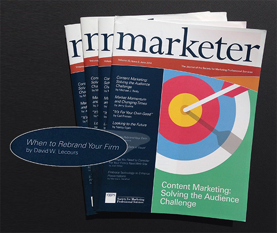
This post was originally published in the SMPS Marketer national magazine.
All living things go through a life cycle of birth, growth, maturity, decline and death. A/E/C firms endure similar life cycles, except that they can shortcut decline and death through reincarnation. If you prefer a more secular term, let’s call it rebranding. But first, some clarity about the term “rebranding.”

Your brand is not your logo. So, changing your logo is not rebranding. Changing the name of your firm is not rebranding. Your firm’s logo and name are key elements of your brand identity, but don’t define your entire brand. Rebranding is a new brand positioning that inspires a new name or logo. Brand positioning answers: what your firm does (services), who you do it for (target markets), and how your unique expertise benefits clients.
Firms struggle with knowing when to rebrand. Here are five scenarios that indicate it’s time to consider rebranding.
1) Significant Change in Strategic Direction
Healthy firms deepen their expertise and capabilities to adapt to a continually changing world. This can lead to a decision to enter new markets or offer new services. After 3″“5 years, your firm may evolve significantly. When your firm is known for what it used to be, not what it aims to be, then it is time to rebrand.

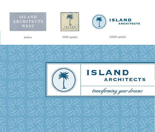
Island Architects made a strategic decision to expand their positioning beyond traditional residential to include contemporary.
A brand should be a beacon for where your firm is headed. But often, the perception of your firm doesn’t match your firm’s vision. How do you know? A brand perception study can help measure your reputation.
Hightail, formerly YouSendIt, recently rebranded because of a significant change in strategic direction. YouSendIt was known for sending and receiving files too large to email. But today, the company offers considerably more. Their name and perception were holding them back. “We have already far outgrown our original use case of only sending large files, and our name should reflect where we are as a company today as well as where we want to go in the future.” says Hightail CEO Brad Garlinghouse.
NOTE: Scenario #1 is a stand-alone reason to rebrand. Reasons #2″“5 warrant rebranding only if combined with #1, or each other.
2) Change of Ownership
Mergers & acquisitions, spinoffs and break-ups are not exclusive to the Fortune 500. They occur within the AEC industry as well.
HOK was established in 1955. In 1983, the firm created the sister brand HOK Sport Venue Event (aka HOK Sport). The brand established itself as the leader in designing sports stadiums. In 2009 through a management buyout, principals of HOK Sport split from parent company HOK. The new independently owned and operated brand is named Populous.
Not only does the name Populous communicate a separation from HOK, it also serves the firm strategically. Working with Milkshake Media, Populous developed a tagline “drawing people together” to communicate capabilities beyond stadia into arenas, convention centers and fairgrounds. “As the world becomes more populous, and ever-advancing technology separates us into audiences of one, our expertise becomes more relevant,” says Joe Spear, senior principal. “Our singular focus is to design containers of emotion for the collective energy of lots of passionate people.”
3) The Brand Identity is Rotten
Unlike greek yogurt containers, A/E/C firm logos do not come with an expiration date. This is unfortunate because many A/E/C firm brand identities have lost their freshness and fester in the back of the marketplace refrigerator unnoticed by owners. However, potential clients and employees do notice. Fair or not, they make judgements about the firm based on subtle visual cues. Reread Malcom Gladwells classic, Blink, if you need a refresher.
Graphic design, like all forms of design and fashion, cycles through trends. Colors, patterns, and typography (fonts) can become dated. A/E/C firms constantly claim being current with technology. This claim falls flat when handing out business cards with a tired logo straight out of 1972!
4) Coming of Age
There are watershed moments in a firm’s life cycle that mark the transition from start-up into maturity. This is the equivalent of a sweet 16 party or heading off to college; marking the transition from adolescence into adulthood.
For A/E/C firms, this transition may be a game-changing project win, a strategic leadership hire or moving into a new office. The result is that the firm has left the minor leagues in favor of the majors. A rebrand may be necessary to mark this evolution.
5) Anniversaries
Birthdays that end in zero often cause us to reflect upon where we’ve been, and where we are headed. Sometimes this results in a mid-life crisis. The same is true for A/E/C firm anniversaries; a great time to pause and evaluate. A SWOT analysis can be a valuable tool for moving forward. It’s best to engage an outside consultant to help with this process because you can’t read the label if you are inside the jar.
A 10, 20, or 30-year anniversary itself is not a reason to rebrand. But, it may cause you to reflect, and realize catalysts one through three mentioned previously are also occurring. If so, then it’s time to rebrand.

Firms often add an anniversary logo to compliment their core logo. You’ve probably seen these “30 years of service / script typeface / laurel leaf embossed seals” used in email signatures, or as stickers on outgoing envelopes. To be clear, this is not rebranding, and it certainly isn’t unique. A better approach is a memorable event to celebrate the accomplishment with past, present and future clients and employees.

For Schmidt Design Group’s 20th Anniversary, LecoursDesign designed a gift book given to past, present, and future clients at their memorable anniversary event.
Rebranding can be scary, costly and time consuming. There needs to be a good reason to reincarnate your firm. If any of these scenarios hit home, get professional help now. Don’t wait until decline or death. A successful rebrand can breathe new life into your firm.
For more about LecoursDesign branding services, click here.
To purchase David’s archived SMPS rebranding webinar, click here.


 Much like a M.D., a branding consultant shouldn’t prescribe a course of treatment without diagnosing the problem first. The Discovery Phase allows us to diagnose by looking backward before building a forward-looking brand.
 The foundation of a great brand is positioning. Positioning is the mindspace you occupy in your target audience’s head. What do potential clients and employees think when they hear your firm’s name?
 Clients love this phase because they get to witness the birth of tangible brand assets. Who doesn’t love a cuddly new firm name, swaddled up in a new logo, with fresh colors, fonts, and trade dress?
 After establishing the core brand identity, it’s now time to apply the new look across all brand touchpoints. Touchpoints are all the ways a prospective employee, client, or teaming partner may encounter your brand. You never know which touchpoint: business card, blog post, job site sign, etc. will be the gateway of introduction to your brand. Since first impressions matter, make all touchpoints the best your budget allows. The brand plan you created in phase one determines your prioritized list of touchpoints needing attention.
 The introduction of a new brand requires a significant investment of time and dollars ($50k”“$250k). You want to protect this investment with effective brand management. This begins with the introduction and rollout of your new brand.